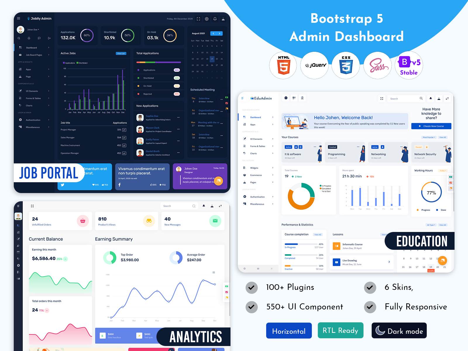
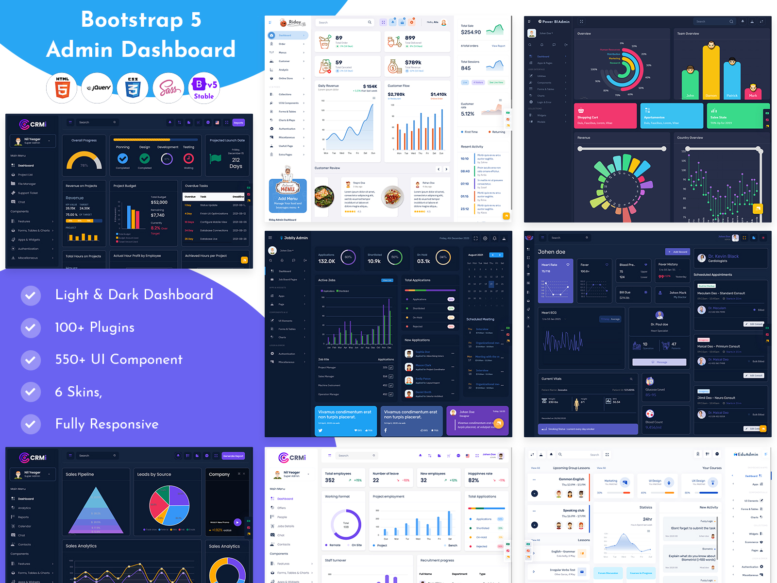
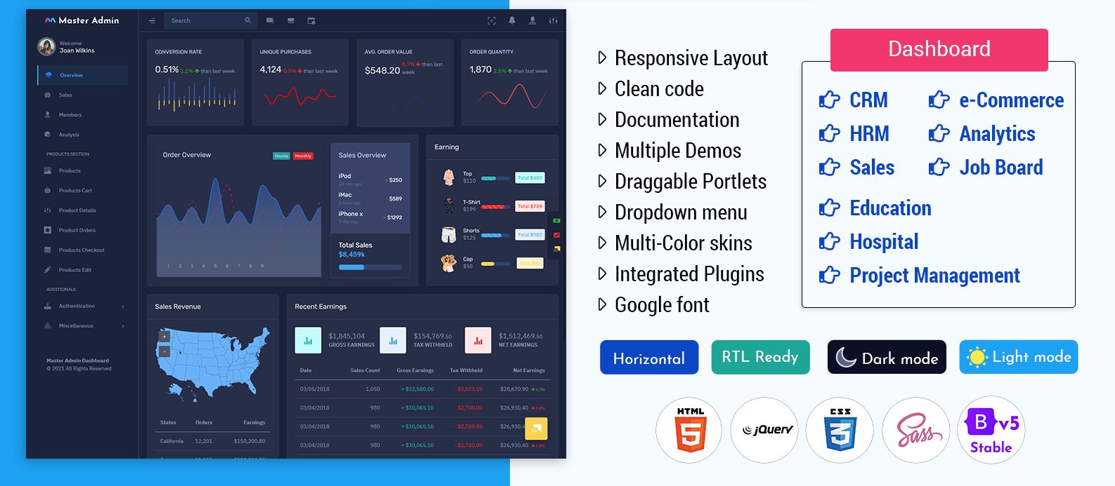
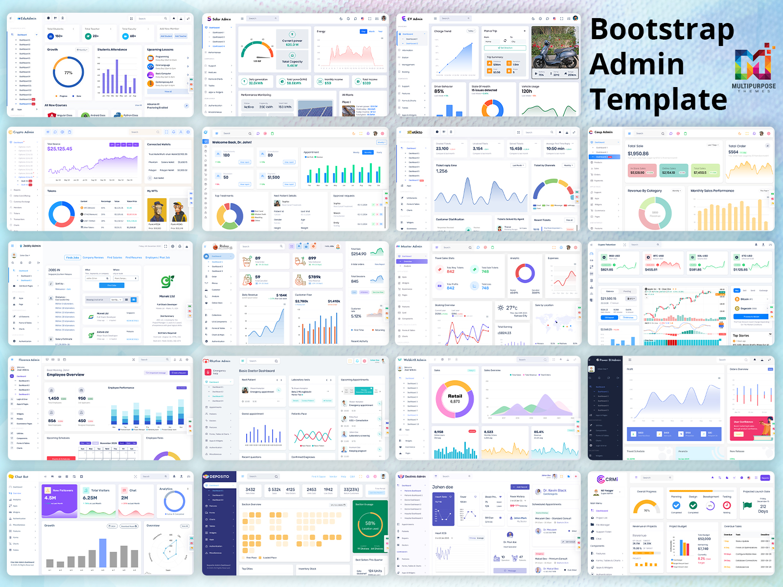
When you’re working on a project with a lot of data, whether it’s business KPIs, financial data, or any other sort of indicator – your dashboard serves as the foundation. It’ll be one of the first things your visitors notice. This is where Admin Templates can come to assist you. As you look around for admin template, you will notice that there are multiple different options available to consider. However, you should pick the best dashboard theme out of them. Continue to read and we will share the best features that a dashboard template should have.
What characteristics distinguish an excellent dashboard?
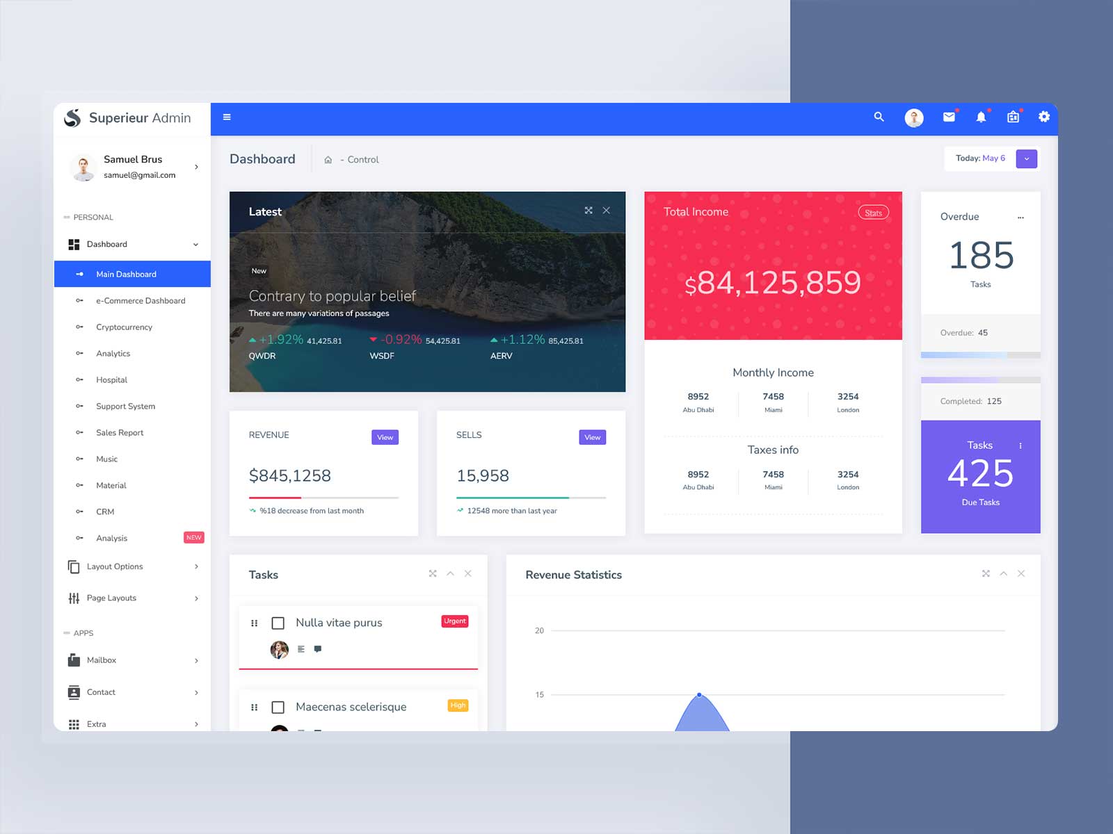
Before we get started with the processes, let’s clarify what a dashboard is. One of my favorite definitions is from the book The Big Book of Dashboards: “An Admin Dashboard is a visual representation of data that is used to monitor conditions and/or aid comprehension.” This definition emphasizes the significance of putting oneself in your users’ shoes. It’s up to us, as designers, to figure out what information our consumers want to see and where they can find it. A well-designed dashboard will make this evident (and simple!) straight away, allowing users to make swift business choices.
Only show what is absolutely essential.
It may seem clear, but it isn’t. The problem is to strike a balance between the data that can be shown on a Bootstrap 5 Admin Dashboard and the data that should be displayed. “Not everything that can be counted counts, and not everything that counts can be counted,” Albert Einstein once stated. It’s tempting to create every imaginable card, chart, and filter, but it’s best to keep things simple. Make it simple for consumers to access and dig further into data in another part of your product if they want to learn more. This is something important to be mindful at the time of UI UX design.
Don’t deceive anybody.
Charts should accurately represent a collection of data. As a result, finding the best approach to present the information is critical for comprehension. Be wary of optical distortions and excessive animations, which might lead to a false interpretation for inattentive eyes even when the data is correct. Even the axis on which data is presented (horizontal or vertical) has an influence on how your consumers interpret it. The UI UX Design will play a major role in here as well.
Explain the situation.
To assist analysts easily grasp the data, a good Admin Template Dashboard layout should include meaningful names. To emphasize contexts throughout navigation, stick to a strong name and icon standard.
Assist in conducting a thorough inquiry
Analysts will need to look into the facts further in many situations. Provide features like as filters, breadcrumbs, drill-downs, and raw data exporting capabilities to make this easy for them.
Select colors with care.
Remember to keep fundamental design psychology ideas in mind while you construct your dashboard. Even if neon colors were the UI design trend that year, it isn’t enough to turn a dashboard into a nightclub. Maintain a consistent color palette and consider factors such as design limits and accessibility.
Make customization possible.
If your user can alter and customize your Bootstrap Admin Dashboard, it will be much more beneficial. You will, however, need to strike a balance for your Admin Template Dashboard, as with everything in UX design. Additionally, customization choices should not interfere with the system’s established navigation patterns or aesthetic consistency.
Recognize the hierarchy of information
Because dashboards pack a lot of information into a short area, it’s critical to create a clear hierarchy between the items. This may be accomplished by visually grouping and subdividing secondary data and visually leveling related groupings of data. Typography, element size, card design, borders, and shadows are all important in ensuring that your users grasp the material.
Final words
Of course, a project like this is only complete until user testing and iterations have been done. Conduct interviews with folks who will be using your Admin Panel Dashboard on a regular basis to better understand their requirements and ensure that your final design represents their objectives. With these pointers in mind, you’ll be able to create a well-designed, effective dashboard that will assist your users in making rapid business choices at critical moments.