Managing crypto is not just about buying and selling coins. It is about having the…
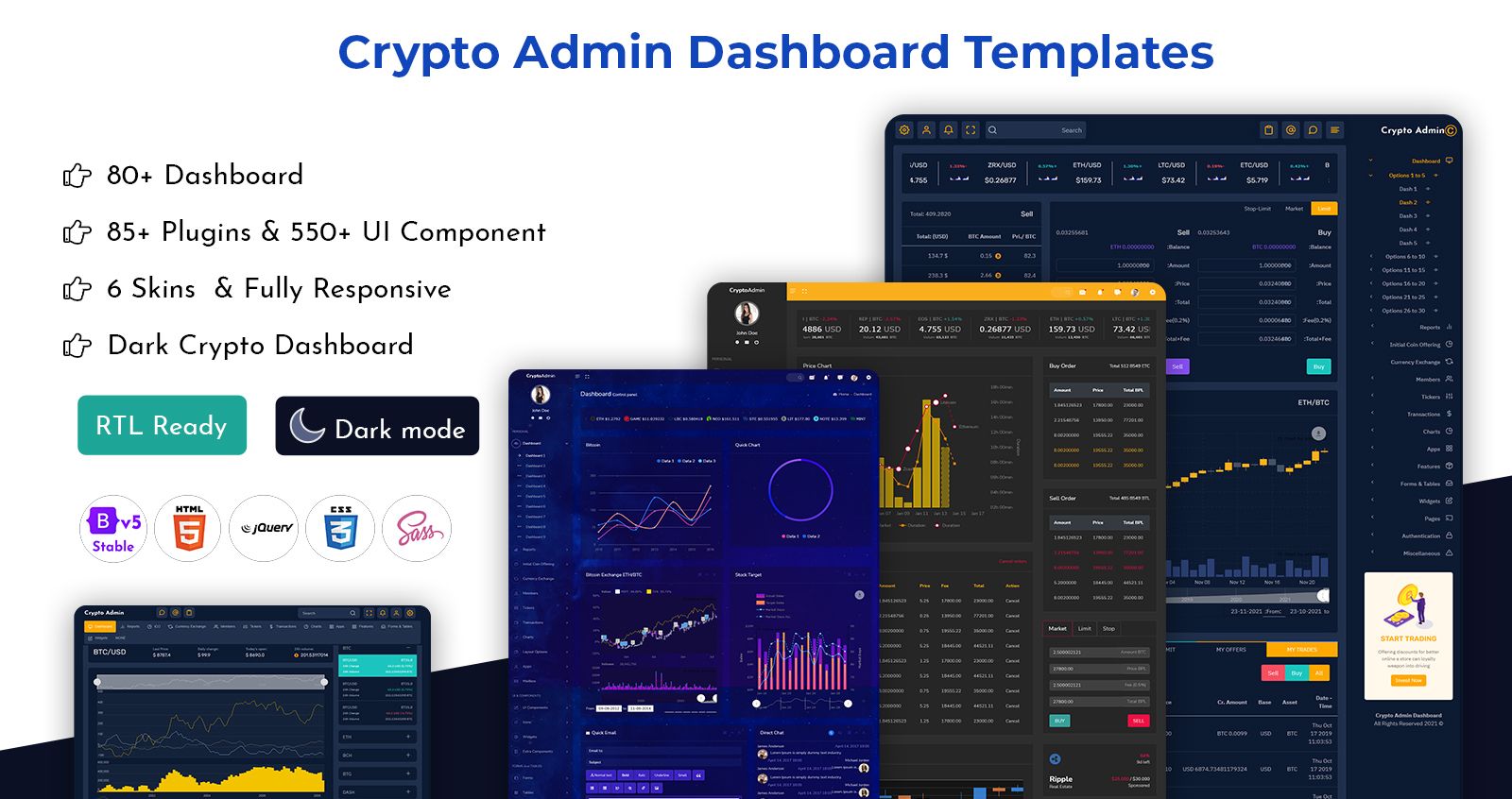
How to Get the Most out of your Cryptocurrency Dashboard Template
Reading Time: 3 minutes
Many individuals find it difficult to comprehend data if it isn’t presented in a straightforward manner. You need to keep this fact in mind when you are trying to find a Cryptocurrency Dashboard Template. They may experience cognitive overload, be scared by what’s on screen, or misunderstand what you’re trying to say. They may or may not utilize dashboards at all for their job.
Good dashboards are meant to aid any sort of user, whether a typical businessperson or an experienced specialist, in better interpreting, understanding, and acting on complicated data circumstances – or in quickly identifying what information is shown on the screen. Here are some of the most important factors that should be present in your dashboard. You need to keep these in mind and locate the right Ethereum Dashboard template to get your work done.
MORE INFO / BUY NOW DEMO
Fonts and typography are important.
The language that accompanies a dashboard, as well as its visualizations and numbers, must be simple to read and aid in the navigation of the dashboard viewer. For best accessibility for your various Crypto Dashboard audiences, keep font kinds, sizes, and styles to a minimum.
Roboto, Open Sans, and Lato are all Google tabular fonts that work well for dashboards, reports, and charts. These typefaces are also easy to read at tiny sizes, are clean, and come in a variety of weights. On a dashboard, it’s best to stick to a single font type with no more than three distinct weights (e.g., normal, and bold) and a maximum of four font sizes. This provides enough diversity to draw a user’s attention to priority material, such as table or chart headings, while keeping axes and labels from becoming overly prominent.
Choosing your dashboard’s colors
Color is an excellent approach to aid end users in navigating your Cryptocurrency Dashboard, charts, or other data display. Its significance in the design process cannot be overstated. Color may be used to guide people to the information they need in the order they need it. It brings emphasis to figures and aspects that need to be observed, and it indicates changes.
To begin, choose a complimentary color scheme and adhere to it. Start with a primary color, such as orange, and then attempt to create a theme that complements and contrasts that basic color. Consider how many are required in the worst-case situation, such as a pie chart with ten or twelve colors. This will need a comprehensive color palette or theme that can fit nicely side by side in your dashboards.
Consider the usability features of color, such as color blindness, after a theme has been selected. Ensure that colors have appropriate contrast whether side by side in a bar chart or next to each other in a pie chart; low contrast values between colors make charts and the dashboards they’re used on difficult to see.
Grouping and hierarchy
It’s critical that the correct dashboard type be chosen to meet user expectations and that analytic capabilities are taken into account. It’s pointless to create a thorough operational dashboard for a senior manager who simply requires top-level KPIs, and the converse is true when giving a Crypto Admin Dashboard to someone who has highly specific requirements.
To tell an integrated tale, start by grouping relevant facts. Certain charts are better understood when seen in context. By grouping relevant data or visualizations using graphic elements like boxes, lines, and shapes, you may offer visual signals on connected data and save viewers time from having to figure out correlations between charts.
Use groups to direct users to distinct sections of the experience, such as KPI charts or charts that describe different portions of the same narrative. White boxes and dividing lines are utilized to categorize relevant topics of interest in the financial example below. This makes navigating a large amount of info much simpler.
Alignment and layout
This does not necessary imply that all components of a Cryptocurrency Dashboard Template should be the same size, but when feasible, aim to create visual alignment across different components to reduce the amount of work needed to move around the dashboard visually.
Alignment aids in the creation of hierarchy. Because the human eye naturally moves from top left to bottom right, consider aesthetically aligning chart headers, charts, and text blocks correctly.
Focus on all these factors and get hold of the best Bitcoin CryptoCurrency Template Dashboard Theme to get your work done.
MORE INFO / BUY NOW DEMO
Related Posts