In the fast-moving digital world, businesses rely heavily on web applications to manage operations, users,…
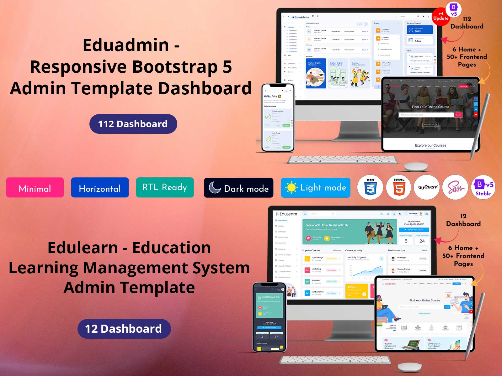
Popular Online Courses Dashboard Bootstrap Templates 2023
Reading Time: 5 minutes
One of the most challenging aspects of developing an application is the online course Bootstrap Templates design. Knowing what information to offer to your consumers is both an art and a science, whether you’re developing fast and easy mobile apps or Online Education Courses Dashboard. Here are some tips that you can follow during the produce design phase of your software dashboard.
Be familiar with your key performance indicators (KPIs)
Every product, from effective Admin Panel Dashboard to mobile fitness applications, is developed around a few key performance metrics. MyFitnessPal measures calories in, calories out, and weight reduction, while Google Analytics tracks conversions and traffic.
Understanding your key performance indicators (KPIs) is essential for developing a LMS Dashboard that people will like using. Your KPIs should be the main emphasis of your interface design and the first thing people see when they first launch your app.
Look at how KPIs, in this example recent tweets and account activity as well as conversions, traffic, and other objectives, are made the center of attention by a range of programs, from Twitter to Google Analytics.
Watch Video
EduAdmin – Light Dashboard
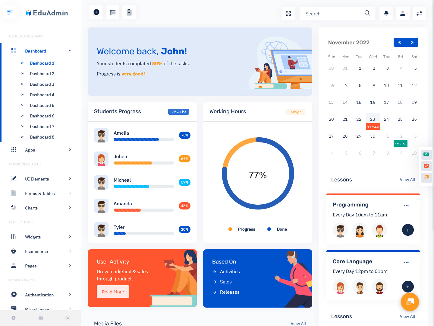
MORE INFO / BUY NOW DEMO
EduAdmin – Dark Dashboard – RTL
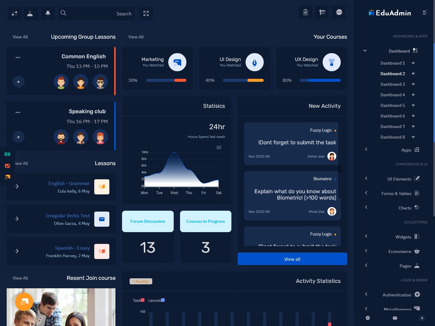
MORE INFO / BUY NOW DEMO
EduAdmin – Light Mini Sidebar Dashboard
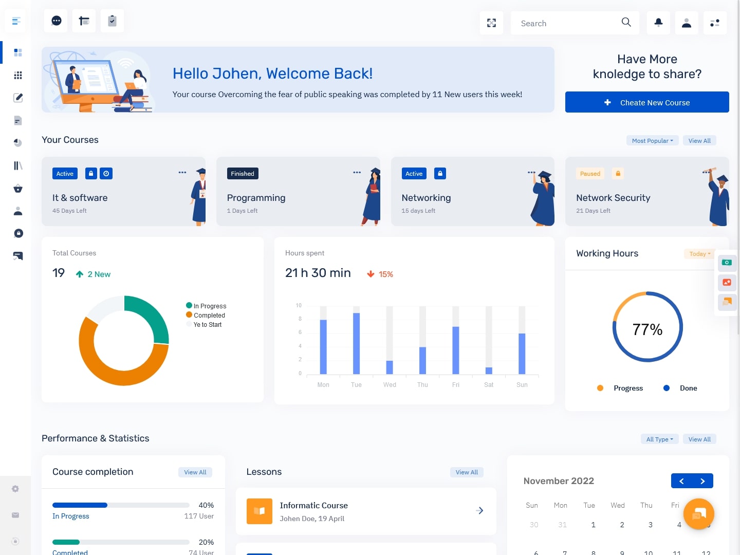
MORE INFO / BUY NOW DEMO
EduAdmin – Dark Mini Sidebar Dashboard – LTR
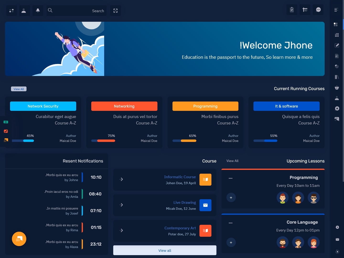
MORE INFO / BUY NOW DEMO
EduAdmin – Light Horizontal Dashboard
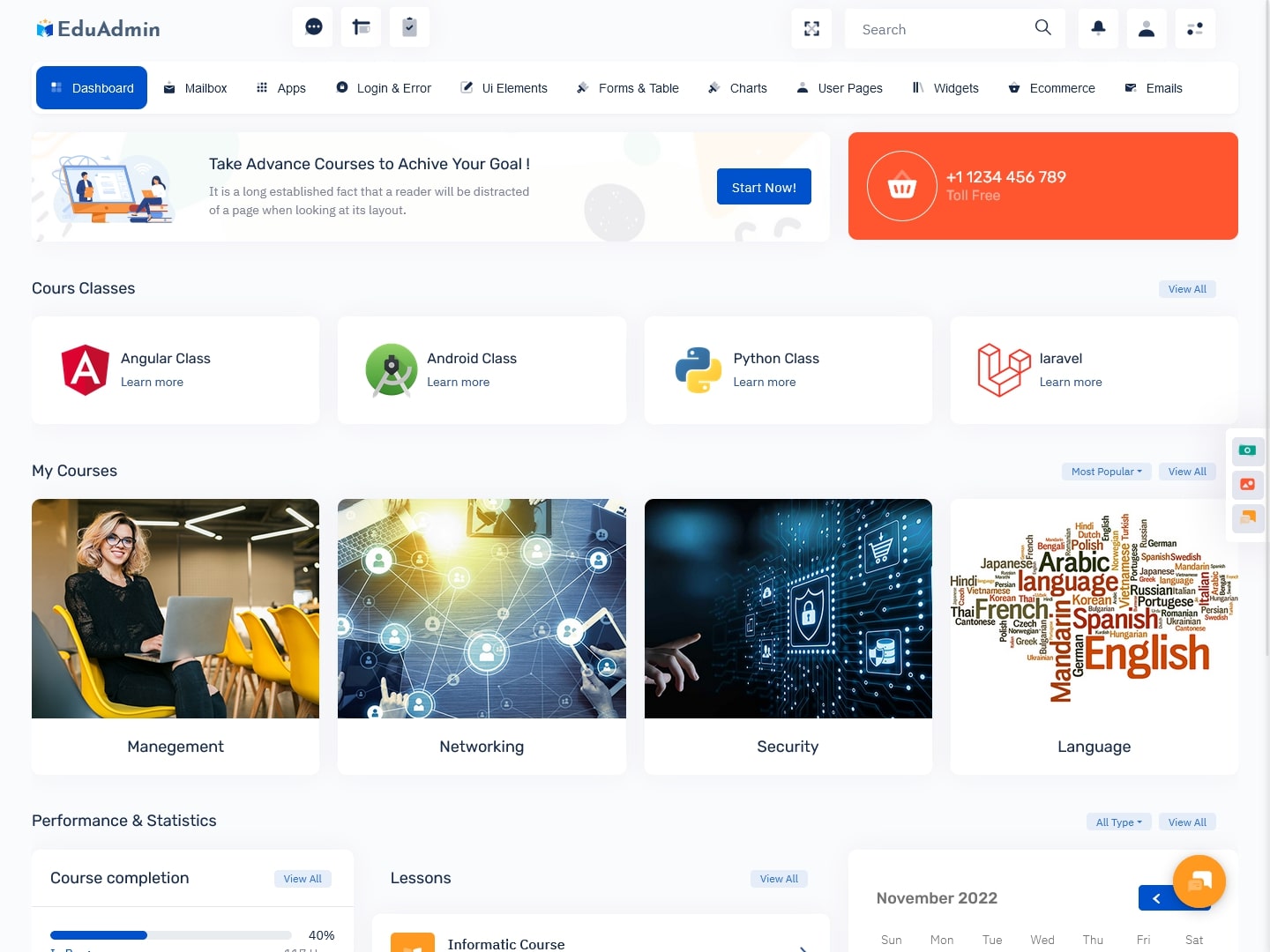
MORE INFO / BUY NOW DEMO
EduAdmin – Dark Horizontal Dashboard Dark
MORE INFO / BUY NOW DEMO
Keep things straightforward, light, and airy.
If in doubt, keep it simple. The finest user interfaces (UIs) aren’t too complicated—in fact, they’re not at all complex. A basic, user-friendly Online Education Courses Dashboard may conceal a significant amount of capability with the appropriate usability strategy.
Organize the functions of your product into fundamental categories, and then base the Bootstrap Templates of your interface on these categories. By classifying all of its capabilities into the following five groups: Campaigns, Lists, Reports, Autoresponders, and Search, MailChimp handles this really well.
Create a tabbed or modular style for consumers to choose features from if your product contains hundreds of features. Simplicity is effective, and it is always preferable to choose a clear, straightforward design than one that is complex yet effective. Keep this in mind and pick the right Bootstrap Admin Web App as well.
Colors may be used to warn and inform people.
In Online Education Courses Dashboard, colors are crucial, especially when creating outstanding user interfaces. By using button colors and alerts, colors may be used to alert and inform users of tasks, activities, features, and more. On your Dashboard Template, it is often recommended to choose predictable and conventional colors. Orange and red may be used to signify a little or major concern, whereas green is a terrific sign that everything is OK.
EduAdmin – LTR – Semi Dark Dashboard
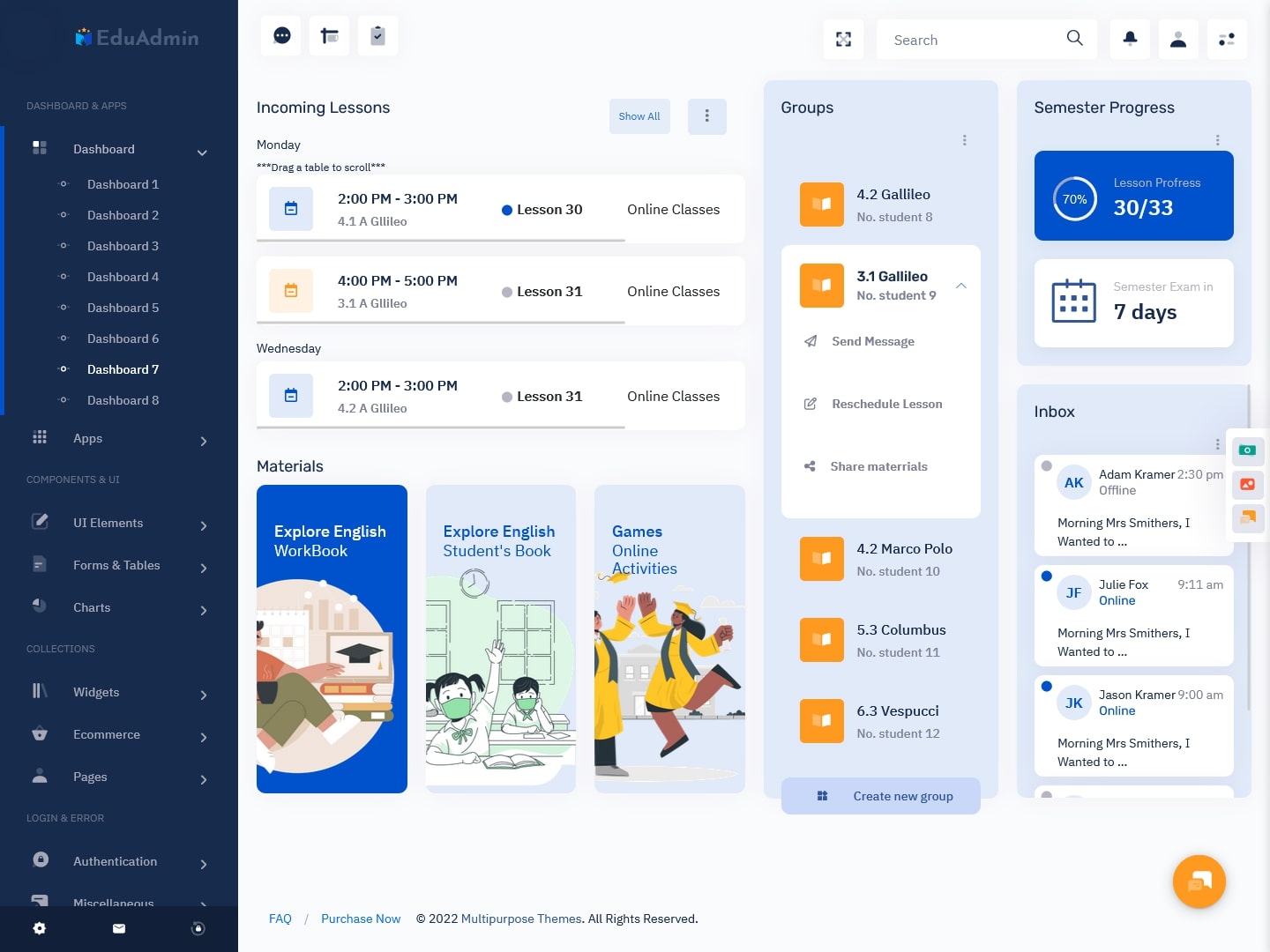
MORE INFO / BUY NOW DEMO
EduAdmin – RTL – Semi Dark Dashboard
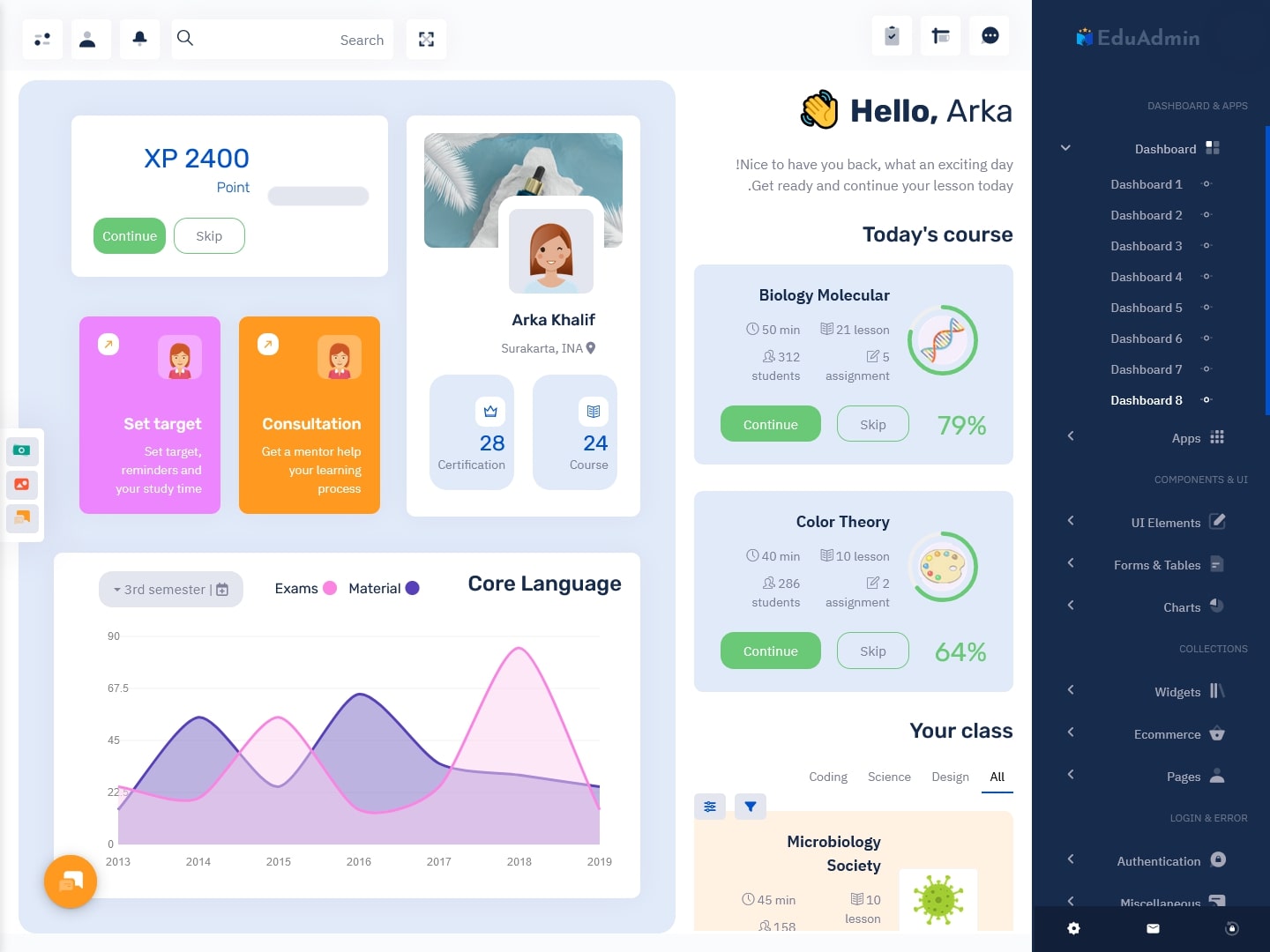
MORE INFO / BUY NOW DEMO
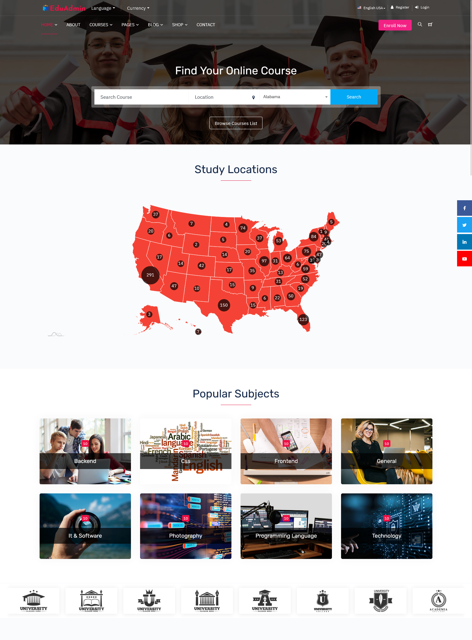
EduAdmin – Home Page
MORE INFO / BUY NOW DEMO
Avoid creating a new dashboards from scratch.
There are certain Bootstrap Templates elements that apply to all dashboards. For instance, almost all social networks provide a feed of recent updates. A left-aligned navigation bar and a right-aligned content area may be found in almost every B2B application.
Use features that are typical of your sort of application rather than starting from scratch when creating your online course dashboard to hasten the design process. In Admin Template UI design, dropdown alerts and account menus are commonplace and well-known.
Create for your most often used platform
How will your app’s users engage with it? Which device—their iPad, a high-resolution PC, or a smartphone—will they use to see it? Building a strong and intuitive user interface requires an understanding of the platform that your consumers favor.
Despite the fact that any current Online Education Courses Dashboard should be responsive (viewable on any sort of PC or mobile device), it’s crucial to build your application with the platform that receives the most use. For example, big buttons are essential for tablet applications.
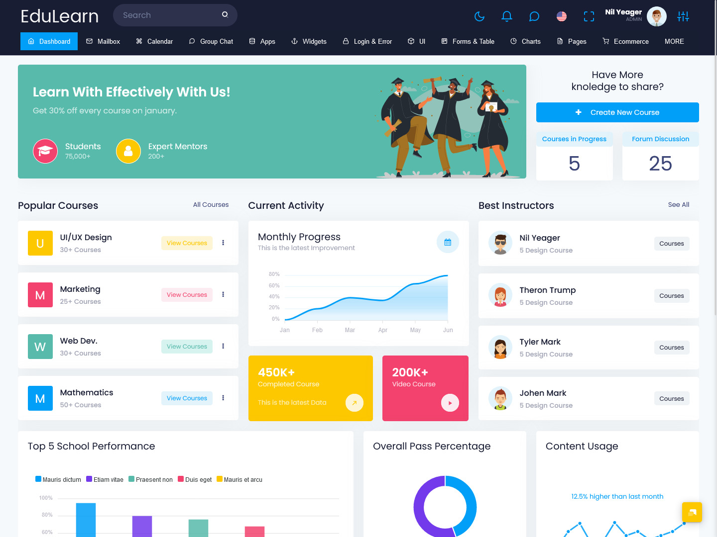
EduLearn Horizontal Light Dashboard LTR
MORE INFO / BUY NOW DEMO
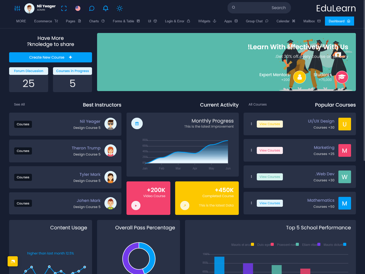
EduLearn Horizontal Dark Dashboard RTL
MORE INFO / BUY NOW DEMO
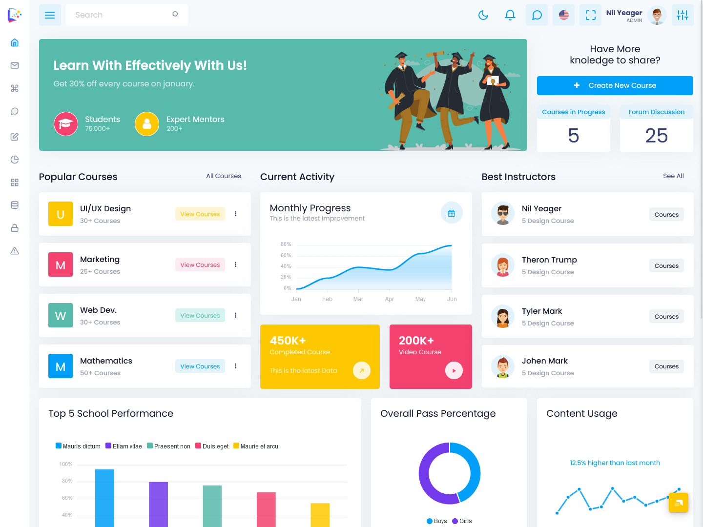
EduLearn Mini Sidebar Light Dashboard LTR
MORE INFO / BUY NOW DEMO
EduLearn Mini Sidebar Dark Dashboard RTL
MORE INFO / BUY NOW DEMO
EduLearn – Home Page – LTR
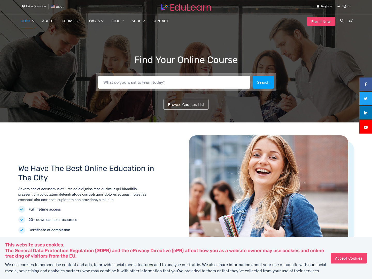
MORE INFO / BUY NOW DEMO
EduLearn – Home Page – RTL
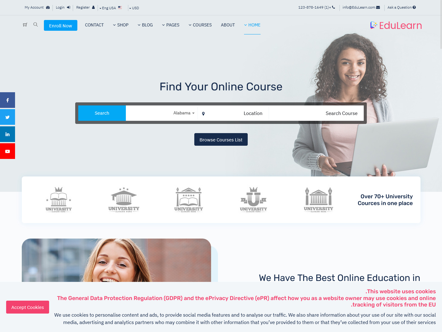
MORE INFO / BUY NOW DEMO
To find out what your audience wants, poll them.
What interests your users? Application developers typically err when deciding how their Bootstrap Templates will be utilized, which causes them to place too much emphasis on metrics that aren’t as crucial as they should be.
Instead of making educated guesses about what your consumers would find significant, ask them directly. Facebook used this tactic to comprehend the requirements of its advertisers and as a consequence, updated its user interface (UI), replacing measures like impressions with reach.
Fewer choices are nearly always preferable.
Remember this simple principle when creating user interfaces: the less alternatives there are, the fewer issues consumers will run through. You’ll deal with fewer emails and support requests when your user interface is clear and basic.
Consider adding an advanced features option to your Bootstrap Admin Dashboard if you need to achieve a balance between usability and power. You may create a straightforward interface for other users while enabling complex functionality for power users.
Final words
By following these tips, you may create an Online Education Courses Dashboard. It will provide outstanding results to you in the long run.
 skip to Main Content



This Education Admin Dashboard Template helped me a lot, I appreciate this admin template from the bottom of my heart
Thank you sir, we are glad to know that you liked our admin template dashboard. , You can find many more such admin templates on our website https://multipurposethemes.com/. There is a better admin template than one, must check once sir
I have to learn till late night and all thanks to Multipurpose Themes website to provide me best Online Education Courses Dashboard with Many new learning features
Thank you sir, we understand our customer’s requirement and create our own Bootstrap Admin Template, which makes it easy for our customer to work with that admin template… That’s why all Bootstrap Admin Templates of our Multipurpose Themes Better than all. ,
There are so many pages and options in this Education Bootstrap Admin Dashboard and LMS dashboard! Very good design with excellent usability for the admin template, good work
Thank you sir, It has always been our endeavor to make our admin template dashboard different from all because we are happy that our customers get new and better experience with our admin template.
This is the perfect Education Responsive Web Application Kit. This is what I was looking for. I can’t find any better website for Admin Templates than this.
Thank you sir, we are very happy to tell you that you will not find our education bootstrap 5 admin template on any other website because our admin template is different from all. to give our customers a great experience
Very workable Education Admin Template with many useful features. Good Work Multipurpose Themes..
Thank you sir, we want to tell you that our second admin template UI Framework has been launched a few days ago, in which you will get all the new options, please visit our website https://multipurposethemes.com/
My client was looking for a similar Education Admin Dashboard UI Kit, I gave your reference, he is very impressed with your admin template today. , good work guys
Thank you sir for suggesting our Education Bootstrap Admin Template and we also thank your clients for putting their trust in us, and we assure your clients through this comment that our Education Admin Template They will be able to do all the work related to education very easily and we hope that they will have a good experience using our home template.
This admin bootstrap admin template is so good and so much fun to lean into that it’s too much fun to study
Thank you sir, we have created our education admin template with the aim that anyone can use our education admin template, but they should never get bored and from our admin template, they will get to learn new things and get a good experience.
In fact, this admin dashboard template has a lot of new functions that many of my work is done so quickly and so well and can keep a lot of student data.
Yes sir, thank you, we assure you that you will never have a bad experience with our admin template, because we make our admin template so good that our customers will not face any problem once they buy from our admin template.
I got so much love from this Dashboard Admin Template that I think I am very grateful to this admin template and this admin template is so good that I got to see a lot of new functions by adding a template. , Good Job Multipurpose Themes
Thank you sir, in each of our bootstrap admin template, you will get new functions only, because our customer’s satisfaction is our first priority.
If I describe this education admin template in one word, “one man army”, all the work related to education is done very easily with this bootstrap admin template.
Thank you very much sir, we have given all those features and functions in this admin template so that our customers can do all the work from our admin template.