Today, almost every business runs on WebApps. From customer management systems to eCommerce platforms, from…
Designing an Intuitive Admin Template Interface for Improved Usability
Reading Time: 5 minutes
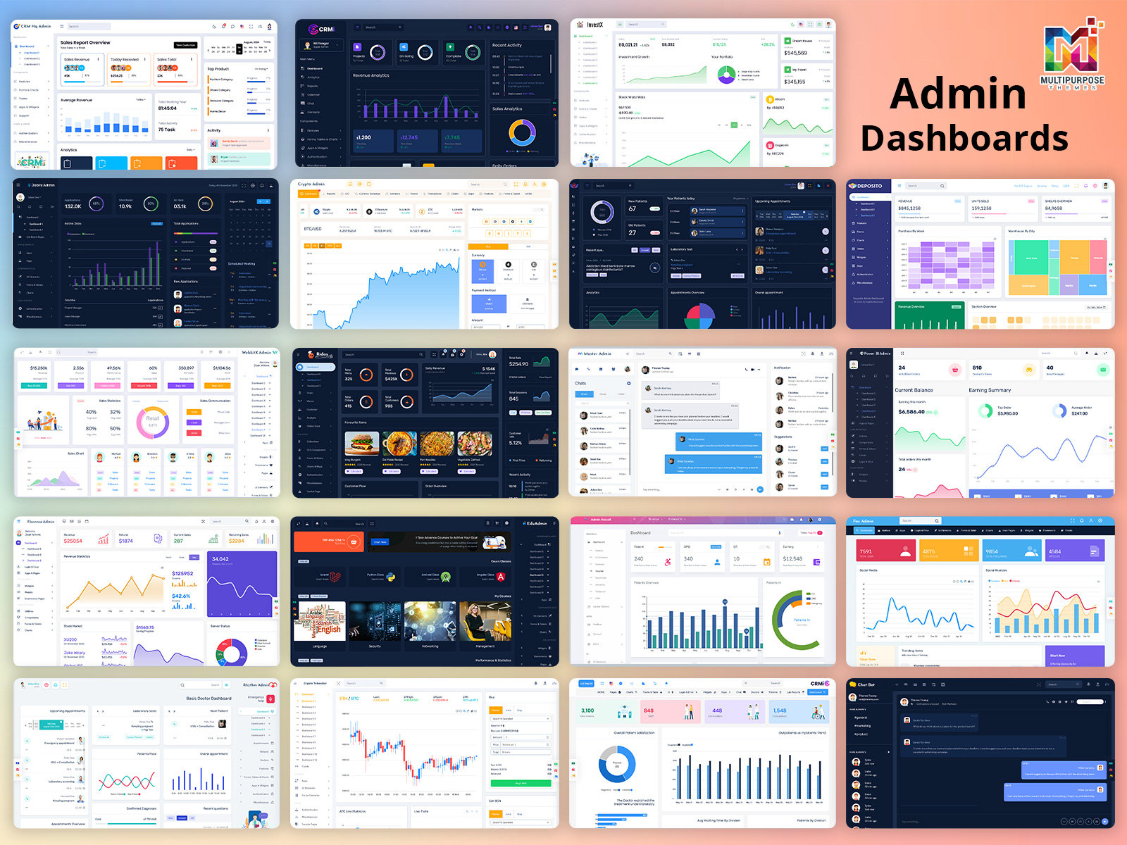
An Admin Template is one of the most important parts of any web application or software. It allows admins and other privileged users to monitor and control various aspects of the system. A well-designed admin dashboard interface can greatly improve usability and productivity. Here are some key principles for designing an intuitive admin dashboard using a dashboard template.
BUY NOW
Simplicity is Key
The admin template should only display the most essential information and controls needed by admins. Extraneous data or rarely used functions should be removed or tucked away under sub-menus. The key metrics and controls should be prominently visible when the admin first opens the dashboard. The interface should be free from visual clutter. Use plenty of white space and align page elements cleanly. Group related data and functions into neat sections. Simplicity enhances scanability and comprehension.
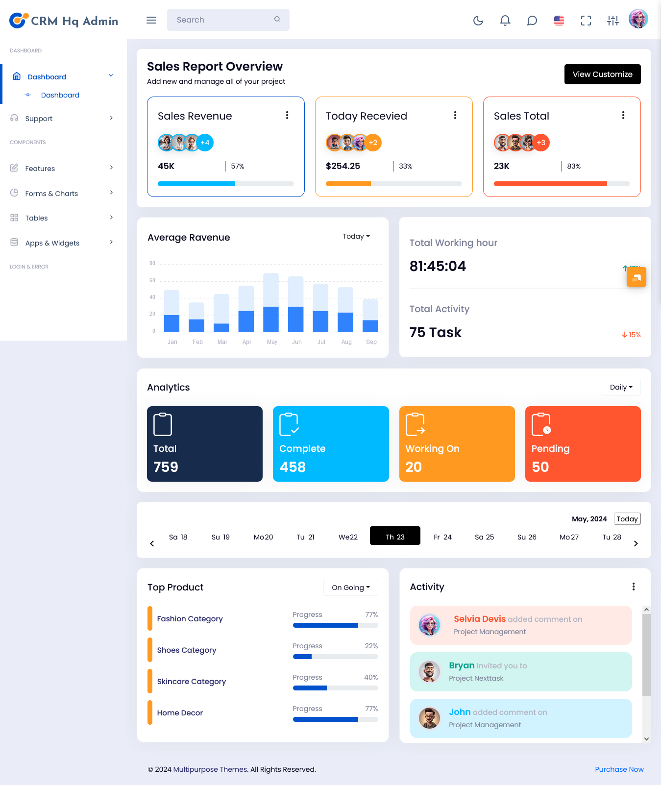
1: CRMHq Admin
MORE INFO / BUY NOW DEMO
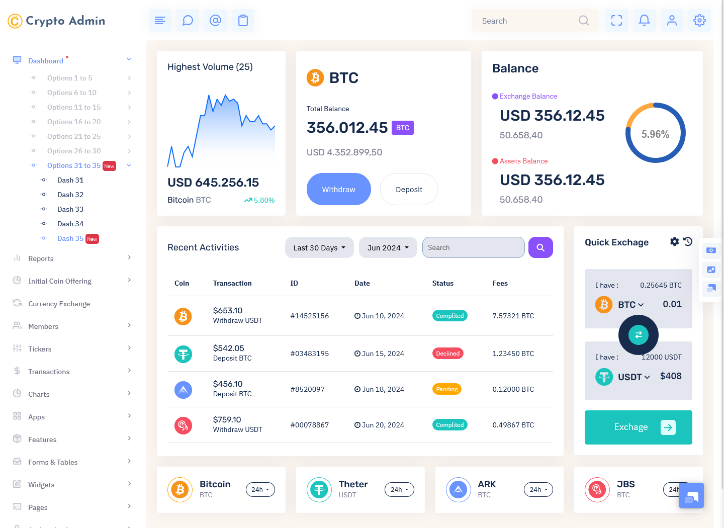
2: Crypto Admin
MORE INFO / BUY NOW DEMO
3: CRMi Admin
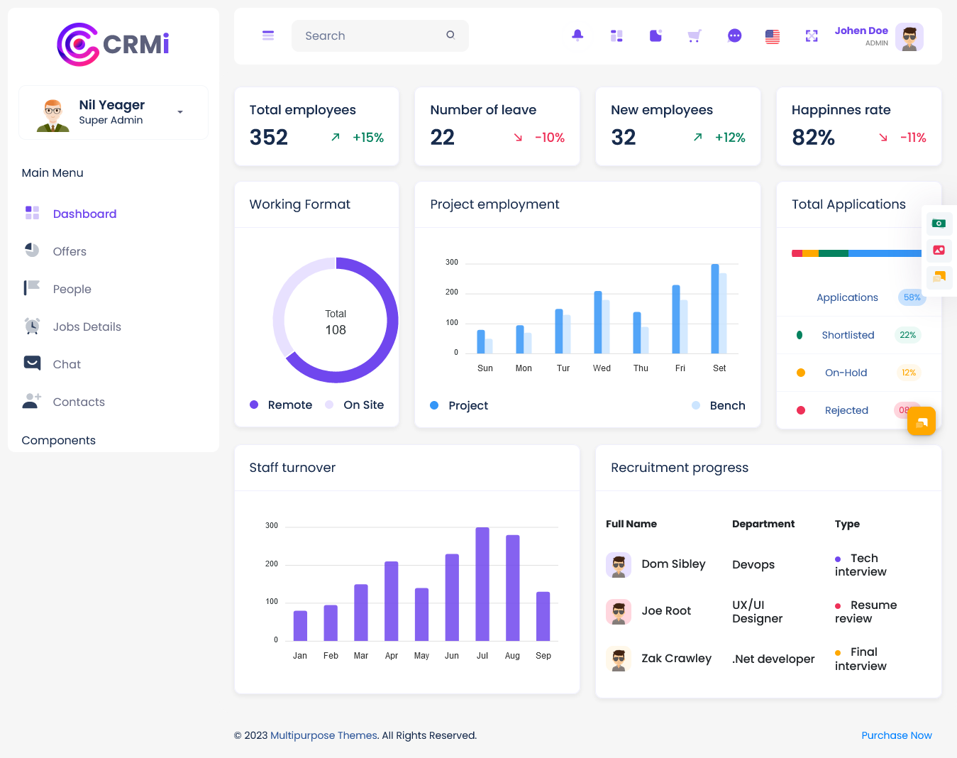
MORE INFO / BUY NOW DEMO
4: Power Bi Admin
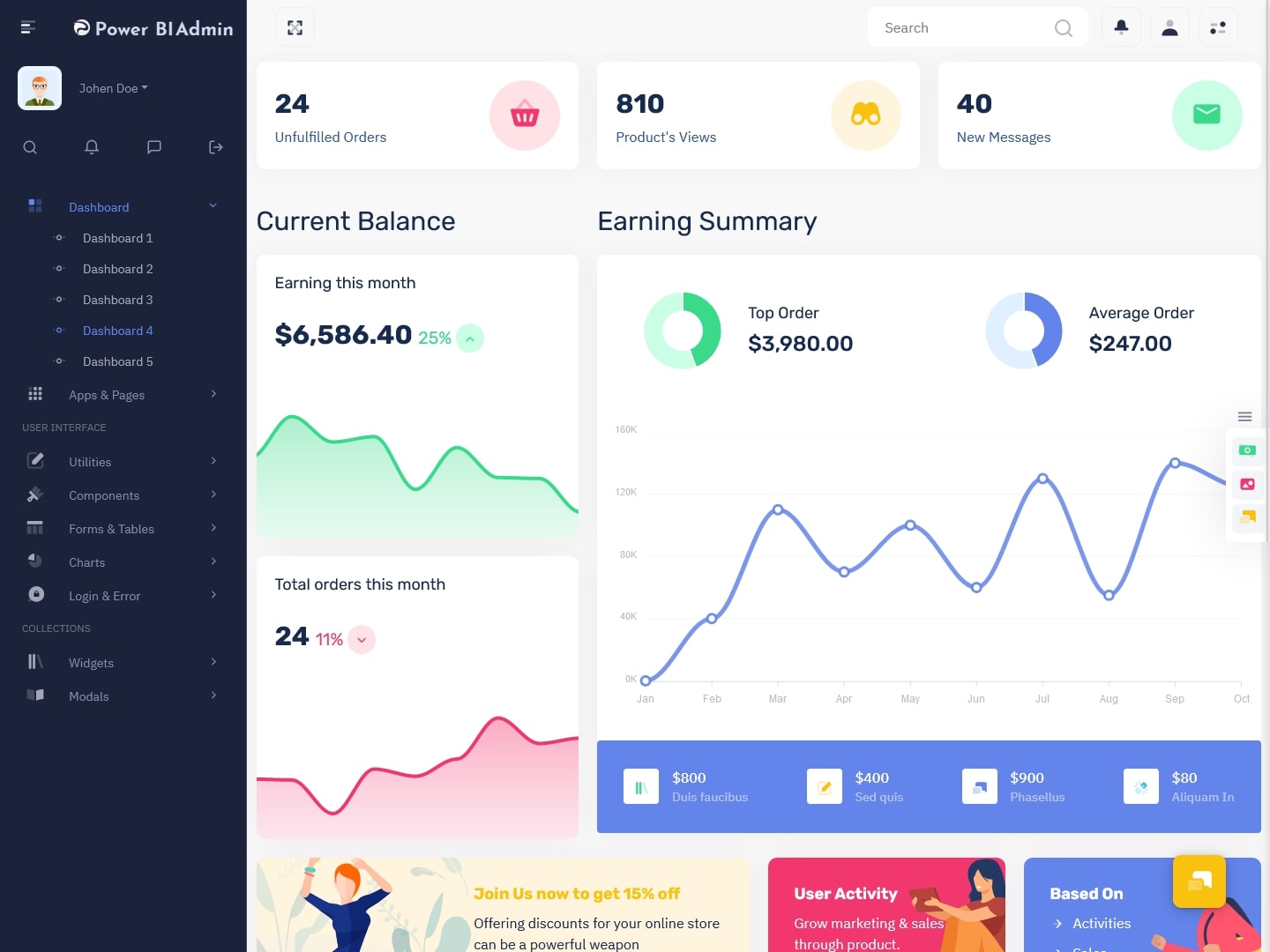
MORE INFO / BUY NOW DEMO
5: Doclinic Admin
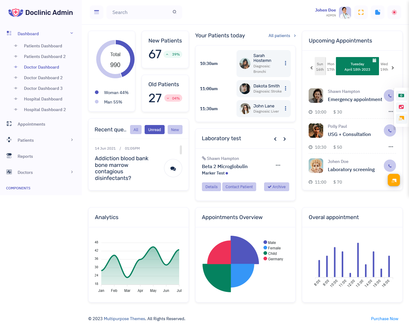
MORE INFO / BUY NOW DEMO
6: WebkitX Admin
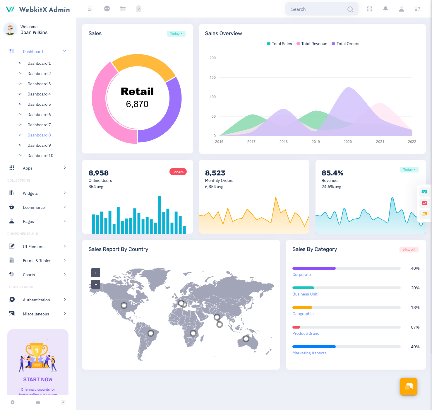
MORE INFO / BUY NOW DEMO
7: Warehouse Admin
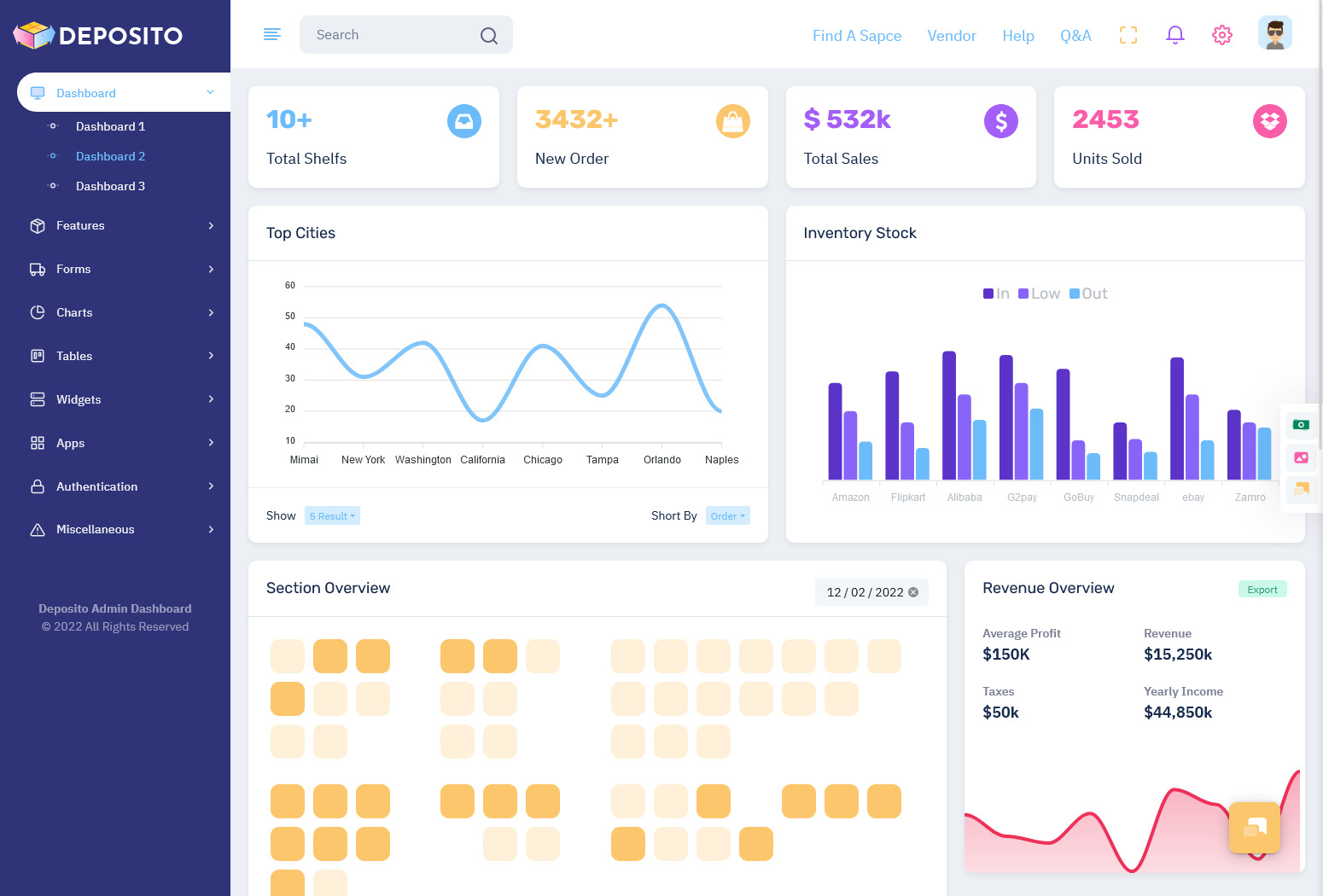
MORE INFO / BUY NOW DEMO
8: Crypto Tokenizer Admin
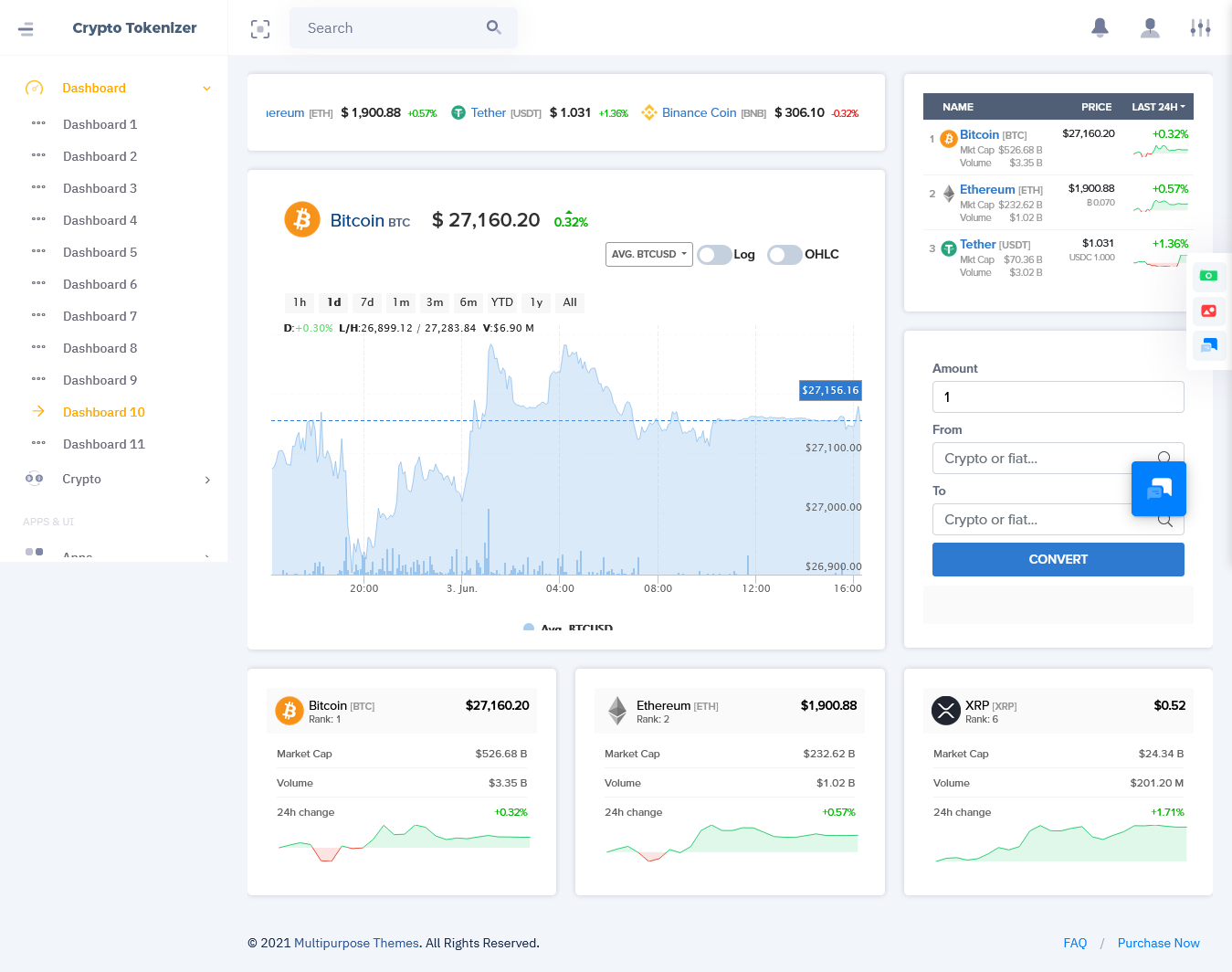
MORE INFO / BUY NOW DEMO
9: Rhythm Admin
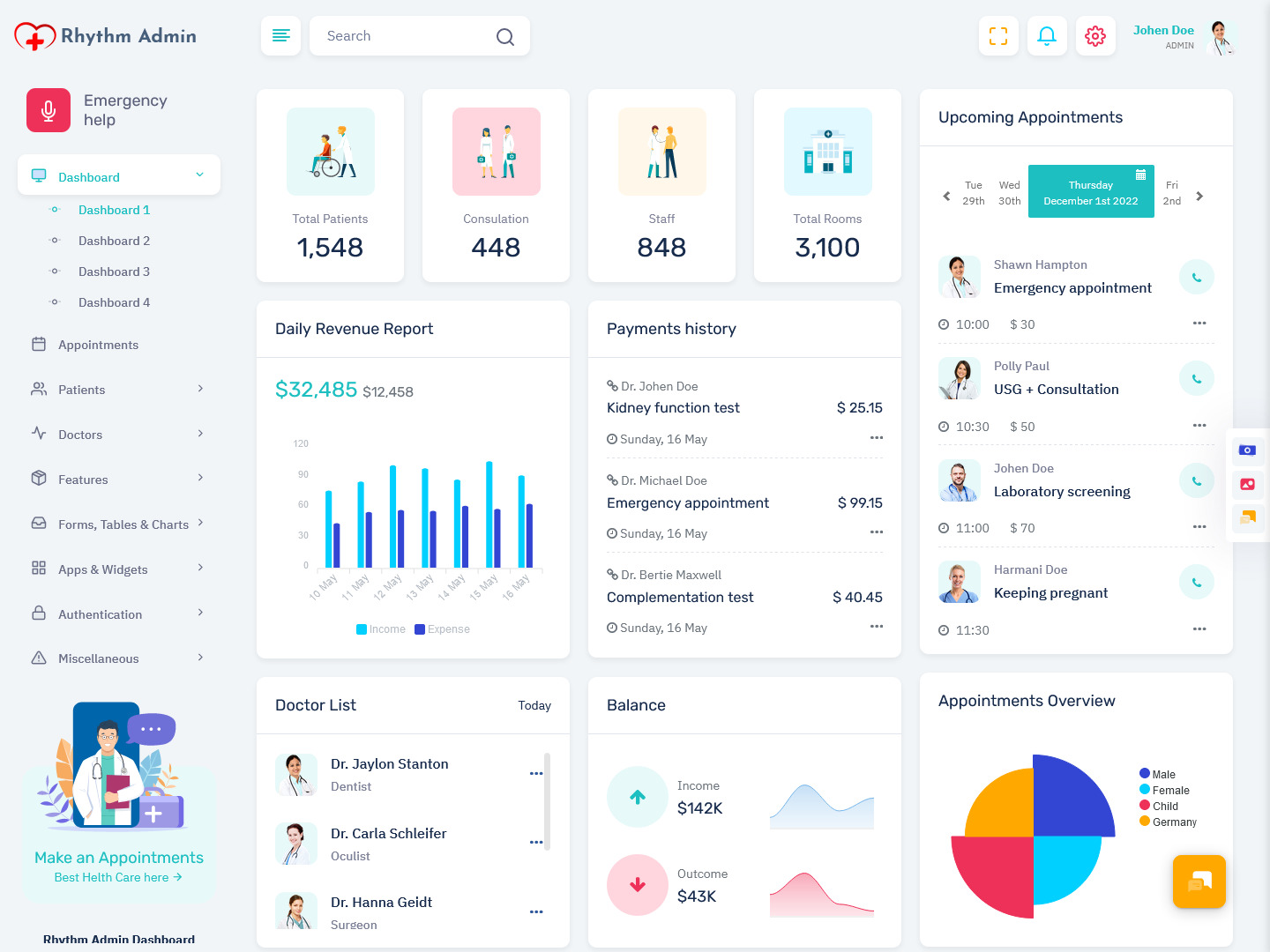
MORE INFO / BUY NOW DEMO
10: ChatX Bot Admin
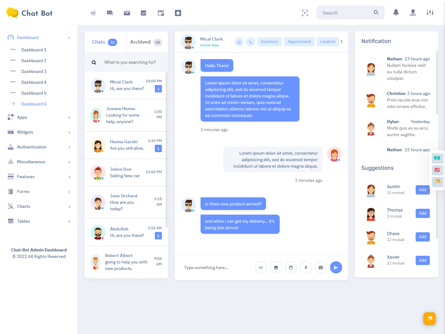
MORE INFO / BUY NOW DEMO
11: CrmX Bot Admin
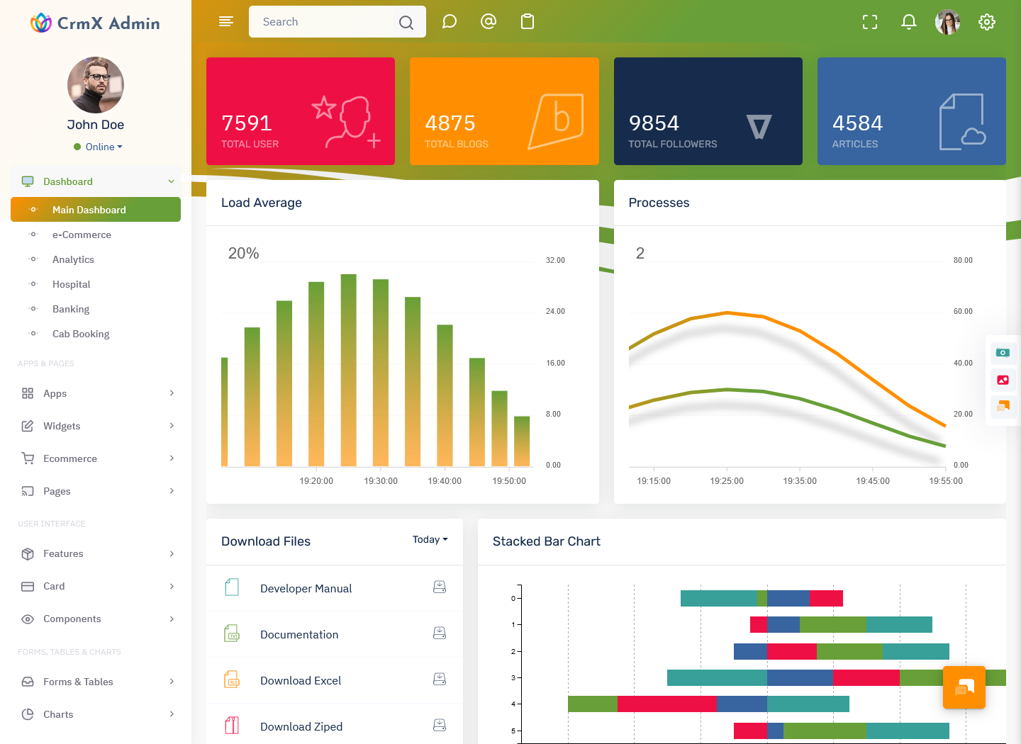
MORE INFO / BUY NOW DEMO
12: Florence Admin
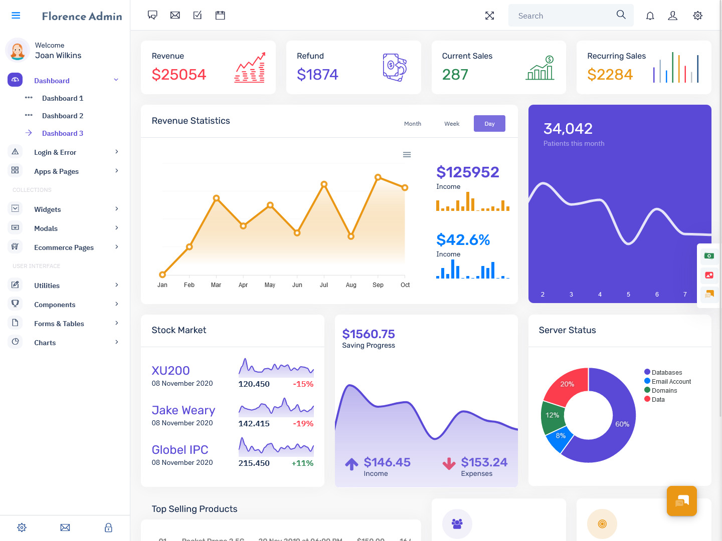
MORE INFO / BUY NOW DEMO
13: VoiceX Admin
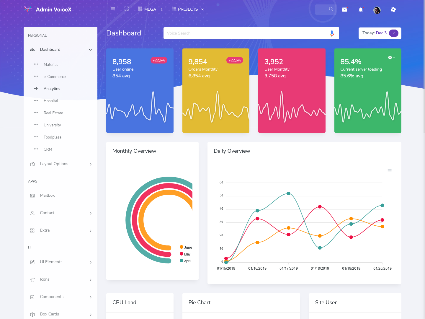
MORE INFO / BUY NOW DEMO
14: Riday Admin
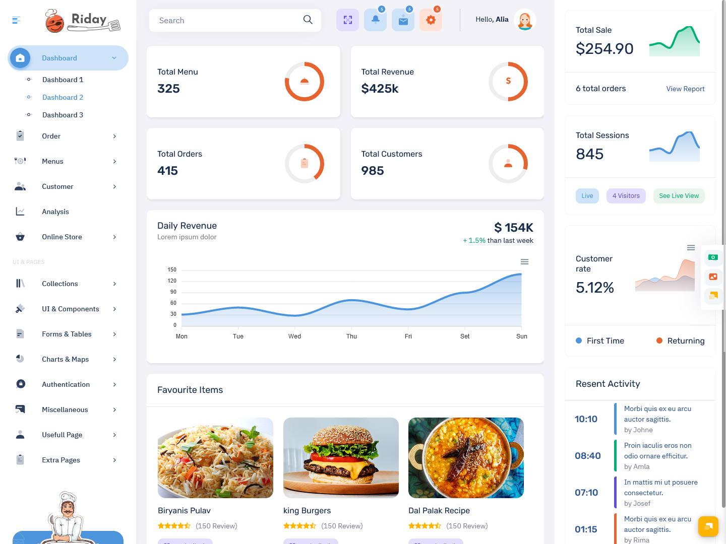
MORE INFO / BUY NOW DEMO
15: Fox Admin
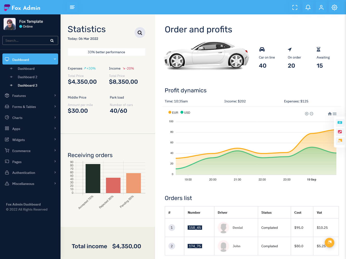
MORE INFO / BUY NOW DEMO
16: InvestX Admin
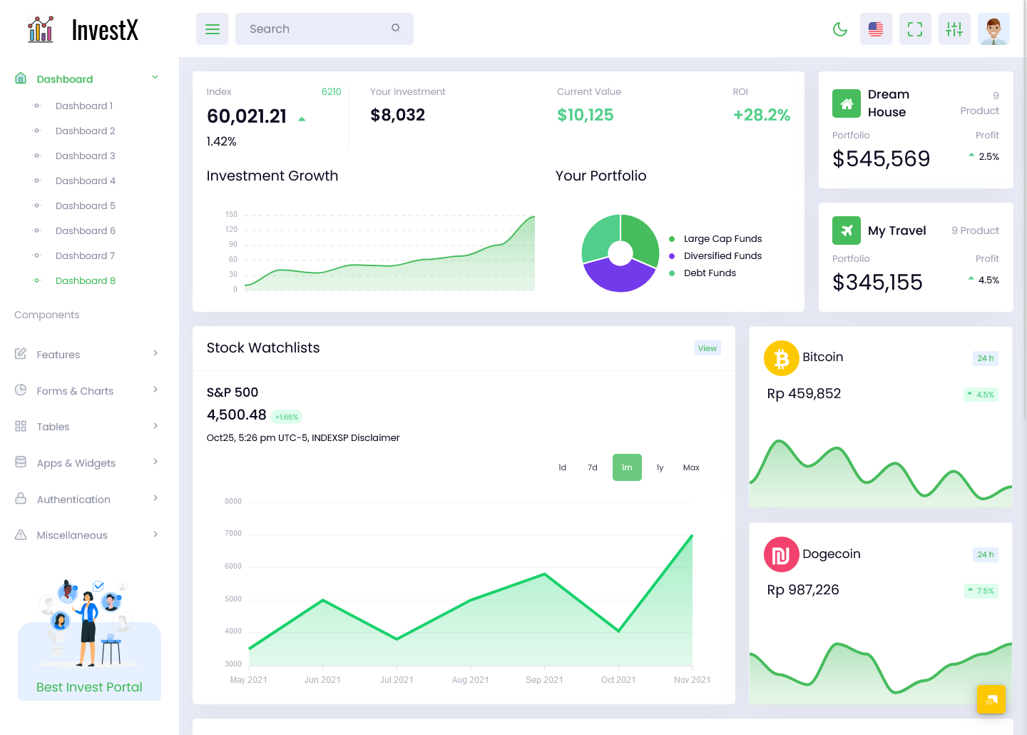
MORE INFO / BUY NOW DEMO
17: EduAdmin
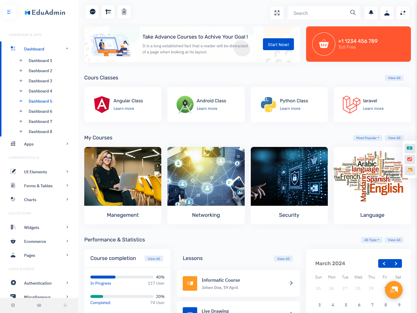
MORE INFO / BUY NOW DEMO
18: Joblly Admin
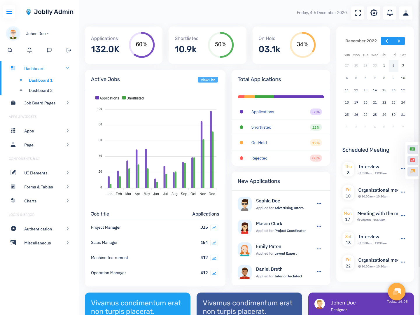
MORE INFO / BUY NOW DEMO
19: Master Admin
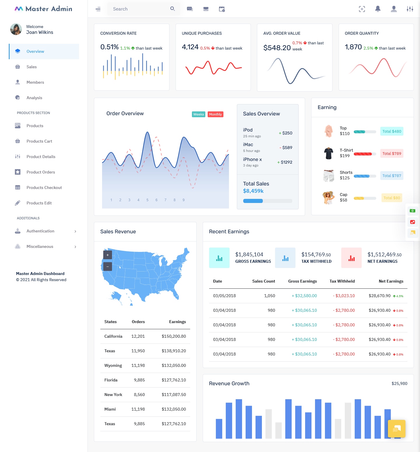
MORE INFO / BUY NOW DEMO
Provide Overviews as well as Details
Display summary overview cards or widgets showing key metrics like number of users, revenue totals, uptime percentage, etc. This gives admins an at-a-glance view of system health and status. Additionally, provide drilldown capability to view more granular details as needed. For instance, if total revenue from the overview dashboard is low, admins should be able to click and view revenues broken down by product, region, user demographics etc.
Intuitive Navigation and Hierarchy
Organize information and functions into intuitive main menus and submenus. Group related items together for easy scanability. More frequently used functions should be top-level menu items, while rarely needed admin-only functions can go under submenus. Using standard conventions that admins are familiar with from other dashboards is advisable, so they feel instantly comfortable navigating your custom interface.
Responsive Information Design
The key metrics and charts should auto-refresh at sensible intervals to provide up-to-date information. Real-time data is great but avoid superfast refreshing that is disorienting. For less frequently changing statistics, provide one-click refresh buttons to fetch the latest data. The information architecture should be responsive and performant even when large datasets are involved on the back end.
Smart Data Visualizations
Display dashboard template data via intuitive visualizations like bar graphs, pie charts, line graphs etc. This allows pattern recognition at a glance. Enable drilldown from the visualizations to view the underlying raw data. Especially avoid dense tables full of figures which are boring to parse mentally. Creative visualization can make even dull statistics more engaging. Use colors, size, placement and contrast effectively in the visual design.
Actionable Insights
Simply showing loads of data on the dashboard template is useless unless it empowers smarter decision-making. Hence the displayed metrics should aim to provide actionable insights instead of just raw data. For instance, if multiple server uptime metrics are green, consolidation opportunities can be indicated to save cloud infrastructure costs. If website traffic from mobile devices exceeds 70%, it could trigger advice to test a responsive mobile UI design.
User-Friendly Option Controls
Instead of confronting admins with complex configuration options right away, provide user-friendly controls to modify settings which enhance usability. Use descriptive toggles, sliders, knobs, switches etc. Progressive disclosure where advanced settings are tucked away in ‘advanced’ sections also prevents feature overload for novice users while allowing customization.
Smart Widgets
The Admin template doesn’t have to be one dense page overflowing with data. Break it up into modular, independent widgets showing performance metrics, alerts, search bars etc. Consistent widget design and behavior reduces the learning curve across various admin dashboards. Widgets enable admins to rearrange elements on their dashboard template via drag-and-drop. Better yet, enable admins to customize their dashboard template by adding or removing widgets as per individual preference.
Keyboard Shortcuts
Since admins may use the Admin template constantly, keyboard shortcuts for frequent actions aid usability and speed. For instance, provide shortcut keys to toggle settings on/off, approve/deny items in a moderation queue, bookmark reports etc. But do not overdo shortcuts, as that becomes difficult to memorize. Display visible hints about available shortcuts on the dashboard UI.
By keeping complexity at bay and focusing on an intuitive, user-friendly interface, you can build dashboard template that delight. Careful planning of information architecture combined with smart visual design enhances scanability, recall and interactions. That in turn empowers admins to monitor and manage systems more efficiently. Great admin UX delivers tangible productivity payoffs over the long term.
Explore our extensive collection of admin templates and themes tailored for your website. Elevate your design and user experience by visiting us now.
 skip to Main Content


The Best CRM Admin Dashboard Template – CRM Hq Admin has a really well-structured design template!! I am really impressed by this one.
Everything is good in Cryptocurrency Admin Dashboard. Design, source codes and variety of choices. Word “Perfect” suits the most for this Crypto Dashboard Templates.
I’ve been using the Doclinic Hospital Dashboard Template, and it’s consistently been reliable and user-friendly. A real game-changer for managing my hospital data!
I am very happy to say that I have done a lot of work by purchasing this Power BI Dashboard Template, because I really find this admin template very useful to me.
I’m really enjoying the Restaurant food Dashboard. You guys are doing amazing work on the Riday Bootstrap 5 Admin Dashboard Template.
You are a Excellent. I really enjoy the lesson and actually I learned a lot. Keep it up the good work in Education Bootstrap 5 Dashboard Template. Best Education Software Dashboard ever.
Great Job Employment Dashboard! Very resilient and upstanding code quality. Amazing and good Admin Dashboard Templates for beginners.
Never thought that this Admin Templates from this website is going to be such great. The CrmX Bootstrap Dashboard template is very helpful. I’m happy with the CRM Admin Panel Dashboard! Thanks.
The Logistics Warehouse Software Template are beautifully designed, which will make my site stand apart. Customer service is very friendly and flexible as well. great job!
I was shocked to see your Chat Application Dashboard with New And such fantastic features. Really Amazing Bootstrap Admin Template.