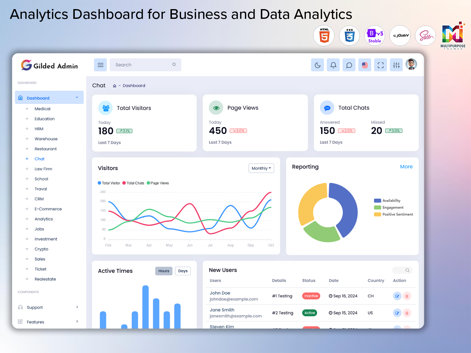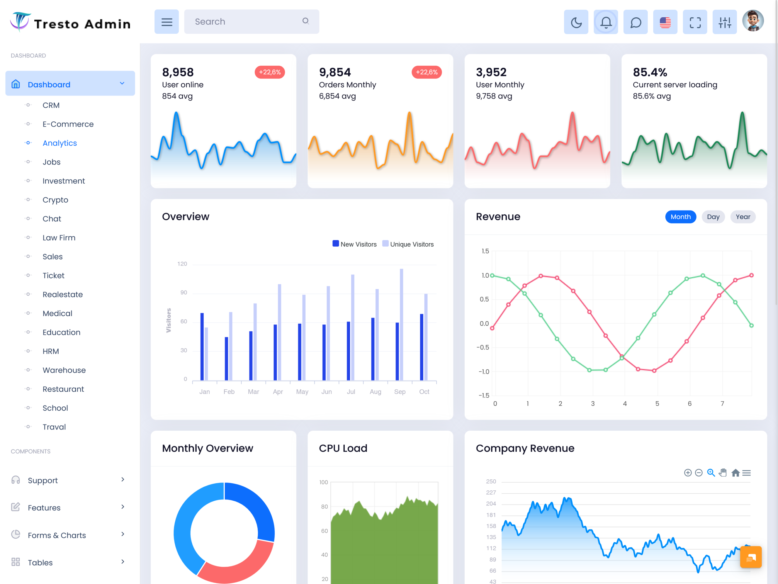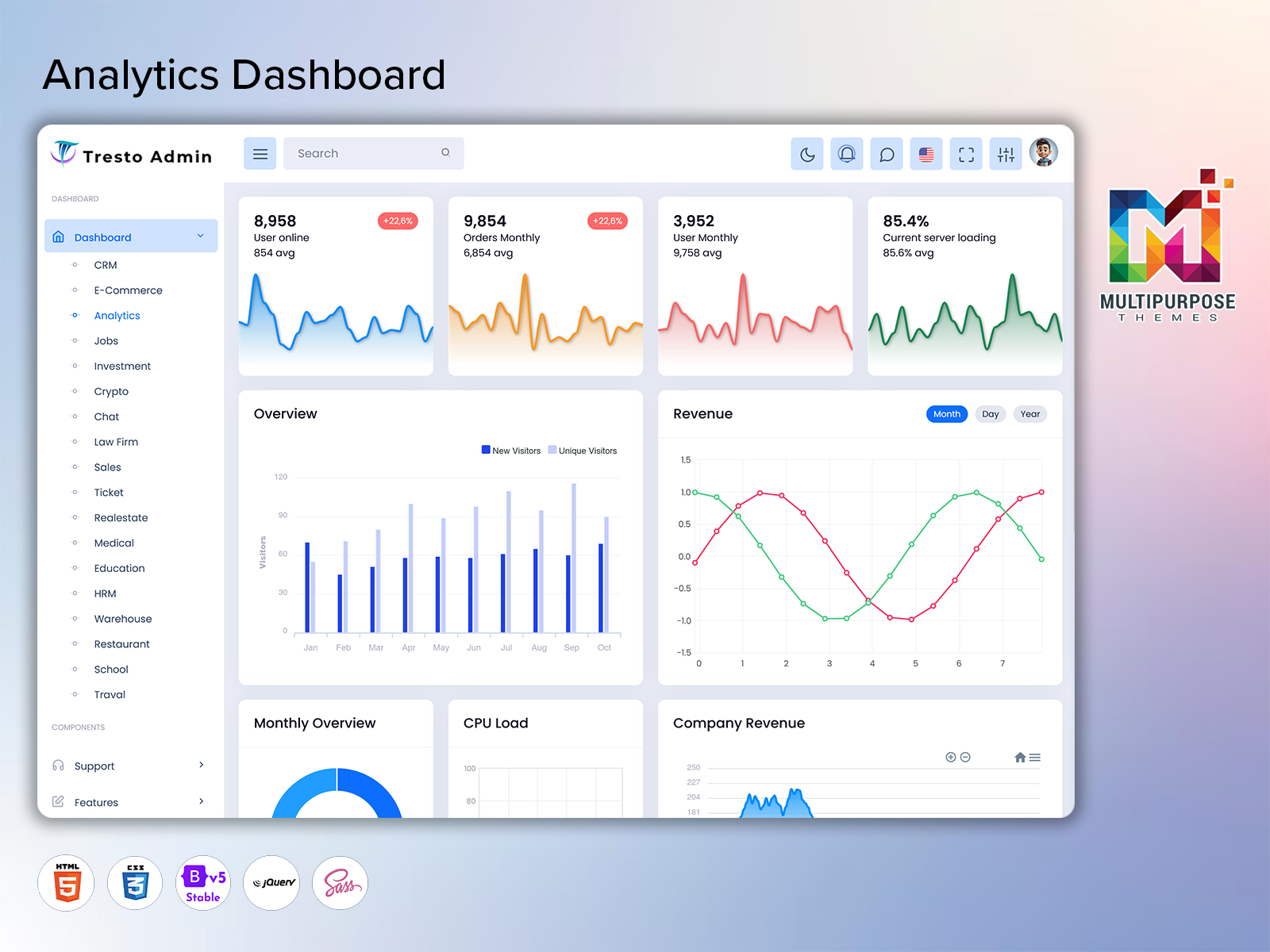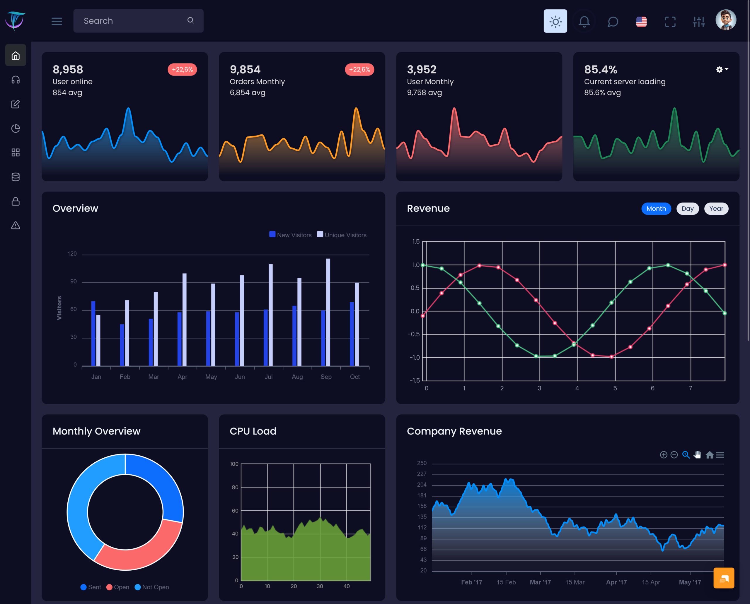
Businesses create information throughout their activities. Customer interactions orders, website visits, marketing campaigns, financial transactions,…
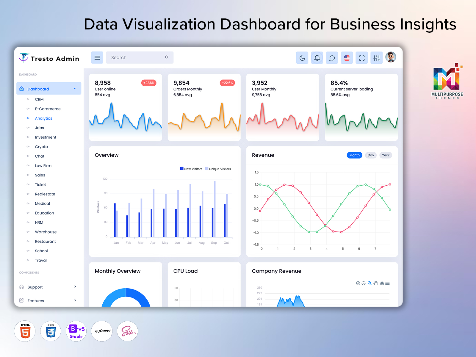
Data Visualization Dashboard: A Smarter Way to Understand Business Data
Reading Time: 7 minutesFeatures :
Businesses make a bulk amount of information every day.sales transactions, customer activity, website visits, payments, registrations and other records can quickly become difficult to understand when they are stored across various systems. An analytic dashboard brings important information into one organized view so users can understand what is happening without spending hours checking separate reports.
A well-planned dashboard is not simply a screen filled with numbers. It should help users recognize changes, compare performance, understand business movement, and decide what needs attention. For this reason, an Admin Analytics Dashboard can become a useful working space for managers, business owners, marketing teams, sales professionals, and administrators who regularly depend on data.
Watch Full Video
What is an Analytic Dashboard?
An Analytic Dashboard is a visual interface that organizes business information in a simple and understandable format. Instead of reading long spreadsheets or checking multiple reports, users can review important information from one central screen. It makes data easier to read by presenting meaningful numbers, comparisons, progress indicators, and visual information in a logical arrangement.
For example, a company may want to understand whether its sales are improving, how customers are interacting with its platform, or whether revenue is moving in the expected direction. A Revenue Tracking Dashboard can help users follow financial movement, while a Sales Overview Dashboard can provide a broader picture of sales activity. Similarly, a User Statistics Dashboard can help administrators understand changes in their user base.
The real purpose of an Analytic Dashboard is to reduce the distance between information and action. When useful data is available in a clear format, teams can identify important changes earlier and spend more time deciding what to do next instead of manually organizing information.
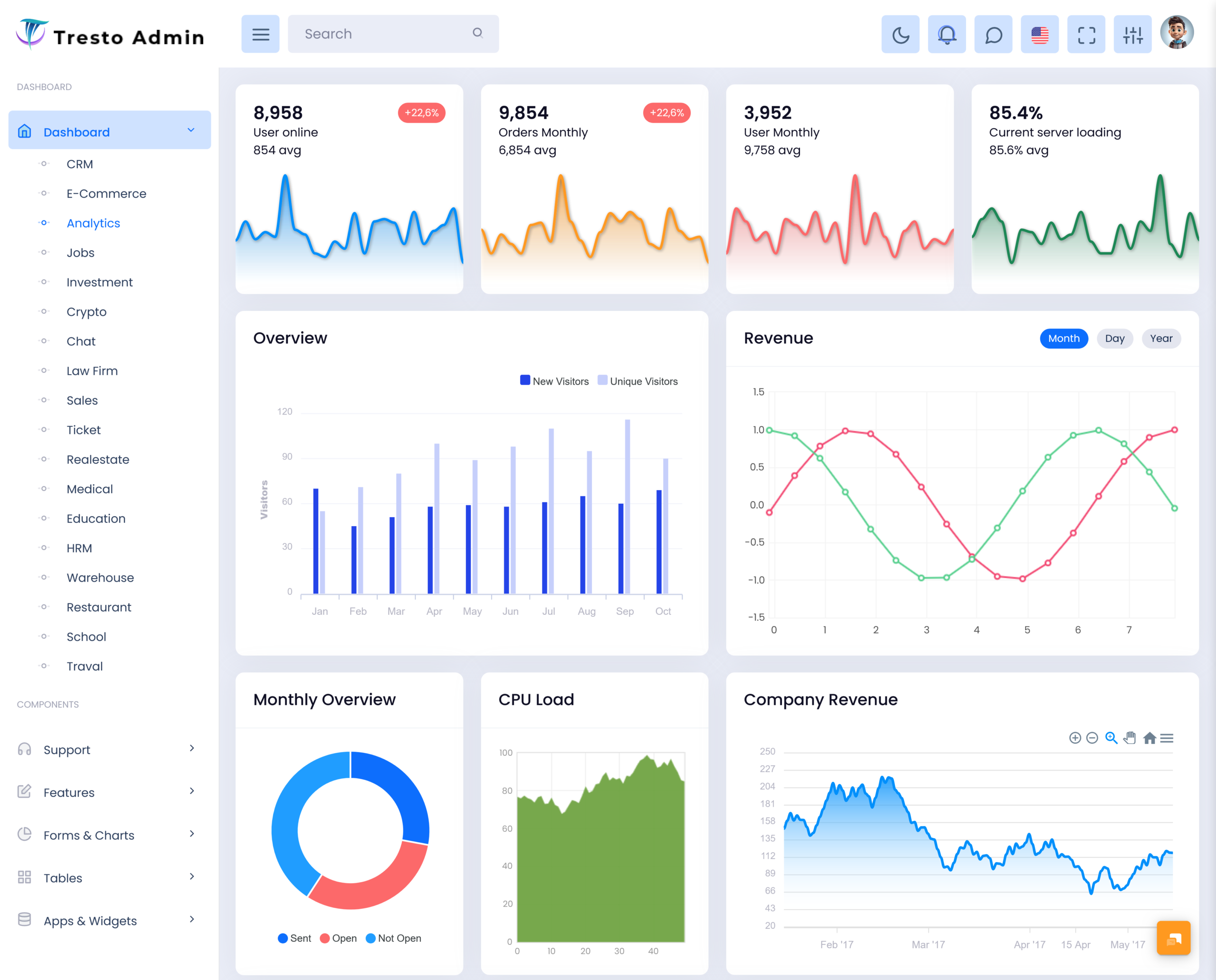
VIEW DEMO BUY NOW
Features :
1. Clear Data Presentation
An Analytic Dashboard presents important business information in a structured visual layout. Users can understand key numbers without moving through several pages. Clear spacing, readable labels, balanced sections, and meaningful visual indicators make the information easier to scan during everyday work.
2. Performance Comparison
A useful dashboard allows users to compare current results with earlier records or selected targets. This makes it easier to understand whether performance is improving, remaining steady, or moving in an unexpected direction. Comparisons can support better planning and help teams notice meaningful changes.
3. Revenue Visibility
Financial information becomes easier to follow when revenue-related figures are arranged in one dedicated view. A Revenue Tracking Dashboard can help businesses review income movement and understand financial performance over selected periods, giving decision-makers a clearer foundation for reviewing commercial results.
4. Sales Monitoring
A Sales Overview Dashboard gives sales teams a practical way to understand their overall selling performance. It can bring important sales information into a single workspace, helping managers review progress, recognize changes in sales activity, and make more informed decisions about future sales planning.
5. User Data Understanding
Understanding users is important for digital businesses, applications, and online services. A User Statistics Dashboard can organize information about the user base so administrators can observe changes over time. This makes it easier to understand audience growth and identify unusual movements in user activity.
6. Flexible Information Management
Different businesses have different reporting needs, so an analytic interface should be adaptable. Teams may need to focus on financial information, customer activity, sales performance, or operational results. A flexible dashboard structure allows the displayed information to support the specific priorities of each organization.
7. Quick Access to Important Information
An effective dashboard saves users from repeatedly searching through different sections for commonly needed information. By placing relevant business data within easy reach, it creates a smoother daily workflow. Users can review the current situation quickly and then move directly toward the next task.
Improving Team Collaboration with Analytics
One of the most valuable qualities of an Analytic Dashboard is its ability to create a common understanding among different teams. Sales employees, managers, administrators, and business owners may look at the same business from different perspectives. When they work from a shared information source, discussions can become more focused and practical.
For example, a sales manager may notice a change in sales performance while an administrator notices a change in user activity. Looking at these areas together can encourage the team to investigate whether the two movements are connected. This creates a more complete view of business performance.
The dashboard also becomes more useful when its design matches the way people actually work. Important information should be easy to recognize, while less important details should not distract from the main purpose of the screen. A thoughtful layout can make even complex business information feel manageable.
VIEW DEMO BUY NOW
Benefits of Analytic Dashboard
1. Saves Time
An Analytic Dashboard reduces the need to collect information manually from different reports. Users can review important business data from one organized location, allowing them to spend less time preparing basic summaries and more time working on decisions, planning, and business activities.
2. Supports Better Decisions
When business information is presented clearly, managers can understand current conditions more easily. An analytic dashboard gives decision-makers useful evidence before they choose a direction. This can reduce guesswork and encourage decisions based on actual business performance rather than assumptions or incomplete information.
3. Improves Business Visibility
A dashboard gives teams a wider view of what is happening across important areas. Whether the focus is revenue, sales, users, or another business measure, having information together makes changes easier to notice and gives management a clearer understanding of overall performance.
4. Helps Identify Changes Early
Small changes can become important when they continue over time. Regular dashboard monitoring helps users notice unusual increases, decreases, or shifts sooner. Early awareness gives teams more opportunity to investigate the reason behind a change and respond before it becomes a larger problem.
5. Encourages Team Alignment
When departments work with different reports, their understanding of performance can sometimes differ. A shared dashboard provides a common reference point for discussions. Teams can review the same information, communicate more clearly, and focus their efforts on the areas that require attention.
6. Makes Reporting Easier
Preparing regular reports can take considerable effort when information needs to be collected manually. An analytic dashboard creates a ready environment for reviewing important figures. This makes routine reporting more convenient and gives users a consistent way to follow business progress.
7. Supports Future Planning
Historical and current information can help businesses understand how performance is changing. By reviewing patterns and comparing results, managers can develop more realistic plans for upcoming activities. A dashboard therefore supports not only daily monitoring but also longer-term business thinking and preparation.
Who Can Use an Analytic Dashboard?
An Analytic Dashboard can be useful for almost any organization that works with measurable information. E-commerce businesses can use it to review sales and revenue movement. SaaS companies can study user activity and customer trends. Marketing teams can examine campaign-related performance, while service companies can monitor operational results.
Managers can use an Admin Analytics Dashboard for regular business reviews, while sales departments may prefer a Sales Overview Dashboard for their day-to-day monitoring. Financial teams can benefit from a Revenue Tracking Dashboard, and product or platform administrators can use a User Statistics Dashboard to understand changes within their user base.
The main advantage is flexibility. The dashboard does not need to serve only one department. With the right information and layout, it can become a shared business tool that supports different roles without making the interface unnecessarily complicated.
Conclusion
An Analytic Dashboard can turn scattered business information into a practical and understandable workspace. It helps users review performance, recognize changes, understand important figures, and make decisions with greater confidence. Instead of treating data as something that only belongs in reports, businesses can use it as part of their everyday workflow.
From an Admin Analytics Dashboard to a Revenue Tracking Dashboard, Sales Overview Dashboard, or User Statistics Dashboard, each approach can serve a different business purpose. The most effective solution is one that focuses on useful information, simple presentation, and the actual decisions users need to make.
As businesses continue to depend on data, having a clear and well-organized dashboard can make everyday monitoring easier and help teams stay focused on meaningful business outcomes.
VIEW DEMO BUY NOW
Frequently Asked Questions
1. What is the main purpose of an Analytic Dashboard?
The main purpose of a Multi Purpose Themes Analytic Dashboard is to organize important business information into an easy-to-understand interface. It helps users review performance, compare information, recognize changes, and make decisions without depending entirely on manually prepared reports. Businesses can adapt the dashboard according to their industry, team structure, reporting needs, and the type of information they want to monitor regularly.
2. What is the difference between an Analytic Dashboard and a normal report?
A normal report generally presents information for review, while an Analytic Dashboard is designed for ongoing monitoring and interaction with business information. A dashboard gives users a quicker way to understand current conditions and compare important figures. It is especially useful when managers need to check business performance regularly rather than reviewing information only after a report has been prepared.
3. Can an Analytic Dashboard be used for sales management?
Yes, an Analytic Dashboard can be useful for sales management because it can organize relevant sales information into one working area. A Sales Overview Dashboard can help managers understand sales movement and review performance over time. It can also support discussions between sales teams and management by providing a shared view of important sales-related information.
4. Why is a Revenue Tracking Dashboard useful for businesses?
A Multi Purpose Themes Revenue Tracking Dashboard provides a dedicated way to understand financial movement. Instead of checking different records separately, users can review relevant revenue information from a central interface. This can make financial monitoring more convenient and help managers recognize changes that may require further investigation, planning, or discussion with the finance and business teams.
5. Is an Analytic Dashboard useful for monitoring users?
Yes, especially for websites, applications, SaaS products, membership platforms, and other digital services. A Multi Purpose Themes User Statistics Dashboard can help administrators understand how their user base changes over time. It provides a practical way to organize user-related information and can help teams identify patterns that may influence product improvements, customer engagement, or future business planning.
6. Can businesses customize an Admin Analytics Dashboard?
Yes, customization is often important because every business measures success differently. An Admin Analytics Dashboard can be planned around the information a specific organization needs most. Businesses can decide which areas deserve greater attention, how information should be arranged, and which measurements are most useful for their managers and administrators.
7. Why should I consider Multi Purpose Themes for an Analytic Dashboard?
Multi Purpose Themes can be considered when you need a ready dashboard foundation for an analytics-focused web project. It can help developers start with an established interface instead of creating every dashboard element from the beginning. Before selecting a template, businesses should review its design, structure, customization options, and compatibility with their specific application requirements.

Related Posts