

An Analytical Dashboard provides firms with a means of analyzing crucial data without being drowned…
Analytics Dashboard: Structuring Business Data for Analysis
Reading Time: 11 minutes
Businesses create information throughout their activities. Customer interactions orders, website visits, marketing campaigns, financial transactions, employee activity and processes all add to this content. As these areas grow the value of collecting this data becomes more important.. There is also the challenge of organizing it and looking at it in meaningful ways.
Watch Full Video
An Analytics Dashboard can act as the place for this type of information arranging selected data into a space that lets users look into areas of activity without constantly switching between separate reports or spreadsheets.
The value of this kind of interface depends on the way it organizes the information. A sales manager may look at customer and revenue-related data while an operations manager may need reports about workflow or resources. Marketers may focus on campaign activity and website visits while needing to understand the environment in which they work. Each group has a point of view and the interface needs to handle this complexity. This is why an effective Analytics Dashboard should be built around the needs of users than offering a generic structure where everyone sees the same content.
What Is an Analytics Dashboard?
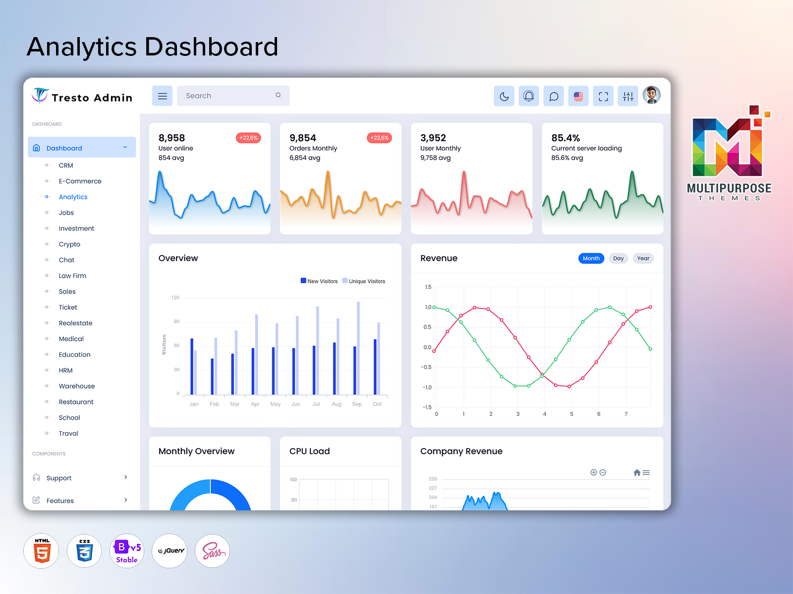
An Analytics Dashboard is an interface for organizing business data and showing selected reports in a way. It can bring together information from areas of operation. Provide reports, measurements, trends and other data points related to these activities.
The interface itself is a way to access this information than replacing the systems that create it. Users can look at details that’re important to their work comparing values analyzing trends and looking into reasons behind them. The data can come from software applications covering areas like sales, customers, finance, website activity, marketing campaigns, databases or business-specific applications. Business Analytics benefits from this setup because it lets users look at reports in the context of an activity investigating revenue figures in the context of sales records or customer information in the context of engagement notes. In a way Data Analytics within the dashboard can involve filtering and comparing with users picking a timeframe, department, location, product category or other measure to look at. Of just bringing together random data points the interface can offer controls to let users see the information they need in the way they expect.
Analytics Software can help with this process providing the tools users need for reporting and analysis. The specific features will vary based on the application and data connections. The main ideas stay the same: organizing information giving reports and supporting deep analysis. The interface can also separate aggregated data points from views offering an overview and allowing users to look deeper into specific sections to review underlying reports and tables.
In terms of an Analytics Dashboard creates a place for organizing business data according to the needs of users.
VIEW DEMO BUY NOW
From Raw Records to Usable Business Information
Data comes from sources and is created for specific reasons. A sales application will track transactions a website will record visits and an accounting system will store data. While this data is important for areas looking at it alone may not be enough to understand larger business trends. An Analytics Dashboard can offer a place for this information organizing it based on the needs of users. The goal is not to bring every metric but to let investigators look at relevant reports without switching between multiple programs.
For example a manager looking at product sales may need to see metrics like sales volume order values, customer demands and product-specific details. A marketing professional may care more about tracking website traffic sources, campaign activity and customer engagement. In either case a dashboard can provide a place to look at these details going from an overview to specific sets of information.
In this way Business Analytics becomes more efficient as users can look at the reports they need in one place. Another benefit is the ability to separate data like an average value from detailed records, where investigators can check the numbers that make up this metric. At the time Data Analytics can become more straightforward as users filter and compare values choosing the parameters they want to look at. It is also important to make sure that the information on the dashboard is accurate, relevant and up to date according to the database or software. As such the interface should be seen as part of information-processing practices, not a tool for making reports.
Another point to consider is consistency especially when different departments look at the information in different ways. A dashboard can create labels, categories, date ranges and report structures making it easier to compare and analyze. The value of an Analytics Dashboard is not in showing information but also in creating a common ground for understanding it.
Key Features of an Analytics Dashboard
1. Centralized Data View
An Analytics Dashboard can gather business data points from areas providing a place for report creation. This means users don’t have to move between applications long as these systems are connected to the dashboard.
2. Interactive Data Exploration
Users might want to look at data in ways exploring specific timeframes, departments, locations, product categories or other factors. An interface that helps with this kind of exploration can offer tools for filtering and sorting than just one fixed view.
3. Business Performance Reporting
The interface can organize data into reports with users looking at measurements, averages, totals and other indicators. The specific details will depend on the application with Business Analytics covering revenue, sales, customer details, operations, finance or other metrics.
4. Data Visualization
Analytics Dashboards can show a lot of information which can be hard to process in table form. Charts, tables, indicators and other tools make the data easier to understand with the type of visualization depending on the information that needs to be shown.
5. Custom Reporting Sections
Departments and users will have needs, which may require separate reports. A dashboard that has a layout can handle this offering sections for sales, marketing, finance, operations or other areas. If needed these sections can also be rearranged based on user permissions or investigative needs.
6. Detailed Data Views
An overview is helpful. Users might also want to look at the details. This can be done by providing a set of pages or panels for report investigation with the analytics interface helping users move between this data.
7. Flexible User Access
Not everyone needs the information with executives, managers, analysts, department leads and others having different responsibilities. An Analytics Dashboard can offer views or permissions for user groups making sure everyone sees the information they need in the right way.
Using Analytics Dashboards Across Different Business Functions
One of the benefits of an Analytics Dashboard is that it can fit functions without users having to switch between different programs. The data they look at may be similar. The way they use it will be different. This is shown in the needs of Sales, Marketing, Finance, Operations and other departments with each area having its concerns.
In the case of Sales Business Analytics can be used to look at customer progress product demands order volumes or revenue trends depending on what the user needs. Marketing will focus on website visits, campaign performance, customer acquisition and engagement while Finance will look at money values and transactions. Operations covers a set of indicators from order tracking to resource allocation and service availability. Executives and Managers may be more interested in an overview analyzing reports at once and looking into details when needed. Analysts will have their needs using filters and sorting to look at data points in more depth. This example shows how important it is to design the Analytics Dashboard around the needs of groups rather than trying to bring everyone’s needs together in one interface. Even the same data can be shown in ways depending on the department, role or goal of the investigator.
A similar point applies to Data Analytics, where users can use the dashboard to look at one set of aggregated data and then go deeper to see the details. This lets investigators look at a summary and then dig into the numbers finding the reasons behind them and looking at these values again. The goal is to help the analysis process not just give an overview. This can be done by designing the interface around parts like summary cards report tables or detail views. By doing investigators can move through the dashboard easily only finding the information that matters without extra data that doesn’t help their goals.
VIEW DEMO BUY NOW
Benefits of Analytics Dashboard
1. Organized Business Information
An Analytics Dashboard brings together reports, tables, charts and other data points organizing them based on the needs of the users. Different sections can be set aside for areas of responsibility helping department managers and analysts find the reports they need. In addition this structure can be used to show the connections between sets of data.
2. Easier Data Review
Large amounts of information are hard to look at when using a list or table format. A dashboard on the hand can make this easier by organizing the data points based on the needs of the person looking at it. This can range from sorting to adding options, for filtering, where users choose specific criteria and the interface shows only the relevant entries.
3. Better Department Visibility
Business Analytics can be used in areas of responsibility with Sales, Marketing, Finance, Operations and other departments all having access to an interface that is right for their needs. This method lets investigators look at reports in a way that matches their point of view while still being able to get information that belongs to another area of responsibility if needed.
4. More Consistent Reporting
A single place to work can help make things the same, where the basic ideas are used the way in all reports. This is especially helpful when comparing, where the same numbers are looked at in sets of data finding patterns, averages, values and other signs. This way teams can see where their department stands, using the rules.
5. Flexible Data Analysis
As said before an Analytics Dashboard can be used in areas of responsibility with users having different ways to sort and filter. The same ideas can be used to help with Data Analytics, where investigators can sort, filter and use methods to look at patterns, values and connections in the data set.
6. Supports Business Planning
Analytics Software can give information that helps with planning and checking the work of an organization. By looking at the business data teams can see how different areas are doing and use this data for planning and improving performance.
7. Scalable Reporting Environment
The interface can handle the needs of the application with parts, reports, data sources and users being added as the needs change. This is especially true for an Analytics Dashboard, where more views and reports can be added without changing the interface completely.
Designing an Analytics Dashboard Around Real User Needs
An interface can have parts but that does not always mean it is easy to use. When it comes to an Analytics Dashboard it is important to build it around what users need not just add controls and hope people use them. For instance a manager might start with a picture and then look into more detailed reports. An analyst might start with a set of data. Use many filters before comparing two sets of information. An executive might only need summaries and a few reports to see what is happening without going through a lot of details. These are some examples but the idea is to figure out what different user groups need and make an interface that fits this instead of trying to mix all the needs together.
A similar idea applies to where labels go so that investigators can understand the data they are looking at. This applies to everything from choosing the right time frame to explaining terms that might be different in departments. The same way applies to how charts and data tables work where users can see a visual of the information and then look at the real data. It also applies to making sure the interface works on devices so that people can use it without any problems with moving around controls or other parts.
Security and access rules also need attention especially when the business data has information. Analytics interfaces can link to login and permission systems giving investigators the level of access to reports and dashboard features.
The last thing to think about is the layout, where the interface matches how different user groups analyze things not just showing a clean but not real picture. By following these ideas investigators can use the Analytics Dashboard in a way that matches their needs without wasting time on extra stuff.
Why Multipurpose Themes Can Be Considered for Analytics Dashboard Projects
Multipurpose Themes offers made admin dashboard and HTML template solutions that can be used as a starting point for different web apps. Their current selection of analytics-related themes focuses on business dashboards, views, charts, data visuals and admin interfaces. Their website has details on dashboard layout ideas and user interface elements that can be used for different projects.
From this point of view a made template can be considered as a starting point for an Analytics Dashboard. The navigation, views for reports, tables, cards, charts and other parts can be changed based on what the app needs and the data it uses. Developers can find out who the users are, look at what they need and put the sections in the dashboard. At the time Multipurpose Themes also has templates for business apps showing how these interfaces can be used.
Conclusion
An Analytics Dashboard can be used to organize business data giving investigators a place to create reports and do analysis based on their needs. Of showing information on its own the interface can bring related reports together grouping them based on business activities and user roles. Business Analytics works better when investigators can use this information in the context of their needs of looking at random bits of data. This is clear in the needs of departments, where Sales, Marketing, Finance, Operations and other areas use different reports that are all in one place. In the way Data Analytics can be helped by letting investigators expand summary cards and get to the real reports and detailed views. Analytics Software is the base for these tasks. The way the Analytics Dashboard is designed is just as important organizing the reports giving easy navigation the right visuals, clear labels, access controls and a layout that works on all devices.
For developers and companies a made dashboard can be used as a base, for an analytics app. With changes and improvements the final Analytics Dashboard can be made to fit the data reporting needs and analysis needs of the people using it.
VIEW DEMO BUY NOW
Frequently Asked Questions
1. What is the main purpose of an Analytics Dashboard?
The main purpose of an Multipurpose Themes Analytics Dashboard is to organize selected business information into a central interface where users can review, compare, and analyze data. It can bring together information from different systems and present it through reports, tables, charts, filters, and detailed views according to the requirements of the application.
2. How does an Analytics Dashboard support Business Analytics?
An Analytics Dashboard supports Business Analytics by organizing business information around specific activities and reporting requirements. Users can review selected measurements, compare periods or categories, and move from summary information to detailed records. This provides a structured environment for examining business information rather than relying only on disconnected reports.
3. What is the difference between Data Analytics and an Analytics Dashboard?
Data Analytics refers to the broader process of examining and interpreting data, while an Multipurpose Themes Analytics Dashboard is an interface used to present and interact with selected information. A dashboard can support Data Analytics by providing organized reports, filters, visualizations, and access to relevant datasets, but it is only one part of a wider analytics process.
4. What types of businesses can use an Analytics Dashboard?
Almost any organization that generates structured business information can use an Analytics Dashboard. Retailers, service providers, manufacturers, technology companies, educational organizations, healthcare businesses, financial firms, and other industries may use analytics interfaces to organize information relevant to their operations. The actual dashboard structure should be based on the organization’s data and reporting requirements.
5. Can an Analytics Dashboard connect data from different software systems?
It can, provided the underlying application supports the required integrations or data connections. An analytics platform may be connected with systems such as CRM, ERP, accounting, marketing, e-commerce, or internal databases. The exact method depends on the software architecture, APIs, database structure, authentication, and data formats involved.
6. What should be included in a good Analytics Dashboard?
The content depends on the intended users and purpose. Common elements can include summary information, detailed tables, charts, filters, date controls, reports, search tools, and role-specific views. A useful dashboard should prioritize relevant information rather than placing every available metric on the main screen.
7. Can an Analytics Dashboard be customized for a specific business?
Yes, an Multipurpose Themes Analytics Dashboard can be customized according to the organization’s data sources, branding, user roles, reporting requirements, and workflow. Developers can modify layouts, navigation, reports, data sections, and visual components. The level of customization depends on the chosen template, software architecture, licensing, and development approach.

Related Posts

This Post Has 0 Comments