
Introduction to CRM Dashboard A CRM Dashboard is an essential part of modern business operations…
The CRM Dashboard That Actually Makes Your Sales Team Want to Use Your CRM
Reading Time: 4 minutes
our sales team hates your CRM. Let’s be honest about it. They complain it’s clunky. They say it takes too long to update. They’d rather track deals in spreadsheets or sticky notes. Sound familiar? The problem isn’t always the CRM itself. Often, it’s the CRM Dashboard. That first screen your team sees when they log in. If it’s confusing or slow, they’ll find workarounds. They’ll avoid the system entirely. Let’s fix that.
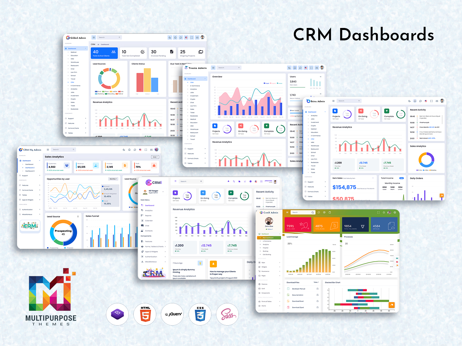
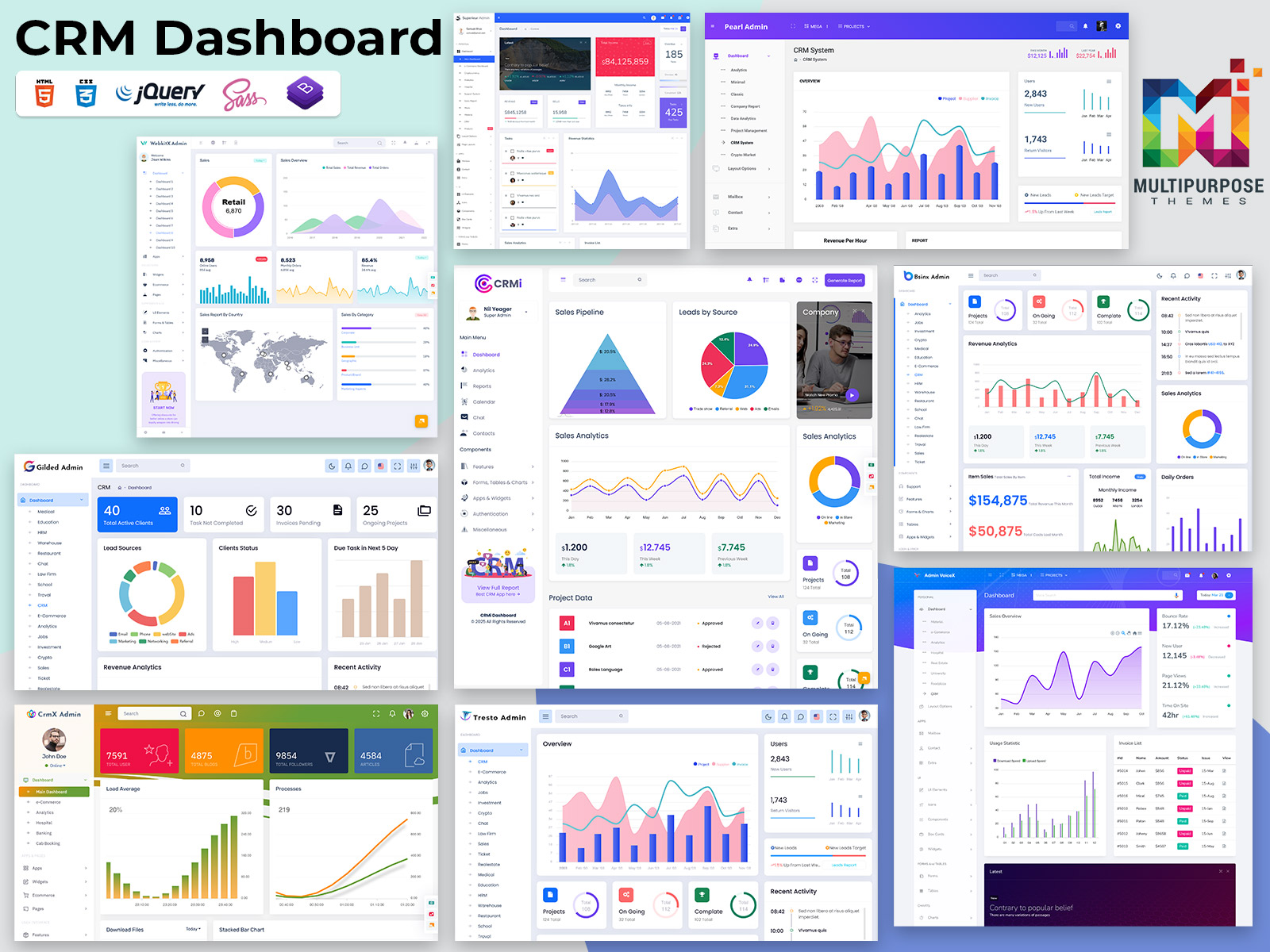
Explore a Unique Multi-Admin CRM Dashboard Design
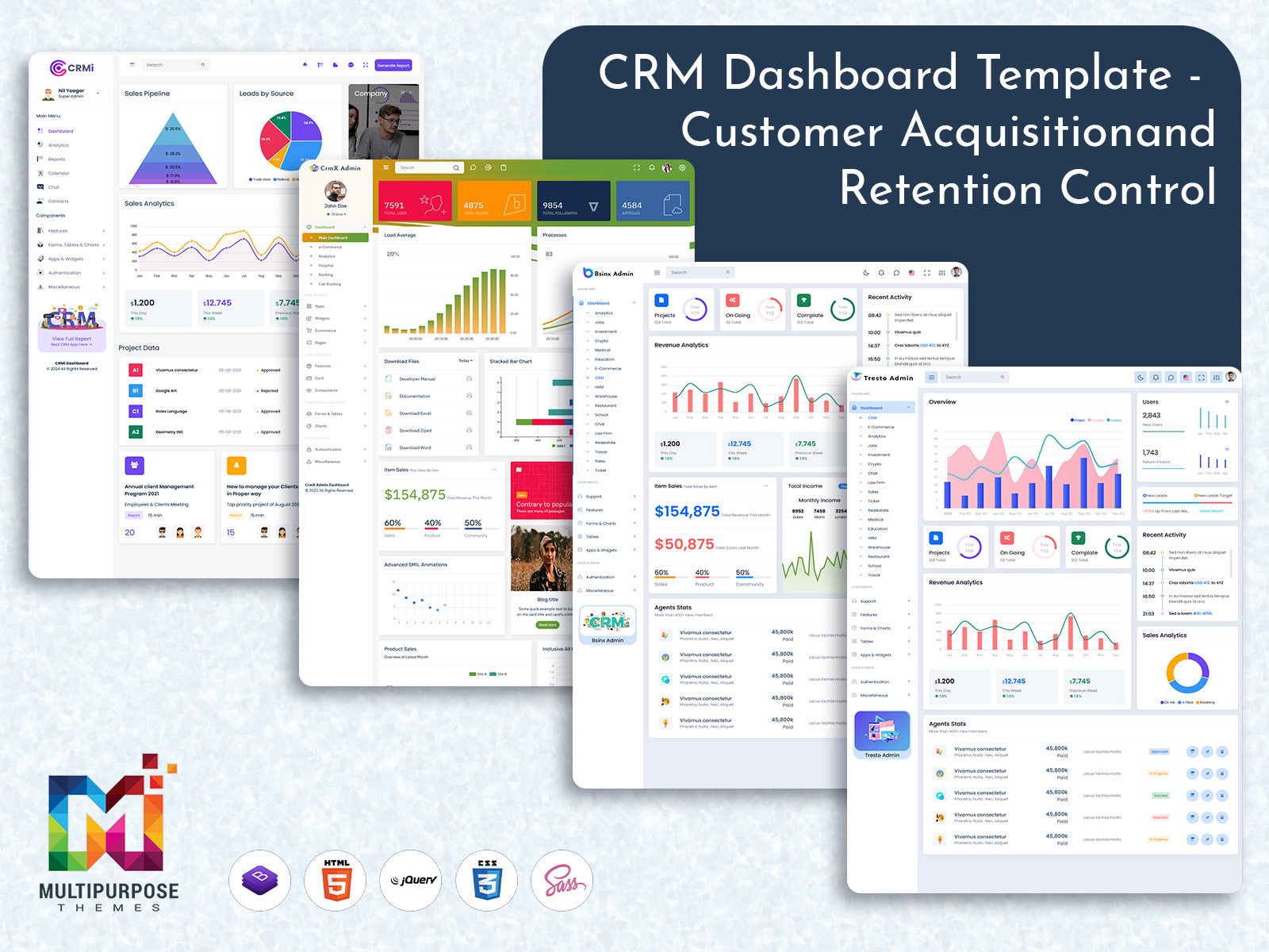
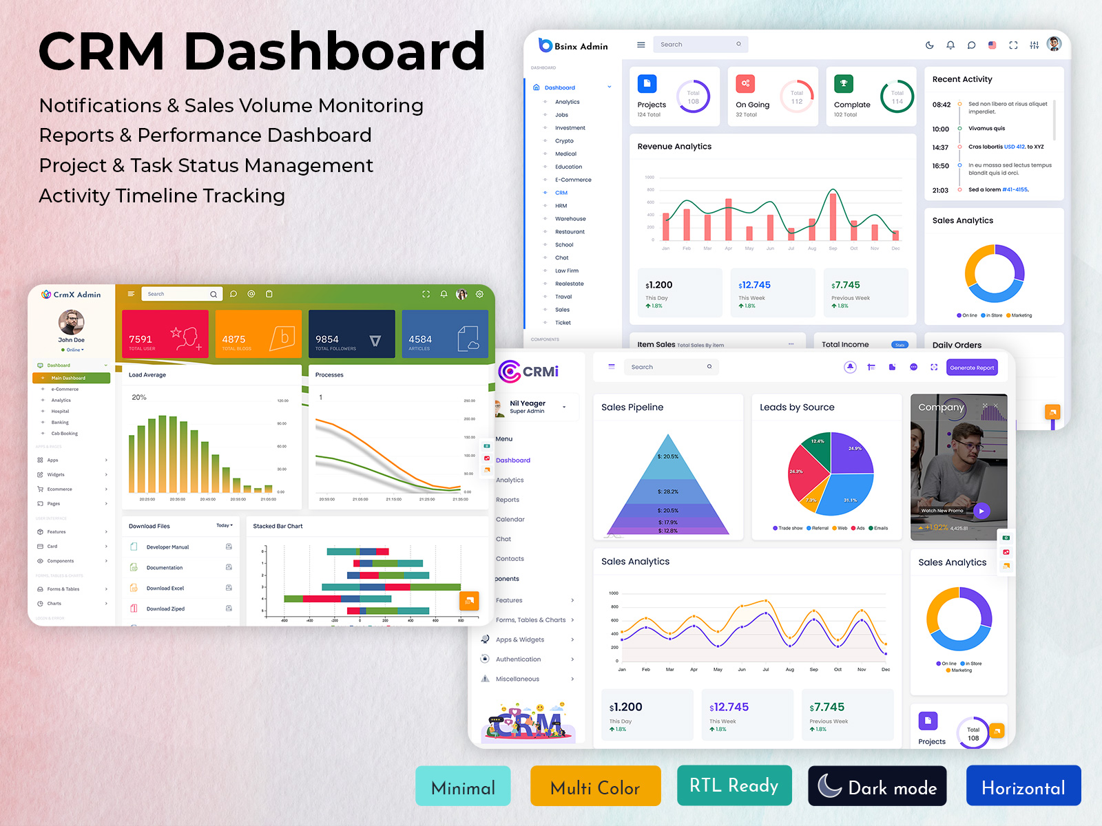
CRMi Admin – CRM Dashboard
BUY NOW DEMO
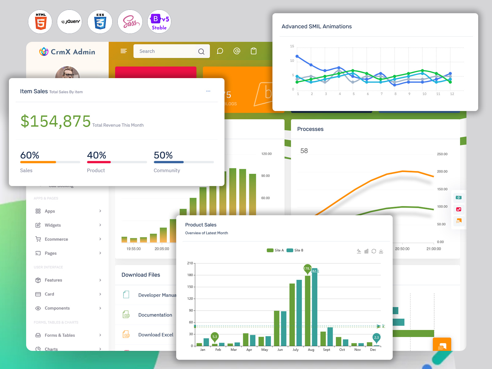
CrmX Admin – CRM Dashboard
BUY NOW DEMO
Gilded Admin – CRM Dashboard
BUY NOW DEMO
Tresto Admin – CRM Dashboard
BUY NOW DEMO
BsinX Admin – CRM Dashboard
BUY NOW DEMO
Superieur Admin – CRM Dashboard
BUY NOW DEMO
VoiceX Admin – CRM Dashboard
BUY NOW DEMO
WebkitX Admin – CRM Dashboard
BUY NOW DEMO
Fab Admin – CRM Dashboard
BUY NOW DEMO
Why Most CRM Dashboards Fail
Walk into any sales office and ask about their CRM. You’ll hear groans. Not because CRMs are bad tools. But because they’re poorly designed for real work. Most CRM dashboard templates show everything at once. Pipeline numbers. Revenue forecasts. Activity logs. Lead scores. Contact lists. Deal stages. It’s information overload.
Your sales rep logs in. They need to check on three hot deals. But first, they have to scroll past widgets they never use. Charts they don’t understand. Metrics that don’t matter to their quota.
They waste thirty seconds finding what they need. Multiply that by twenty logins per day. Five days per week. That’s fifty hours per year per rep. Just navigating a cluttered dashboard. The best CRM dashboard template does the opposite. It shows what matters. It hides what doesn’t. It gets out of the way.
What Sales Reps Actually Need
Here’s what your team checks every morning. Their deals for today. Their follow-ups that are overdue. Their hottest prospects. Their progress toward quota. That’s it. Four things.
Yet most CRM dashboards bury this information. They prioritize company metrics over individual performance. They show team numbers before personal numbers. They display last month’s data more prominently than today’s actions.
This is backwards. Your reps care about their own success first. Help them win individually. The team numbers will follow. A good CRM Software Dashboard puts personal metrics front and center. Today’s calls to make. This week’s deals to close. This month’s quota progress. Everything else is secondary.
The First Screen Problem
You have five seconds. That’s how long your Dashboard Layout has to prove its worth. Five seconds before your rep decides if logging in was worth it. What should they see in those five seconds?
Start with action items. Not passive information. Not historical data. Actions they need to take right now. “Call John Smith about renewal” beats “47 active opportunities” every time. “Follow up on three proposals sent yesterday” beats “Pipeline value $2.3M” every time.
Your CRM dashboard template should answer one question: What do I need to do next? Put that answer at the top. Make it obvious. Make it clickable. Everything else can wait.
Speed Wins Every Time
Nobody talks about dashboard load time. But everyone feels it. Your rep clicks the CRM tab. They wait. And wait. The spinner spins. Charts slowly render. Finally, three seconds later, they see their data. Three seconds doesn’t sound like much. But it feels like forever when you’re checking the CRM twenty times per day.
Speed matters. A fast CRM Dashboard gets used. A slow one gets avoided. This means making choices. You can’t load everything instantly. So, load what matters first. Show today’s tasks immediately. Let the pretty charts load in the background. Use lazy loading. Cache frequently accessed data. Minimize database queries. Compress images. Every millisecond counts.
Your team will check the CRM more often if it’s fast. More checks mean more updates. More updates mean better data. Better data means better decisions.
Mobile Matters More Than You Think
Your top rep is at a client meeting. She needs to check deal details. She pulls out her phone. She opens your CRM. The desktop layout shrinks to fit her screen. Text becomes unreadable. Buttons become tiny. She gives up.
Lost sale? Maybe. Lost productivity? Definitely. Half your team checks the CRM from mobile devices. Yet most CRM dashboard templates are designed for desktops only. They technically work on phones. But barely. Mobile isn’t a nice-to-have feature. It’s essential. Your dashboard needs to work on small screens. Really work. Not just display.
This means rethinking layouts. On mobile, your dashboard should show even less information. Just the absolute essentials. One tap to call a lead. One tap to update a deal. One tap to log an activity. Strip away everything else. Mobile users don’t need charts. They need actions.
Customization Without Chaos
Every rep is different. Sarah focuses on new business. Mike handles renewals. Jenny works enterprise accounts. They need different dashboards. But here’s the trap. Give users too much customization and chaos follows. Everyone builds their own dashboard. Nobody follows best practices. New hires get overwhelmed. Managers can’t standardize reporting.
The solution is guided customization. Provide three or four dashboard templates. One for hunters. One for farmers. One for managers. Let users switch between them. Let them tweak minor details. But don’t let them build from scratch. That’s too much freedom. Structure helps more than it hurts. Your CRM dashboard template should offer flexibility within boundaries. Choice without chaos.
Data That Tells Stories
Numbers alone don’t motivate. Stories do. “You closed $50K this month” is a number. “You’re $10K ahead of last month’s pace” is a story. “You’ve closed three deals this week, matching your personal record” is an even better story.
Your dashboard should tell stories with data. Not just display metrics. Show progress. Show trends. Show comparisons. Make the numbers mean something. Use color to indicate status. Green for ahead of target. Yellow for at risk. Red for urgent attention needed. Your rep should understand their standing at a glance. Add small charts that show trajectory. Is this deal moving forward or stalling? Is this lead getting warmer or colder? Help your team spot patterns before they become problems.
The Real Test
Here’s how you know your dashboard works. Your sales team logs in without being asked. They check it multiple times per day. They reference it in conversations. They trust its data. That’s the goal. Not compliance. Enthusiasm. Your CRM Dashboard should be a tool they want to use. Not one they’re forced to tolerate. Start there. Build from there. Everything else follows.
Related Posts

This Post Has 0 Comments