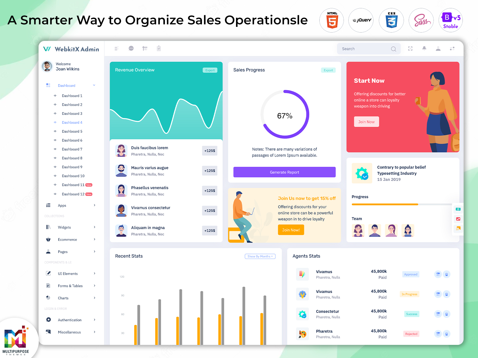
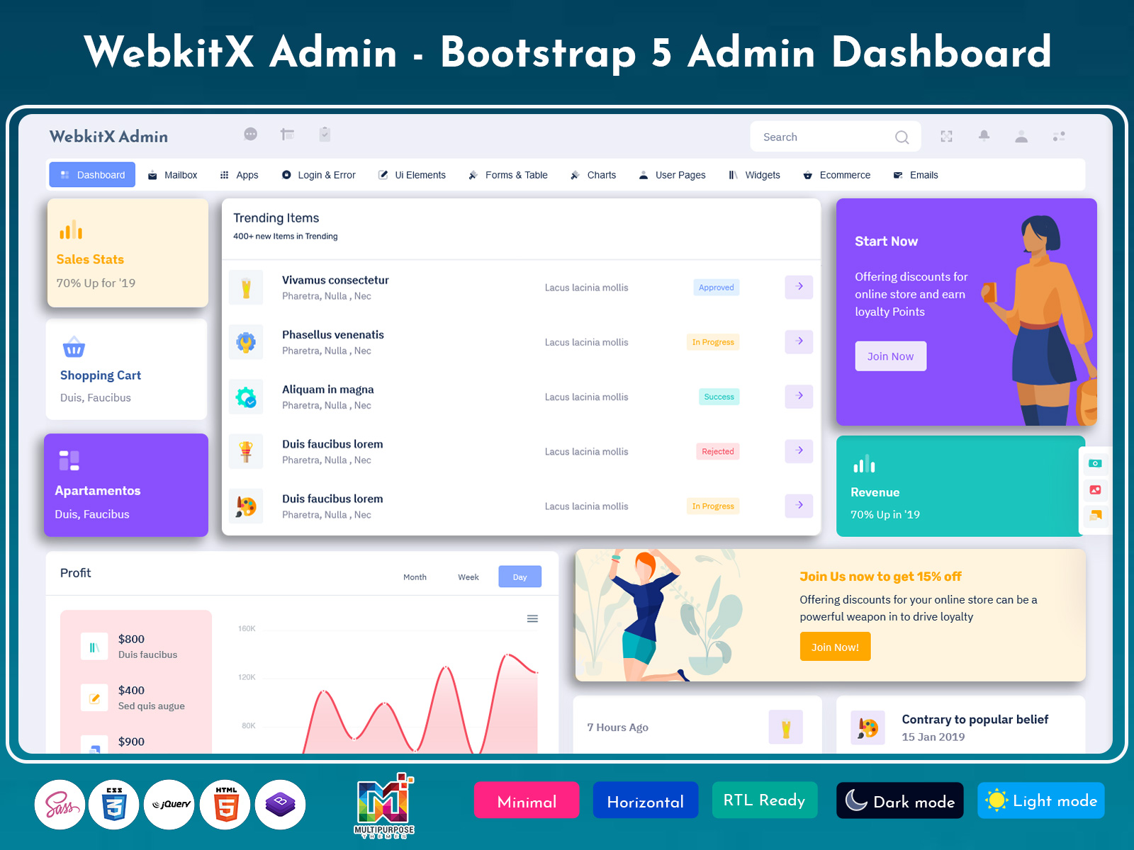
What is a Sales Dashboard? A Sales Dashboard is a centralized digital interface that helps…
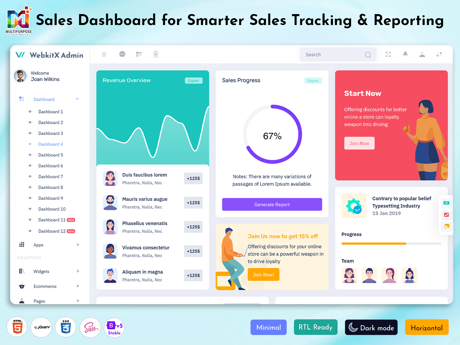
Sales Dashboard: Making Sales and Business Information Easy to Understand
Reading Time: 10 minutes
The Sales Dashboard is an application where the information regarding the sales of a company can be seen in the form of visuals such as graphs, charts, etc. This is very useful for a team to evaluate their performance. It will help them to keep track of their performance. Of using many spreadsheets or looking at reports by hand a good Sales Dashboard brings the important sales numbers into one place that is easy to reach.
Watch Full Video
When it comes to businesses that seek a customized admin template, the purpose is not simply to present the figures. The aim is to facilitate the comparison process of the reports and presentation of data in such a way that facilitates decision-making.
What is a Sales Dashboard?
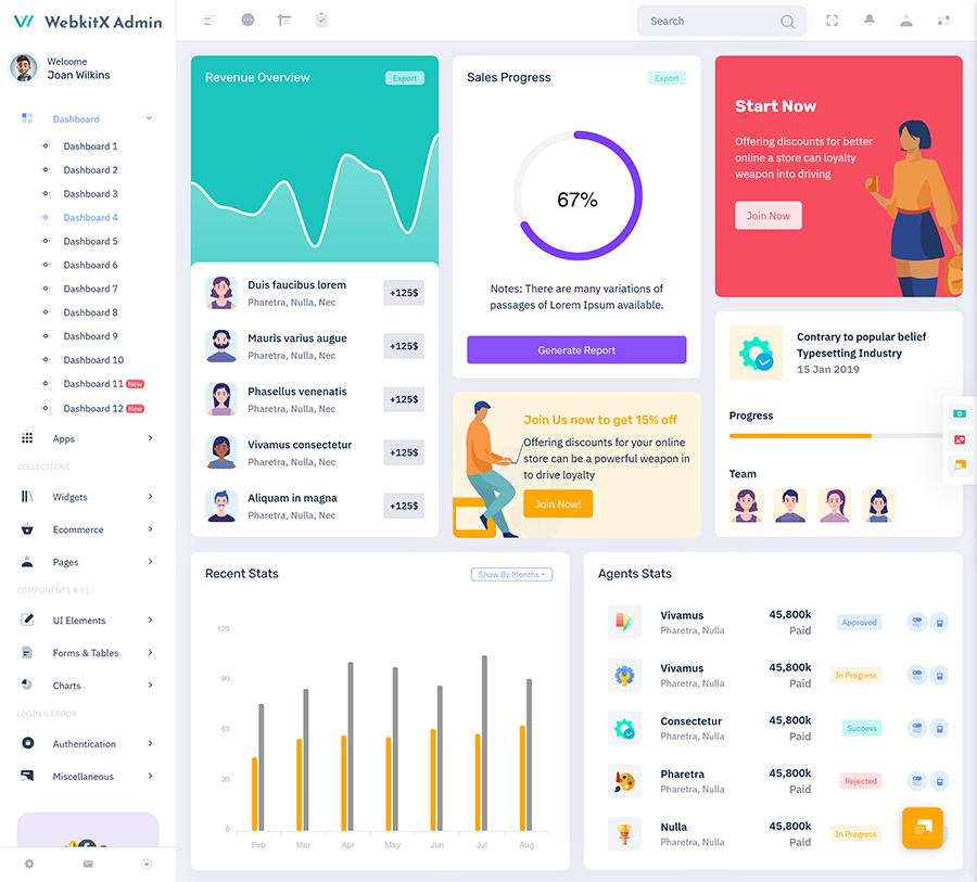
A Sales Dashboard is a tool that helps businesses organize and see sales-related information through charts, quick summary boxes, tables and performance measures. The Sales Dashboard can be used by sales managers, business owners, account managers and operational teams to see how different sales activities are going. Of looking through many reports users can find the information they need in a clear Sales Dashboard layout.
Sales operations are not about recording sales that have been made. Teams might need to follow up on customer questions watch orders compare how sales representatives are doing check changes in revenue and see which products or services are wanted. A Sales Dashboard built for a purpose can bring together parts depending on the data and features in the app.
A Sales Statistics Dashboard acts as a center for people who need a sales overview. This can be the case with either sales, sales projections, comparison of revenues, or any other figure that the organization selects. These figures provide a base from which to examine activities and identify problem areas.
The value of a Sales Dashboard depends on how the information’s shown. Having a screen of many numbers can make the usual monitoring harder. A focused interface puts the information into sections that users can understand without having to scroll through many tabs. This is why a Sales Dashboard is great for meetings, reviews and reporting.
For companies that are building a sales management app, a made admin Sales Dashboard template can give a starting point for the user interface. Developers can change the dashboard connect it to data sources and make the needed functions. The template itself is not a sales management system but it can help with creating the front end.
VIEW DEMO BUY NOW
Sales Dashboard for Better Visibility and Reporting
Sales teams handle information that changes all day. New orders come in customers move through the sales process and sales reps update their activities. Without a way to see this information managers can find it hard to keep track of what’s happening in the business.
A Sales Dashboard creates a place where the selected sales numbers can be brought together. For example companies may want to compare revenue numbers with the period look at the status of deals or watch activity in different regions. The exact information depends on the company’s reporting needs. The goal is to provide a view of the important sales data.
Sales Performance Analytics gives understanding of the numbers by letting users compare patterns in the sales records. Not do managers see a final number but they can also see the differences between products sales reps, dates or customer groups. These comparisons help find the differences that might need attention.
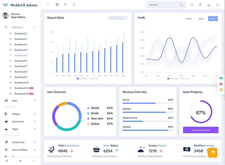
A Monthly Sales Dashboard is helpful for companies that work according to reporting cycles. It can show revenue, number of orders how close they are to targets and how results compare from one period to another in one place. This kind of layout helps teams prepare for reviews while keeping a way to report.
The goal of Dashboard Analytics is to provide users with required data. A retail company will be interested in sales of products and order value, while a service company will concentrate on contracts, client base, and recurring revenues. The flexible design of Sales Dashboard allows developers to adjust the layout according to the business model, when the same report segments can be used for any industry.
One other aspect that needs to be looked at is how comprehensible the interface is for the user. It is quite hard to understand sales data in the absence of any sort of patterns while depicting graphs, tables, figures, etc. Boxes, spacing, labels, and navigation help make the Sales Dashboard easy to use.
In the end a Sales Dashboard can give a way to look at business information. Its success depends on how accurate the data’s what numbers are shown and what functions the development team connects to the interface.
VIEW DEMO BUY NOW
Key Features of a Sales Dashboard
The following features are elements that are being used for the interface that will be created for the sales dashboard application. The availability of these features will depend upon the template and amount of customization made during development.
1. Sales Statistics Overview
Section which provides the sales figures such as revenue, number of orders placed, sales and their proximity to the targets. Placing the above mentioned information on top of the dashboard makes it easy for the user to access the information. Developers can connect each number to the business data. Decide how it should be calculated.
2. Sales Performance Analytics
A section that helps compare sales results over time across product types or for team members. Tables and charts provide a method for organizing the necessary information in an easily readable format in the sales dashboard. This feature will be useful for those businesses that need to analyze certain trends but do not need to use manually produced reports.
3. Sales Dashboard
Monthly reports can be organized using charts, quick summaries and tables with dates in the sales dashboard. Users can look at revenue for each month compare results with the period and watch how the number of orders changes. A monthly view gives a structure for reporting and discussions about performance.
4. Revenue and Target Tracking
The sales dashboard can have sections to show how much money is being made and how close the team is to their targets. Progress indicators or charts can show how the results match the goals. This lets users look at target-related information in the app. The app needs to support how targets are calculated and updated.
5. Product and Category Reporting
Companies that sell things or services can organize their sales data by categories in the sales dashboard. Tables and visual summaries can compare the number of sales order values or revenue for each offering. This layout helps teams look at product details without having to combine records
6. Interactive Charts and Data Tables
While charts show a summary tables can give detail in the sales dashboard. A dashboard might use bar charts to compare data points line charts to show how things change over time or tables to display transaction records. Filters and sorting options can be used to make the interface more useful for users who need to focus on a data group.
7. Responsive Admin Interface
A design that works on screen sizes helps the sales dashboard adjust to desktops, tablets and phones. Navigation and content layout make the interface easier to use on devices. For developers a responsive template based on Bootstrap can help create sales interfaces that work across devices.
How Dashboard Analytics Helps with Daily Sales Management
The sales dashboard helps with the sales reporting process and connects it to the work of the business. A manager might want to see how the sales team is doing in the morning how orders are moving during the day and how results compare at the end of the reporting period. Each task needs information. The dashboard should guide users from high-level summaries to more detailed records.
One way to do this is to organize the interface based on how users would look at their work in the sales dashboard. Quick summary boxes can give an overview. Charts can show comparisons while tables give more details. This structure helps users move from understanding how things are going to looking at records that need attention.
For example companies that are looking at sales performance across regions might want to compare revenue numbers using a chart in the sales dashboard. If a team spots a change in one area they can look at the details of orders or customers in another part of the app. The Sales Dashboard helps with the review and the connected data and rules determine what can be checked.
The sales dashboard can also help with meetings inside the company. Teams can use the interface to talk about how they are doing compared to goals look at results over time and find questions to follow up on. These discussions don’t need every dashboard to have tools for predicting the future. Sometimes just showing the existing data clearly is enough.
A Monthly Sales Dashboard can be set up around the reporting cycles that match the company’s work. Monthly sections can include summaries of revenue comparisons of orders and important performance numbers. Keeping a way to show information helps users know where to find it and how it is presented.
The sales dashboard doesn’t just rely on charts. Every visual should have a reason for being. A chart that shows revenue should have labels and a time range that makes sense. A table that compares products should show the values that users care about without information.
I think that a made Sales Dashboard template helps developers create the structure before the app connects to data. The Sales Dashboard template reduces the need to build every part of the interface from the start. It gives components for pages, layouts, charts and tables.
Why Use Multipurpose Themes for Sales Dashboard Templates?
I like that Multipurpose Themes offer made admin dashboard and Bootstrap-based templates that help developers and businesses build different web apps. The Sales Dashboard collection has ideas, for industries letting users choose a visual base that fits their project needs.
For a sales app the Sales Dashboard template can give a starting point to show reports, numbers, tables and business info. Developers can change the design to match their brand connect the data sources they need and add the functions the app requires. The available layouts and parts need to be looked at based on the projects needs before choosing them.
Benefits of a Sales Dashboard
1. Organized Sales Information
The Sales Dashboard shows business numbers in one place. People can see money made orders and how well they are doing without going from page to page. This helps groups keep track of the information they need when they talk about sales every day.
2. Easier Performance Comparisons
The Sales Dashboard can show data from times, products or teams in the same way. Using pictures and tables managers can see how things have changed easily. This makes it better to talk about sales and look at the parts that need attention.
3. Consistent Monthly Reporting
I notice that the Monthly Sales Dashboard gives a way to check sales numbers during times. Teams can use the screen to look at money each month how orders there are and other numbers. A same look makes it easier to plan and keep track of the reports each month.
4. Improved Data Accessibility
The Sales Dashboard puts the used sales information in a place that people can get through a program. Of looking through many papers for each check team members can find quick summaries and more details in the same system as long as they have the right access and the right connections.
5. Flexible Business Customization
Every business looks at sales in its way. The Sales Dashboard that can be changed lets programmers adjust names, how things look, parts with data and the way things look to fit what the program needs. This helps projects that need a sales screen that matches products, services, customers or how reports are made.
6. Support for Team Discussions
The Sales Dashboard can give a shared place during meetings and check-ins. Teams can use the numbers to talk about results how much progress has been made and what is happening with sales. A same screen helps everyone look at the numbers when they check on the business.
7. Reusable Frontend Foundation
The Sales Dashboard template that’s ready to use has parts that developers can change for their projects. Things like how the screen looks, how to move around and the parts that people see can be used again. This can save time when making the part of the program. How much time is saved depends on the template, how much it needs to be changed and how the program is built.
Conclusion
I think the Sales Dashboard is a way to put sales information together and show how the business is doing through a screen. Features like Sales Statistics Dashboard summaries, Sales Performance Analytics, monthly reports and Dashboard Analytics help people find the information they need better if the data is correct.
For programmers making sales systems choosing a template can give a start for the part of the program. Multipurpose Themes has Sales Dashboard options that can be changed to fit what the project needs. This gives teams a beginning for making professional sales screens.
VIEW DEMO BUY NOW
Frequently Asked Questions
1. What is the purpose of a Sales Dashboard in a business application?
The Multi purpose themes Sales Dashboard is made to show sales information in one picture. The Sales Dashboard can have money numbers order summaries, how much is done, pictures and more depending on the program. Companies use the Sales Dashboard to look at sales and organize reports. The Sales Dashboard does not make sales better on its own. It can make sure the right numbers are easy to see and understand if the data is correct and connected properly.
2. How does a Sales Statistics Dashboard help sales teams?
A Sales Statistics Dashboard is a place where sales teams can see the numbers they need. It can show totals money numbers order numbers or other business numbers. Team members can use this to see what has happened and find parts that need attention. The value of the dashboard depends on what numbers are shown how often the numbers are updated and if the numbers match what the team really needs.
3. Can a Monthly Sales Dashboard be changed for businesses?
Yes a Multi purpose themes Monthly Sales Dashboard can be changed to fit types of businesses by making changes to the front part and adding more work. A store might need to see product sales and order numbers while a service company would look at contracts, new customers and money that comes in regularly. The way the Monthly Sales Dashboard looks should match the business data. Programmers need to connect the Monthly Sales Dashboard to the data and add the math needed for each type of business.
4. What is the difference between sales reporting and Sales Performance Analytics?
Sales reporting shows the facts that have happened like money, number of orders or results for a time. Sales Performance Analytics looks at these facts by comparing them seeing patterns and looking at how things are doing. A dashboard can help with both by showing a view with pictures or detailed lists. The difference is in what steps are taken and what tools the dashboard uses. Not every dashboard has tools for analyzing or guessing what will happen next.
5. Can I use a sales dashboard template for a store?
A sales dashboard template can start the part of an online store if the way it looks and what it has fits the project. Programmers can change parts like product sales order details, customer actions and money reports. The template usually needs to be connected to the stores data and rules. Before choosing one, the technology how it looks on the screen how much it can be. If it works well need to be checked.
6. Why are pictures and lists important in Dashboard Analytics?
Pictures can help people compare numbers or see what has changed over time. Lists can show details that people need to look at closely. Using both pictures and lists is helpful for a dashboard. The pictures and lists should fit what is being shown. Clear names, comparisons and how things are laid out help Dashboard Analytics to work well for the people using it.
7. Why should programmers choose Multipurpose Themes for a sales admin dashboard?
Multipurpose Themes has made dashboard templates that can start building web apps. A sales project can benefit from a template that has how the screen looks the parts that people see and tools, for showing data. The right choice depends on the projects look, technical needs and how much it can be changed. Programmers should look at the features and instructions to see if it gives the starting screen they need for their sales admin dashboard.

Related Posts