
In today’s fast-moving digital world, education is no longer limited to classrooms and physical books.…
LMS Dashboard – Essential Best Practices for Designing an Effective Interface
Reading Time: 4 minutes
An LMS dashboard serves as the command center for online learning. It provides a visual hub where educators and learners can track progress, manage courses, and analyze performance data in one place. A well-designed Learning Management System dashboard transforms complex information into clear insights that drive better decisions.
Creating an effective online course dashboard requires careful planning and user-focused design. The following best practices will help you build a dashboard that engages users and delivers results.
Understand Your Users First
Every successful LMS dashboard template starts with knowing your users. Different people use dashboards for different reasons. Teachers need to track student progress. Students want to see their grades and assignments. Administrators focus on system-wide metrics.
Start by interviewing your users. Ask them what they need to accomplish. Watch how they interact with current systems. Look for patterns in their behavior. This research helps you design features that actually solve problems.
Create user personas for each type of dashboard user. Consider their technical skills and daily workflows. A dashboard for executives might show high-level KPIs, while a teacher’s dashboard displays detailed class performance.
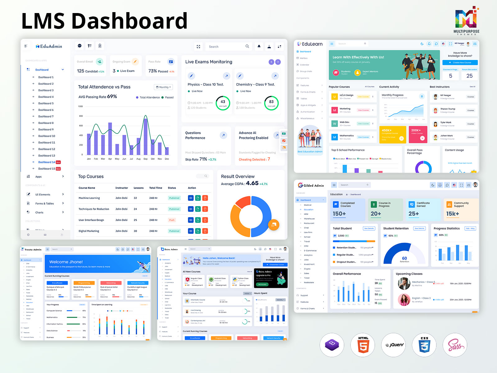
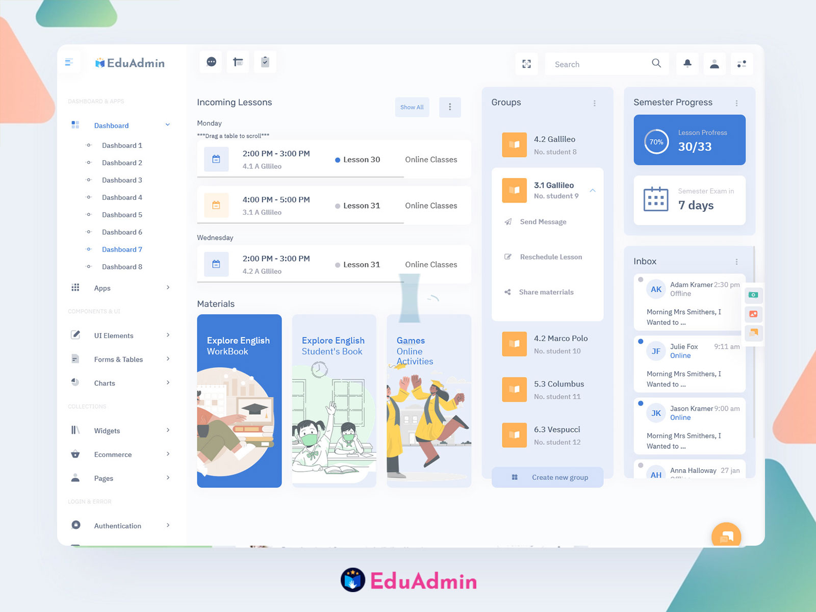
Explore EduAdmin
Watch Demo Video
Explore Dashboard Design
Dashboard: 1
BUY NOW DEMO
Dashboard: 2
BUY NOW DEMO
Dashboard: 3
BUY NOW DEMO
Dashboard: 4
BUY NOW DEMO
Dashboard: 5
BUY NOW DEMO
Dashboard: 6
BUY NOW DEMO
Dashboard: 7
BUY NOW DEMO
Dashboard: 8
BUY NOW DEMO
Dashboard: 9
BUY NOW DEMO
Dashboard: 10
BUY NOW DEMO
Dashboard: 11
BUY NOW DEMO
Dashboard: 12
BUY NOW DEMO
Dashboard: 13
BUY NOW DEMO
Dashboard: 14
BUY NOW DEMO
Dashboard: 15
BUY NOW DEMO
Keep the Layout Clear and Simple
A cluttered Learning Management System dashboard confuses users and slows them down. Place the most important information at the top or left side of the screen, where eyes naturally look first. Group related data together using white space, borders, or background colors.
Use a logical structure that matches how users work. Put frequent tasks front and center. Hide less critical details in expandable sections or secondary screens. This approach keeps the interface clean while still providing access to deeper information.
Make sure your layout flows naturally from one section to the next. Primary actions like “Start Next Module” should stand out from secondary options like “View Resources”. Consistent placement of elements helps users build habits and find things quickly.
Establish Visual Hierarchy
Visual hierarchy guides users to the most important data first. Use size, color, and position to create this hierarchy. Larger, bolder text works for main metrics. Smaller fonts suit labels and supporting details.
Apply color strategically in your LMS dashboard template. Bright colors should highlight urgent items or anomalies. Use contrasting colors to show positive versus negative trends. Keep your color scheme consistent across all dashboard sections.
Typography matters too. Stick to two or three font styles maximum. Use weight and size to show importance. This consistency helps users scan the dashboard quickly and find key information.
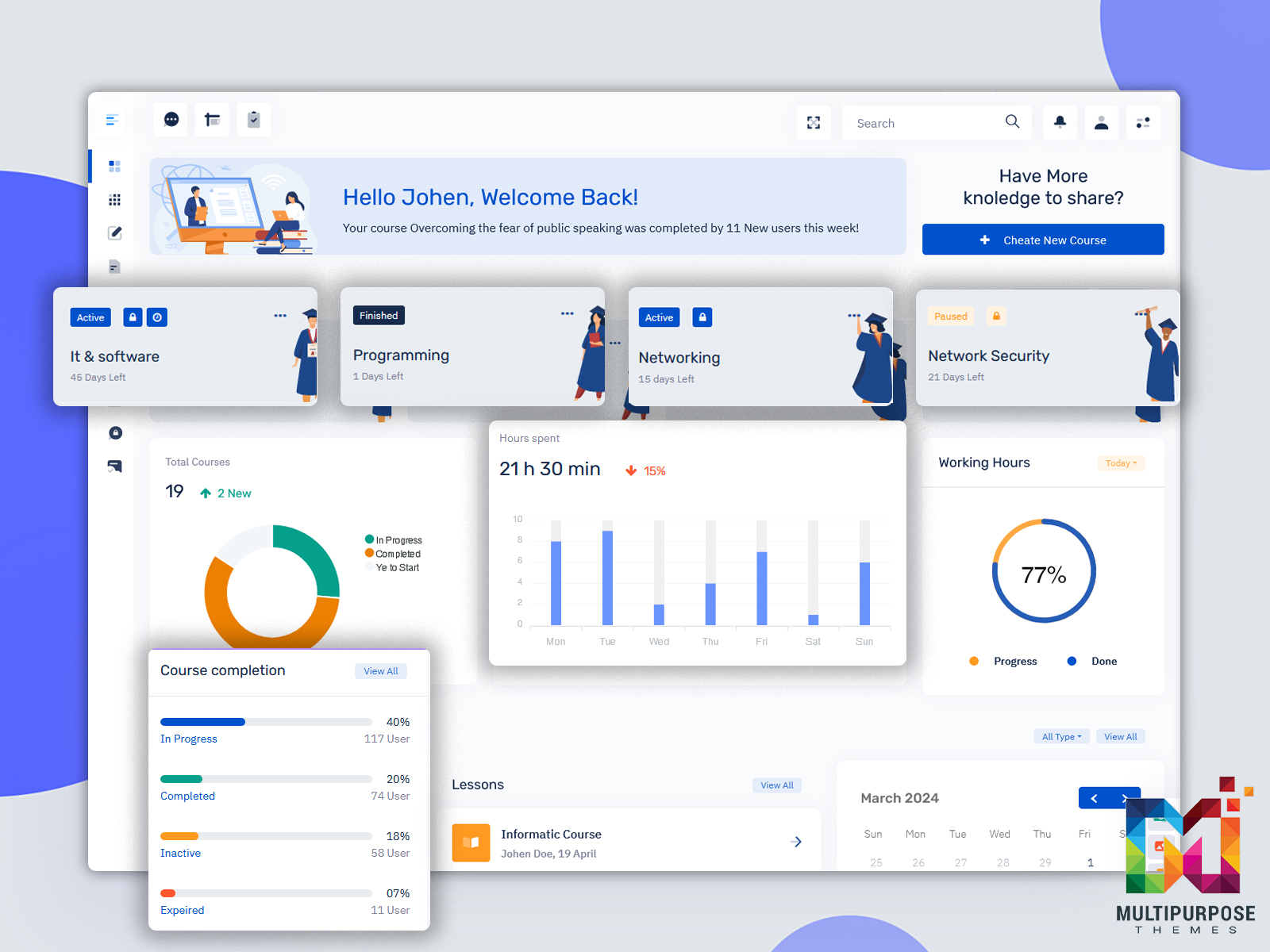
Explore EduLearn Admin
Explore Dashboard Design
Dashboard
BUY NOW DEMO
Focus on Key Metrics
Not every metric deserves space on your online course dashboard. Select KPIs that align with your learning goals and drive action. Too many metrics create noise and confusion.
For educators, essential metrics include completion rates, participation rates, and training deadlines. Student dashboards might show course progress, grades, and upcoming assignments. Choose metrics that provide real insights, not just numbers.
Provide context alongside your data. Show trends, benchmarks, or targets. A completion rate means more when users can see if it’s improving or declining. Context turns raw numbers into actionable intelligence.
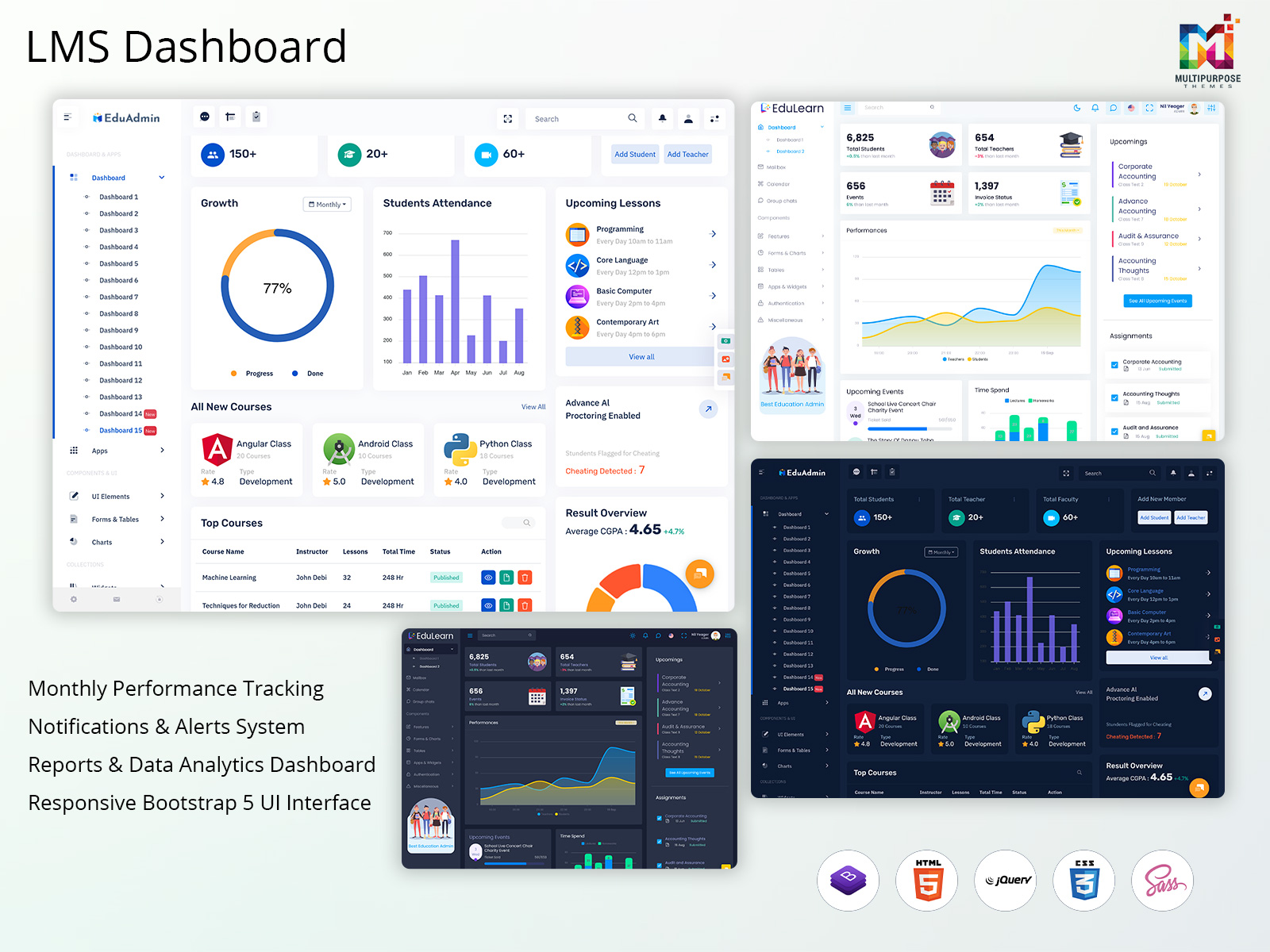
Explore Other LMS Dashboards
Gilded Admin
BUY NOW DEMO
Tresto Admin
BUY NOW DEMO
BsinX Admin
BUY NOW DEMO
Design for Multiple Devices
Today’s learners access courses from phones, tablets, and computers. Your Learning Management System dashboard must work on all these devices. Use responsive design that adapts layouts automatically.
Test your dashboard on different screen sizes. Make sure text remains readable and buttons stay clickable. Elements should rearrange smoothly as screens get smaller. Font sizes and spacing need to adjust for mobile viewing.
A mobile-first approach often produces better results. Design for the smallest screen first, then add features for larger displays. This ensures core functions work everywhere.
Add Smart Filters and Customization
Different users need different views of the same data. Smart filters let them find exactly what they need. A teacher might filter by date, course, or student group. Students might filter assignments by due date or status.
Allow users to customize their LMS dashboard. Let them choose which widgets appear and where. Some users want detailed analytics. Others prefer simple summaries. Customization serves both groups.
Make filters easy to use. Place them prominently and use clear labels. Show active filters so users know what they’re viewing. Provide quick reset options to return to default views.
Include Interactive Elements
Interactive features make your online course dashboard more engaging. Clickable progress bars let users drill down into details. Expandable modules reveal more information without cluttering the main view.
Progressive disclosure works well for complex data. Start with high-level summaries. Provide options to view detailed breakdowns when users need them. This technique prevents information overload.
Add hover tooltips for extra context. These provide help without taking up screen space. Interactive charts that respond to clicks give users control over their data exploration.
Provide Real-Time Feedback
Real-time feedback keeps learners motivated and informed. Show current progress toward goals. Display recent quiz scores and completion status. Visual indicators like graphs and checklists make progress easy to understand.
Make feedback constructive and actionable. If a student scores low, suggest specific materials to review. Point them toward helpful resources. This proactive approach encourages improvement.
Update data frequently so users see current information. Stale data frustrates users and reduces trust in the system. Real-time or near-real-time updates keep the LMS dashboard template relevant and useful.
Optimize Performance
Speed matters for user satisfaction. A slow dashboard frustrates users and reduces engagement. Optimize your database queries to fetch only necessary data. Use caching for information that doesn’t change often.
Limit the number of data points displayed in charts. Aggregate data at higher levels when possible. This reduces processing time and makes visualizations clearer.
Use asynchronous loading for widgets that don’t need to appear immediately. This lets users interact with some dashboard sections while others load in the background.
Final Words
Creating an effective LMS Dashboard requires balancing simplicity with functionality. Focus on user needs, prioritize key metrics, and design for clarity. Make your online course dashboard responsive, interactive, and accessible to all users.
Remember that dashboard design is never truly finished. Keep testing, gathering feedback, and making improvements. The best LMS dashboard templates evolve based on real user needs and behaviors. By following these best practices, you’ll create a dashboard that truly serves your learning community.
Related Posts

This Post Has 0 Comments