

A cyber security dashboard can provide a more organized way to view important security information.…
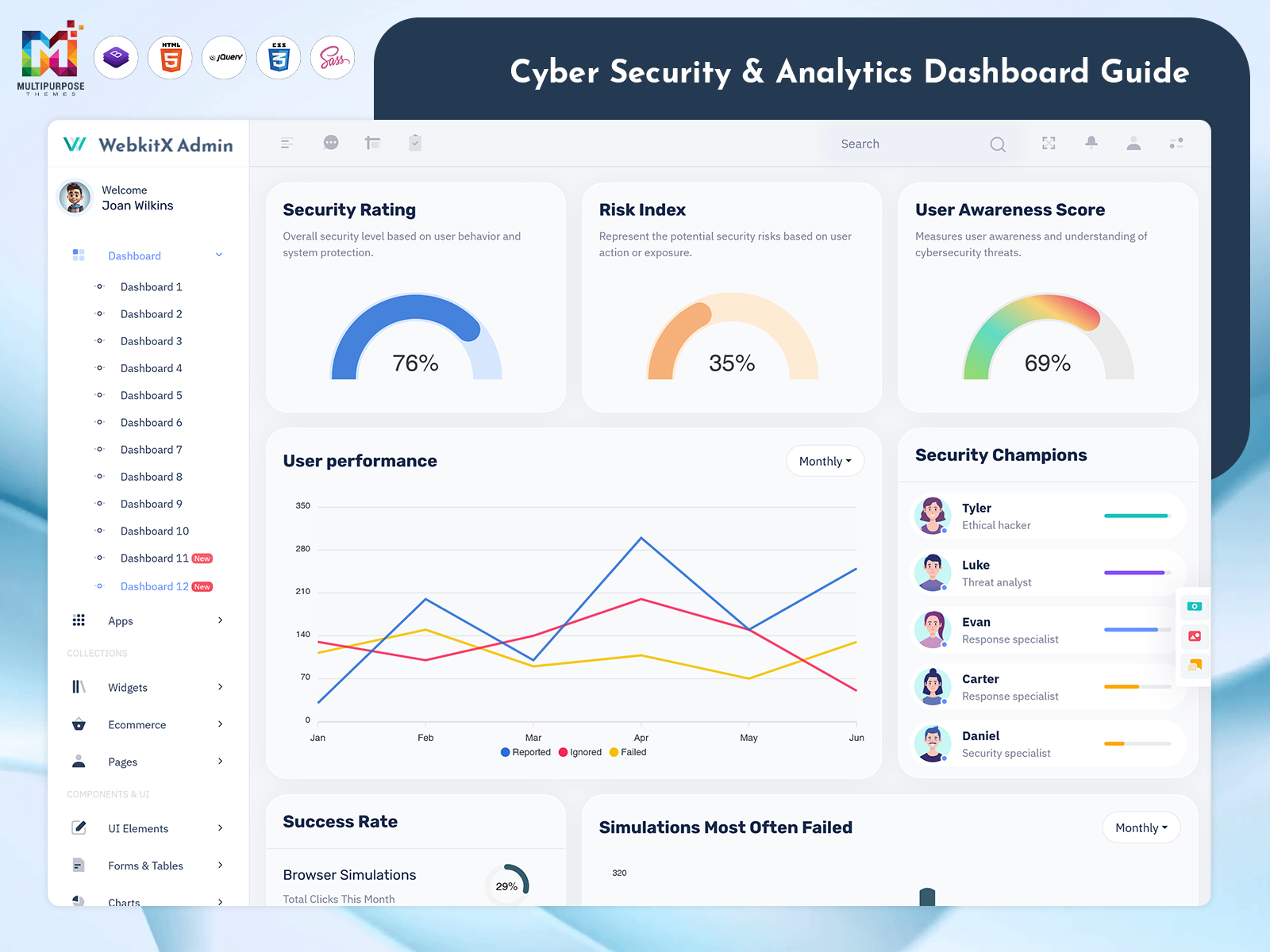
Cyber Security: A Practical Guide to Security Dashboards and Threat Monitoring
Reading Time: 9 minutes
Cybersecurity teams deal with information coming from different places—login activity, security alerts, network events, devices, applications and user accounts. When all of this information is spread across systems it can take time to understand what is happening. A Security Dashboard brings security information into one interface giving teams a clearer view of current activity and events that may need attention. In this article we’ll look at how a Cyber Security Dashboard, Cybersecurity Dashboard and Security Analytics Dashboard can be structured to make security information easier to monitor and work with.
Watch Full Video
Cybersecurity Requires More Than a List of Alerts
A security system can generate a number of alerts during a normal day. Some may require attention while others could simply be routine events or low-priority notifications.
The challenge is not collecting these alerts. Security teams also need to understand them in context.
For example a dashboard may bring together:
- Security alerts
- Login and authentication activity
- Suspicious user activity
- Network traffic information
- Device status
- Threat notifications
- Failed login attempts
- Access events
- System activity
- security incidents
Putting these details into a structured interface makes it easier to move from a general overview to the information behind a particular event.
VIEW DEMO BUY NOW
What Is a Security Dashboard?
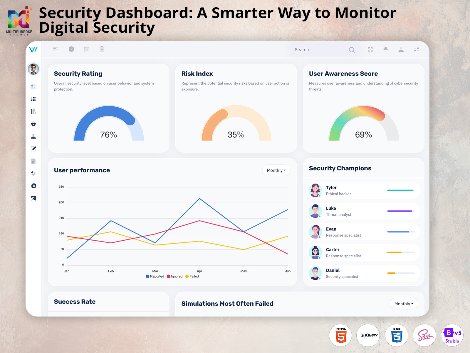
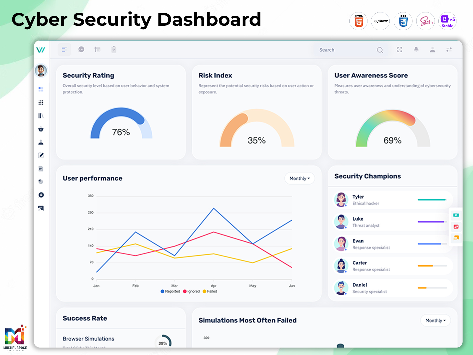
A Security Dashboard is an interface used to organize and display security-related information. Of requiring users to check several screens or systems the dashboard can provide a central view of important events and metrics.
The exact information shown will depend on the application and the systems connected to it.
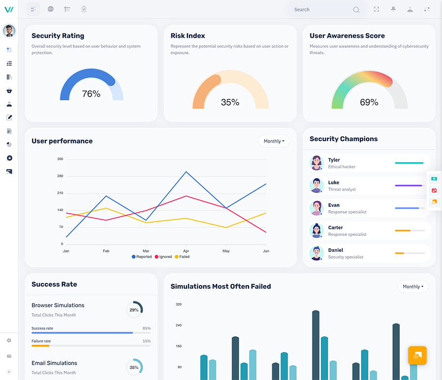
A basic dashboard might display alerts and system activity while a more advanced interface could include analytics, event timelines, risk indicators, user activity and detailed incident information.
The dashboard itself does not provide security automatically. It acts as the interface through which collected security information can be viewed understood and managed.
What Should a Cyber Security Dashboard Show?
There is no layout that works for every cybersecurity application. The information shown should depend on who will use the dashboard and what decisions they need to make.
A practical Cyber Security Dashboard may include sections such as:
1. Security Alerts
Alerts are often one of the things security teams need to see.
A dashboard can separate alerts by status, priority, source or type so users can quickly understand what needs attention.
For example:
- alerts
- Open incidents
- Resolved alerts
- Unusual activity
- Failed authentication events
- Malware-related notifications
2. Recent Security Activity
A recent activity section can provide a timeline of events taking place across connected systems.
This might include:
- New login attempts
- Account changes
- Access requests
- Blocked connections
- Device activity
- Security policy events
The purpose is not to display every event on the first screen. Instead the dashboard should help users find the activity that matters to their work.
3. Threat Information
Threat-related information can be displayed through charts, counters, tables or activity timelines.
Depending on the underlying application users might be able to view detected threats, affected systems, threat categories or recent changes.
4. System and Device Status
Security monitoring can also involve keeping track of devices and systems.
A dashboard could show:
- offline devices
- Devices requiring attention
- Recent security events
- System status
- Endpoint activity
This gives users another way to identify areas that may require investigation.
VIEW DEMO BUY NOW
How a Cybersecurity Dashboard Organizes Large Amounts of Data
Security information can become difficult to follow when everything is presented in the format.
This is where dashboard structure becomes important.
A planned Cybersecurity Dashboard can divide information into sections based on its purpose. High-level metrics can sit at the top while detailed event information can appear in tables or expandable sections.
For example the main screen might provide an overview:
Security Overview
- → Active Alerts
- → Open Incidents
- → Failed Logins
- → Devices Requiring Attention
- → Recent Threat Events
From there users can move into individual sections when they need more detail.
This approach prevents the dashboard from becoming a wall of numbers and notifications.
Security Analytics Dashboard: Turning Events Into Useful Information
A Security Analytics Dashboard goes beyond simply showing alerts. It can help users examine patterns within security-related data.
Analytics may be used to understand:
- Changes in login activity
- Repeated failed authentication attempts
- Unusual access patterns
- Activity across devices
- Security events over time
- Changes in incident volume
- Frequently affected systems
Charts and visual summaries can make these patterns easier to notice.
For example a line chart showing security events over days may reveal a sudden increase that would be less obvious in a long event table.
The actual analytics available will depend on the data sources and backend systems connected to the dashboard.
Different Users Need Different Security Views
Not every person working with cybersecurity information needs to see the dashboard.
1. Security Analysts
Security analysts may need information about alerts, events, affected systems and investigation activity.
Their interface can focus heavily on:
- Event details
- Alert status
- Incident timelines
- User activity
- Threat information
2. Security Managers
Managers may be more interested in overall activity and operational reporting.
Their dashboard could emphasize:
- incidents
- Alert volume
- Resolution status
- Security trends
- Team activity
- High-level reports
3. System Administrators
Administrators may need information related to devices, accounts, access and system configuration.
Their dashboard can provide an operational view of the environment.
Giving users appropriate views can reduce unnecessary information and make the interface easier to work with.
Why Data Visualization Matters in Cybersecurity
Security data can be difficult to understand when presented through tables and text.
Visualization gives users another way to interpret the information.
Depending on the application a dashboard might use:
- Bar charts for comparing event categories
- Line charts for activity over time
- Donut charts for status distribution
- Tables for detailed records
- Timeline views for incidents
- Status cards for important numbers
- Filters for narrowing datasets
The goal should not be to add charts simply because they look good. Each visual element should help users understand a part of the security environment.
Filters Make Security Dashboards Practical
A dashboard can contain a large amount of information but users rarely need all of it at once.
Filters can help narrow the information.
Useful filters may include:
- Date and time
- Alert type
- Severity
- Device
- User
- Location
- Status
- Event category
For example of reviewing every security event from an entire month a user could filter the dashboard to display only high-priority alerts from the last 24 hours.
That small interaction can make a difference when working with large datasets.
Security Dashboard Design for Different Screen Sizes
Security teams may access dashboards from desktop monitors, laptops, tablets or other devices.
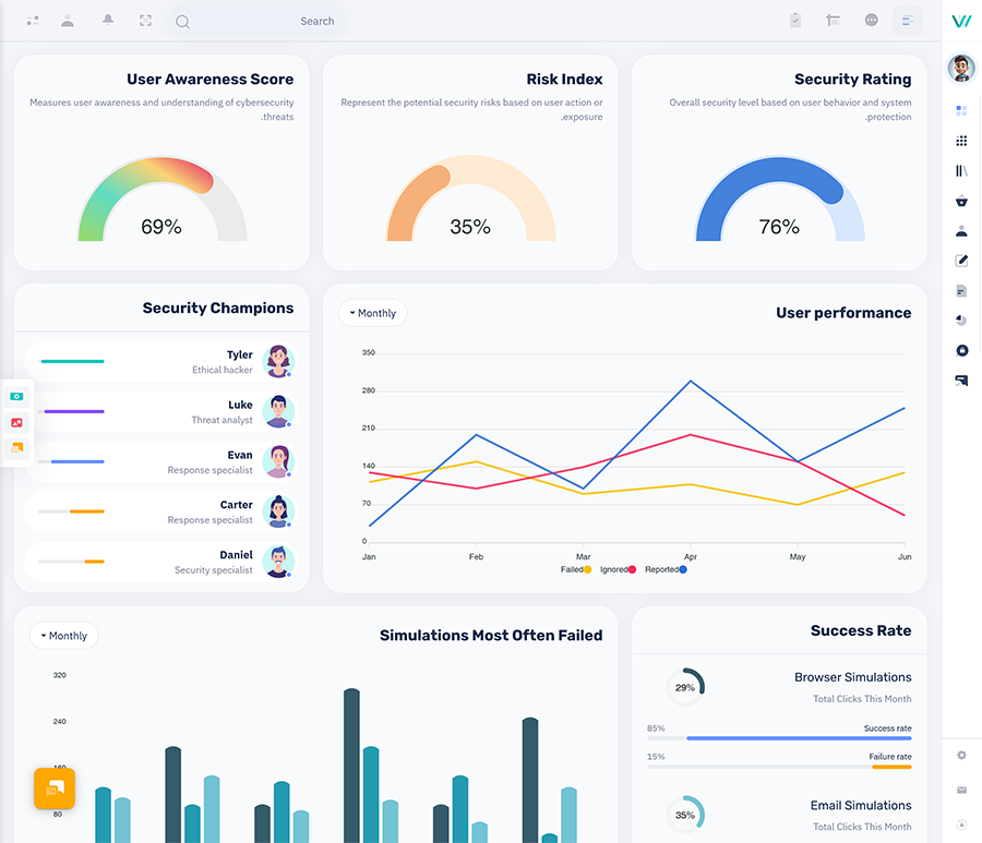
A dashboard therefore needs a layout that can adapt to screen sizes.
On a desktop screen several charts and tables may fit side by side. On a screen the same information may need to stack vertically.
Responsive design can help maintain:
- Clear navigation
- Readable charts
- Accessible tables
- spacing
- Usable filters
- Consistent controls
A responsive dashboard is especially useful when the application is expected to be used across different devices.
How a Security Dashboard Template Helps Developers
Designing a security dashboard from a screen can take considerable development and UI work.
A made Security Dashboard template can provide a starting structure for common interface components such as:
- Navigation menus
- Dashboard cards
- Tables
- Charts
- Forms
- Alerts
- User profiles
- Reports
- Settings pages
Developers can then adapt these components to the requirements of their own application.
A template does not create the cybersecurity system. Developers still need to connect the interface with APIs, databases, authentication systems, security tools, business logic and other required services.
What to Look for in a Cybersecurity Dashboard Template
Choosing a dashboard template should involve more than checking how the homepage looks.
1. Clean Information Structure
Security interfaces can contain a lot of information. The layout should have a clear hierarchy.
Users should be able to understand where they are and where to find types of information.
2. Customizable Components
A useful template should allow developers to modify components according to their applications requirements.
Colors, cards, tables, charts, navigation, forms and other UI elements may all need customization.
3. Responsive Layout
The dashboard should work across screen sizes without making important information difficult to access.
4. Practical Code Structure
Developers should also consider how easily the template can be integrated into their existing project.
A attractive interface is less useful if its structure makes future development unnecessarily difficult.
5. Room for Expansion
Cybersecurity applications can grow as more users, devices, events and integrations are added.
The dashboard should therefore have flexibility to accommodate additional modules and information later.
Common Problems With Designed Security Dashboards
A security dashboard can become difficult to use when too much information is placed on the screen without a clear structure.
Some common problems include:
1. Many Alerts at Once
Showing every notification with the same visual importance can make it difficult to identify the events that actually require attention.
2. Excessive Charts
Charts are useful when they explain something. Adding many of them can make the interface harder to understand.
3. Complicated Navigation
If users have to move through unrelated screens to find basic security information the dashboard becomes less practical.
4. Lack of Filtering
Large event lists become difficult to work with when users cannot narrow the results by date, type, status or other relevant fields.
5. Poor Mobile Responsiveness
A dashboard that works only on a large desktop screen can become frustrating when accessed from smaller devices.
Security Dashboard, vs. Security Analytics Dashboard
Although these terms are closely related they can describe levels of functionality.
A Security Dashboard may focus mainly on showing security information in a clear interface.
A Security Analytics Dashboard can focus more on looking at patterns, trends and connections in security data.
A Cybersecurity Dashboard can mix both ideas based on what the application needs.
The best design depends on what the users need to watch and what information the system can offer.
A Way to Plan a Security Dashboard
Before starting the design of the interface it helps to figure out what the dashboard should do.
A simple plan can look like this:
1. Find the users
Figure out if the dashboard is for analysts, administrators, managers or different groups of people.
2. List the important information
Make a list of the security events, metrics, alerts and reports that users need often.
3. Separate the picture from details
Keep the main information easy to see while letting users dig deeper when needed.
4. Choose the right visuals
Use charts, tables, cards and timelines based on what the information shows.
5. Add filters and search
Give users ways to find security events easily.
6. Plan for changes later
Make sure there is room to add data sources, parts and features in the future.
This method can make the dashboard easier to use. Help developers start with a clear plan.
Why Choose MultiPurpose Themes?
For developers working on panels and application interfaces a ready-made dashboard template can cut down on the UI work needed at the start of a project.
MultiPurpose Themes offers dashboard and admin template options that can be changed to fit application needs. A security-focused design can use existing dashboard parts as a starting point. Then be changed based on the applications data, user roles and features.
The key is to see the template as the base of the interface not as the cybersecurity system. Backend services, security connections, login processes, APIs and the app logic still need to be built according to the projects needs.
A cybersecurity dashboard is more than charts and security alerts. Its real goal is to arrange information so users can see what is happening and get the details they need without extra work.
A designed Security Dashboard, Cyber Security Dashboard or Security Analytics Dashboard can bring alerts, activity, device details, trends and reports into a clear layout. For developers starting with a flexible dashboard template can also give a start for building a security-focused app.
The best dashboard is the one that fits the data, users, processes and systems behind it.
Conclusion
A cybersecurity dashboard is more than charts and security alerts. Its real goal is to arrange information so users can see what is happening and get the details they need without extra work.
A designed Security Dashboard, Cyber Security Dashboard or Security Analytics Dashboard can bring alerts, activity, device details, trends and reports into a clear layout. For developers starting with a flexible dashboard template can also give a start for building a security-focused app.
The best dashboard is the one that fits the data, users, processes and systems behind it.
VIEW DEMO BUY NOW
Frequently Asked Questions
1. What is a Security Dashboard?
A Security Multi Purpose Themes Dashboard is a screen that organizes and shows cybersecurity information like alerts, events, system activity and security measurements.
2. What is a Cyber Security Dashboard used for?
A Cyber Security Dashboard can be used to show an overview of security activity, alerts, devices, login events, incidents and other data from security systems.
3. What is the difference between a Cybersecurity Dashboard and a Security Analytics Dashboard?
A Cybersecurity Multi Purpose Themes Dashboard can show a view of security information while a Security Analytics Dashboard can focus more on looking at trends, patterns and links in security data.
4. Can a security dashboard template be changed?
Yes. Developers can change the interface parts, navigation, charts, tables, layouts and other parts based on their apps needs.
5. Does a dashboard template offer security protection?
No. A Multi Purpose Themes dashboard template gives a structure for the interface. Real security protection comes from the apps security systems, backend services, login features, monitoring tools, connections and security practices.
6. Why are filters helpful, in a security dashboard?
Filters help users focus on amounts of security data by using things like date, importance, status, event type, device or user.

Related Posts

This Post Has 0 Comments