

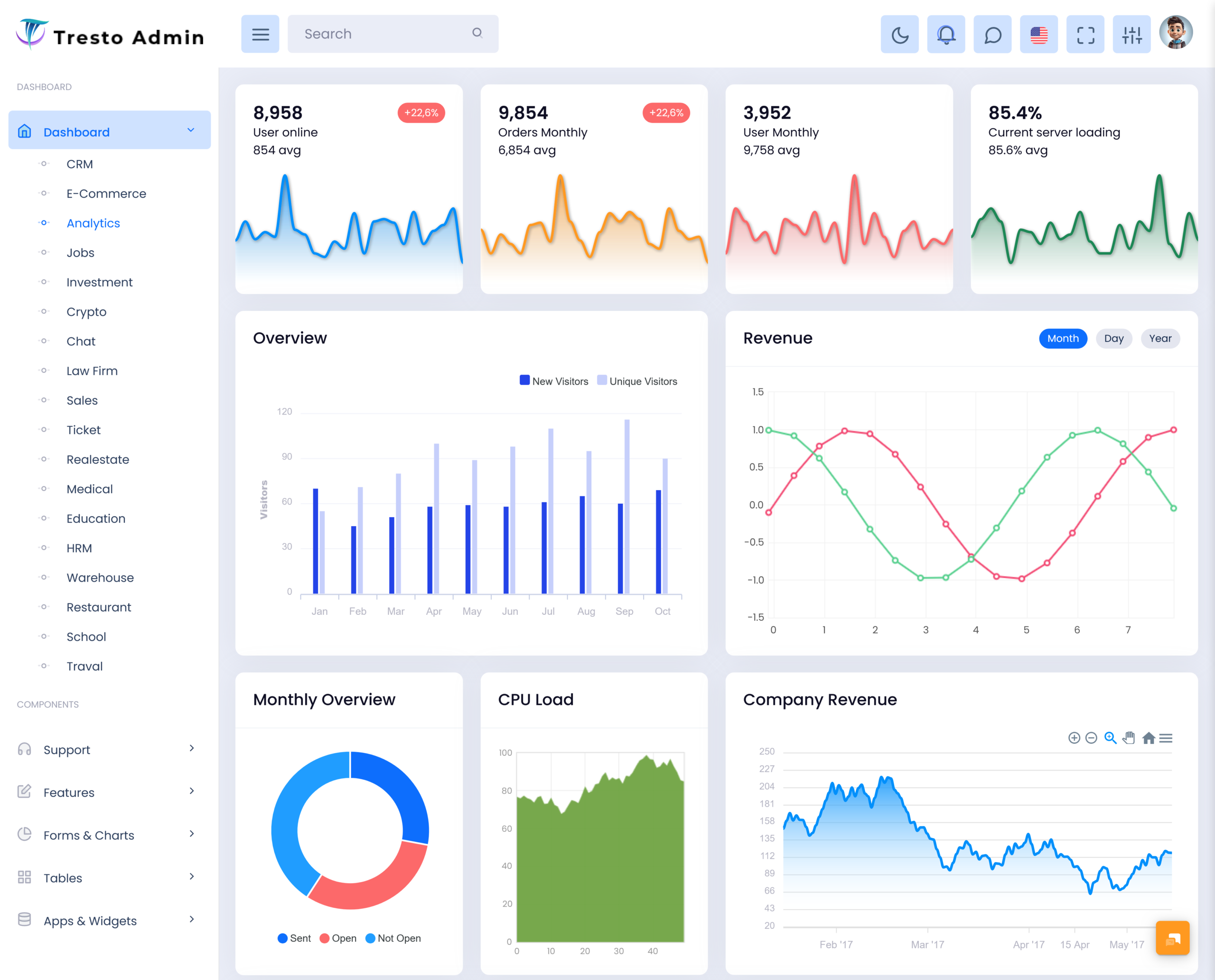
Businesses make a bulk amount of information every day.sales transactions, customer activity, website visits, payments,…
Analytical Dashboard: Turn Business Data into Insights
Reading Time: 9 minutes
An Analytical Dashboard provides firms with a means of analyzing crucial data without being drowned by a massive amount of data. It is not about assigning an equal importance to all figures; rather it allows arranging chosen metrics, comparisons, trends, and indicators in one unified workable perspective. The use of an Analytical Dashboard helps to get insight into the state of affairs in a firm.
Watch Full Video
A well-made dashboard will enable us to answer pertinent questions. Is the performance improvement attributed to a certain product or sales channel? Has there been any change in the activities of customers over a certain period? Is there a performance discrepancy within a certain department? Has there been any unexpected movement in the operational costs? This will need some form of contextual information.
What is an Analytical Dashboard?
An Analytical Dashboard refers to a digital tool that presents business data in a visually comprehensible form for the user to analyze performance, compare information, and detect patterns. An Analytical Dashboard makes use of data points as well as graphical features, such as charts, tables, gauges, comparisons, and trends.
In contrast to a straightforward report, which presents information on a specific date or for a specific reason, an analytical dashboard has the capability to present a wider perspective in terms of how various business processes are interrelated. For instance, a manager may compare income and expenditure figures, look at customer behavior relative to sales outcomes, or evaluate operational performance relative to the past period.
What makes an analytic dashboard valuable is the reduction of the gap between information and comprehension. It would be cumbersome if staff had to visually review hundreds of lines of data before spotting a meaningful change. The right interface can highlight any significant differences, and it gives users the chance to examine the data behind them.
For example, a business may notice that its total sales have increased. That sounds positive, but the overall figure does not explain why. Further analysis may show that one product category generated most of the increase while another declined. A dashboard can help users move from the headline number toward the details that explain the result.
This is also where a Data Visualization Dashboard becomes useful. Visual presentation can make comparisons easier to recognize and help users understand relationships between different measurements. A line can show movement over time, a bar comparison can reveal differences between departments, and a table can provide precise supporting information.
The purpose of an analytical dashboard will differ from person to person. For example, executives might want just an overall picture, whereas department heads may need a bit more detail and analysts would prefer to look at individual data points. Thus, the user interface must be informative but not too complex.
A Business Intelligence Dashboard can move this idea even further by bringing together data from various sections of the business into an integrated view. Rather than seeing single measures, the user sees the broader business picture and bases his plans on facts.
Ultimately, an analytical dashboard is valuable when it helps people understand what the data is saying. The objective is not to display as many charts as possible. It is to make important information easier to interpret and turn it into something useful for business action.
VIEW DEMO BUY NOW
Features of an Analytical Dashboard
An effective Analytical Dashboard should contain features that help users examine information rather than simply view it. The following capabilities can make a dashboard more useful for everyday analysis.
1. Metric Comparison
When comparing values between various time periods, departments, products, geographic regions, or product categories, there could be more significance than just looking at one single value. A dashboard would make it easier to do comparisons and determine what the results mean in terms of growth, decline, stability, or abnormal fluctuations.
2. Trend Analysis
Historical movement can reveal information that a current figure cannot show. Trend analysis allows users to observe how a metric has changed over time. This can help identify recurring patterns, gradual improvements, seasonal behavior, or sudden changes that deserve further investigation.
3. Interactive Data Exploration
It is also possible for people to have varying needs for information depending on what question they would like to ask. The filters provided make it easier for individuals to narrow down from an overview to specifics through interactive features. This helps to give more control while not burdening the dashboard.
4. Contextual Reporting
Numbers become more useful when users understand what they represent. An analytical dashboard can place current results alongside previous values, targets, averages, or relevant categories. This additional context helps prevent users from interpreting a metric in isolation.
5. Data Filtering
Different users may be interested in different segments of information. Filters can allow users to examine selected dates, products, locations, teams, customer groups, or business units. This makes the dashboard adaptable to different analytical requirements.
6. Exception Identification
One useful purpose of analytics is finding situations that do not follow the expected pattern. A dashboard can make unusual changes more visible so users can investigate them. This may include unexpected cost increases, reduced activity, sudden demand changes, or performance deviations.
7. Multiple Data Views
Different information types are easier to understand through different presentation methods. A dashboard may combine charts, tables, summary indicators, and detailed records. This allows users to see the overall picture while retaining access to precise information.
8. Updated Information
If companies handle rapidly changing information, new data might make the dashboard even more valuable to the company. Real Time Insights could provide the company with a better understanding of the current situation if it is important for them to know about it right away.
VIEW DEMO BUY NOW
Turning Business Data into Actionable Insights
The accuracy of raw data does not necessarily translate to easy comprehension. While the spreadsheet may have thousands of entries, the individual examining it might not notice the relevant pattern. The analytical dashboard transforms the format of the data presentation in order for the user to understand the relationships and motion involved.
Imagine a firm that is analyzing their monthly expenditures. The expenditure total will provide information about the amount of money spent but will not provide reasons for why the number changed. Once the data has been sorted out by departments, suppliers, categories, and time, then the firm can analyze the causes of the increase in expenditures.
Such an analysis is important since decision-making is usually not made based on one piece of data. Decision-makers need several pieces of information before taking action.
A Data Visualization Dashboard can make these relationships easier to review. Visual elements allow users to compare information quickly, while filters can help them narrow the analysis to a particular area. This creates a more flexible experience than static reporting.
The same principle applies to customer activity. A company might notice fewer repeat purchases but stronger website traffic. Looking at these figures together could encourage the business to examine whether visitors are converting effectively rather than simply assuming that increased traffic means improved performance.
A Business Intelligence Dashboard can support this broader perspective by connecting information from multiple business functions. When sales, marketing, finance, customer activity, and operations can be viewed within a related analytical environment, management can develop a more complete understanding of business performance.
Benefits of Analytical Dashboard
1. Makes Complex Information Easier to Understand
An Analytical Dashboard makes sure that large volumes of business data are arranged into proper formats. The user will be able to compare key figures, detect changes, and analyze particular aspects without going through each record separately.
2. Supports More Informed Decisions
The better informed the users about the data involved, the better will be business decisions. Analytical dashboard offers necessary information for comparison and trend analysis that can enable managers to analyze situations more objectively rather than going purely by their assumptions and memory.
3. Reduces Manual Reporting Effort
Preparing repeated reports can consume considerable employee time. A dashboard can organize frequently required information into a reusable interface, reducing the need to manually compile the same figures for every review. Teams can then spend more time interpreting results and planning actions.
4. Highlights Important Changes
Small movements may prove hard to detect where information is provided in a big table. The use of visual cues, comparisons, and trends makes it easy for unusual movements to be detected. This helps users investigate any issues before it becomes hard to handle them.
5. Improves Cross-Department Understanding
Various departments have differing viewpoints regarding the business. A common analytical platform can be useful in providing a common platform for information that helps them know how what they do relates to overall organizational performance.
6. Helps Track Progress Over Time
Short-term results do not always give the whole picture. Through the comparison of current results with past periods, it becomes possible for users to know whether the success is short-term or part of a bigger trend.
7. Creates Greater Data Accessibility
An analytics dashboard enables users who have permissions to easily gain access to relevant information without having to refer to multiple reports. With proper filtering and viewing of information, users are able to analyze relevant information without causing any mess in the whole process.
Why Data Visualization Matters in Analytical Dashboards
People often understand visual relationships faster than long blocks of numerical information. This is one reason a Data Visualization Dashboard can be valuable when businesses need to communicate complex findings.
For example, seeing a steady upward trend on a chart may immediately communicate a pattern that would take longer to recognize from a table of monthly figures. Similarly, comparing several categories visually can help users identify which areas are performing differently.
Nevertheless, visualization must facilitate comprehension, not just adornment. When there are too many graphs or when effects are used unnecessarily, or when the format is unsuitable for the information being conveyed, interpretation may be compromised.
A good dashboard therefore combines clarity with context. Users should be able to understand what a metric represents, what period it covers, and why the information matters. This approach makes visualization more useful for actual business analysis.
MultiPurpose Themes: Turning Business Data into Actionable Insights
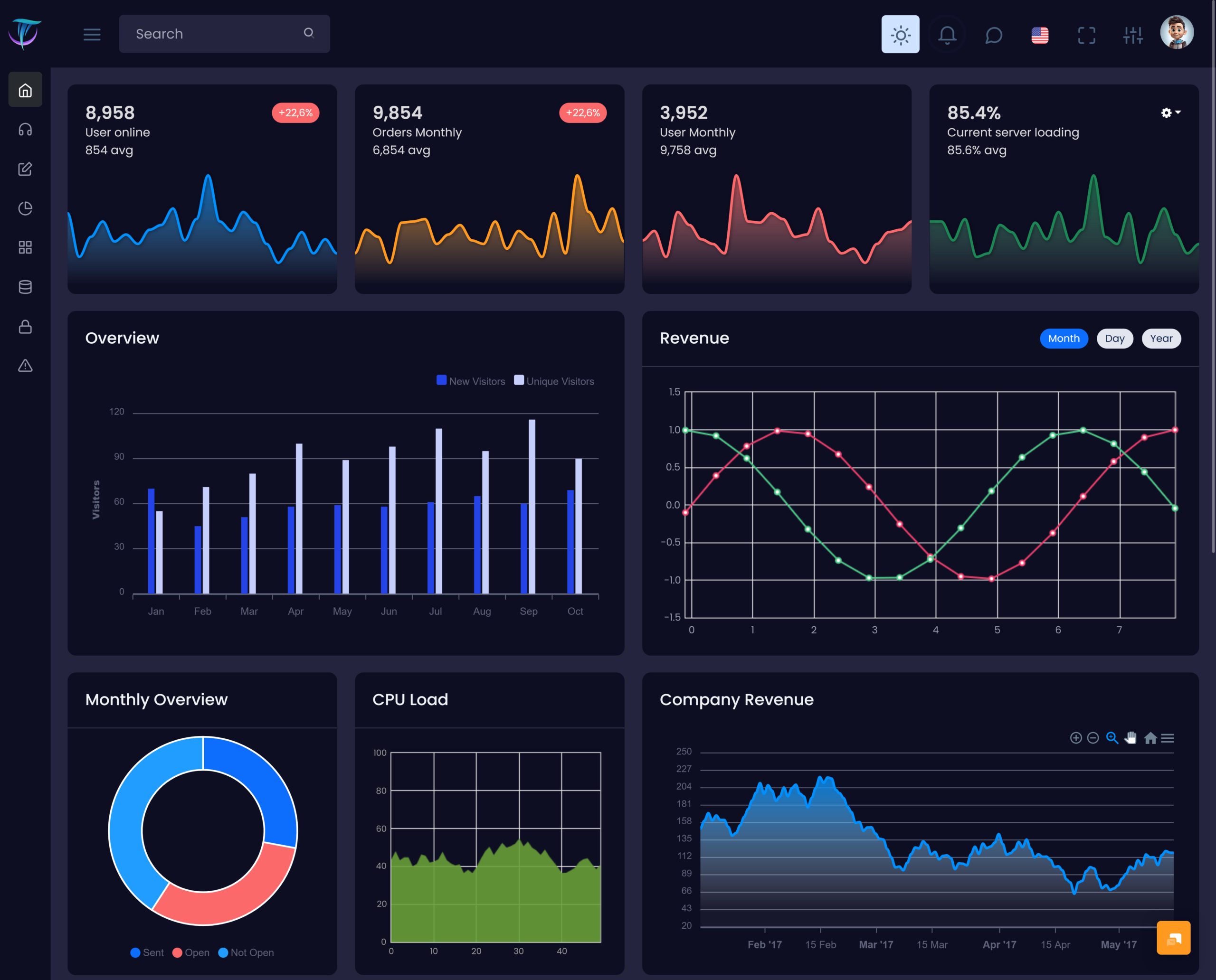
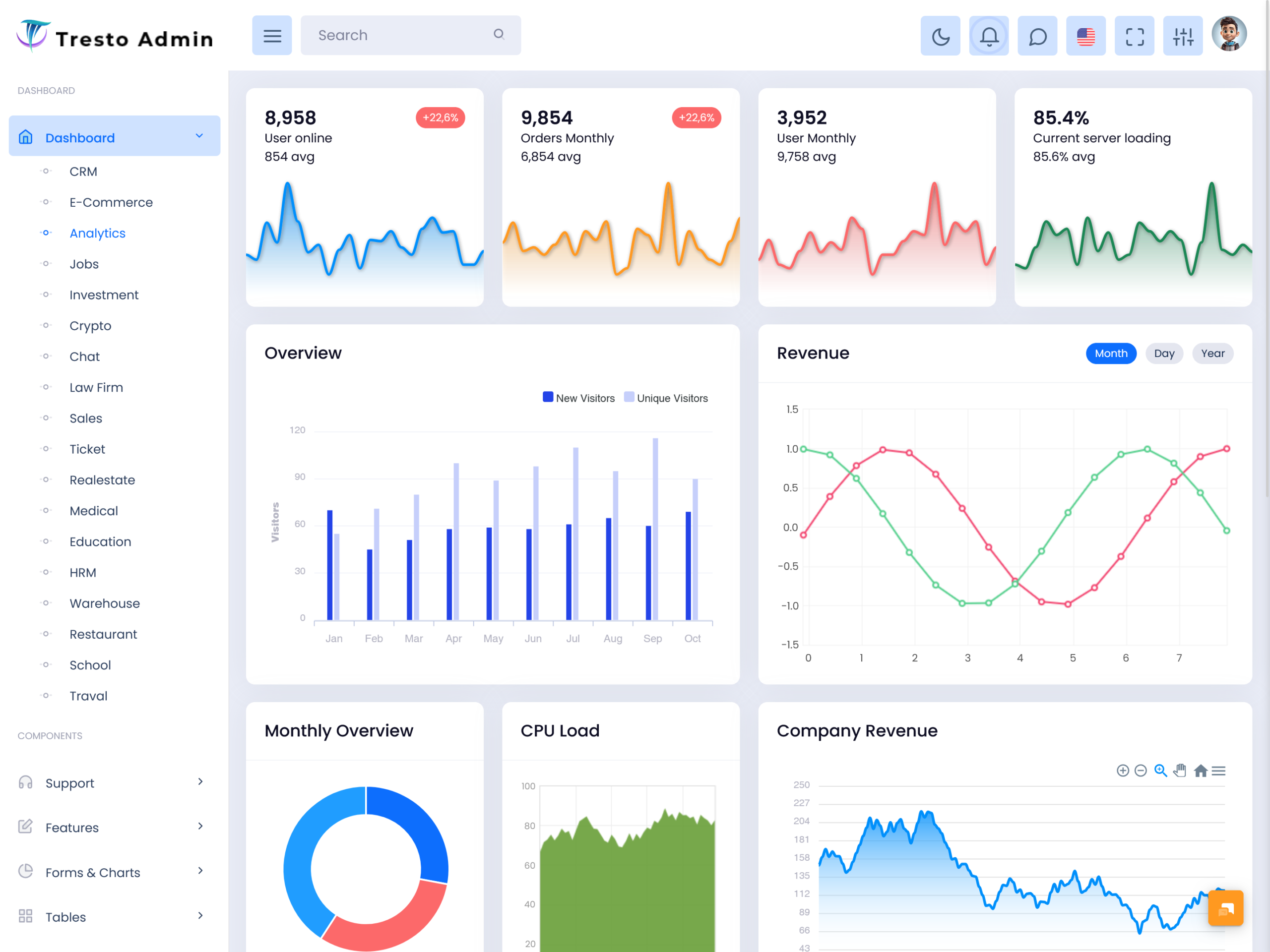
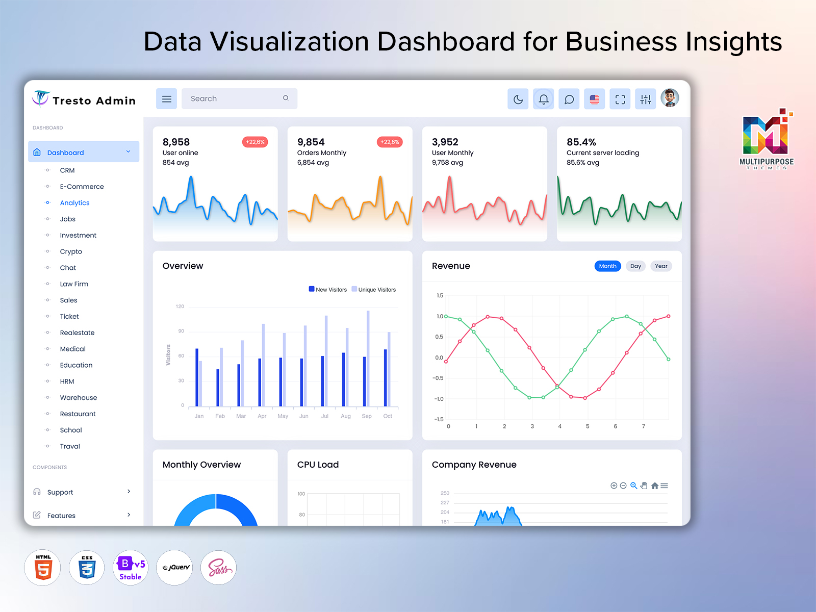
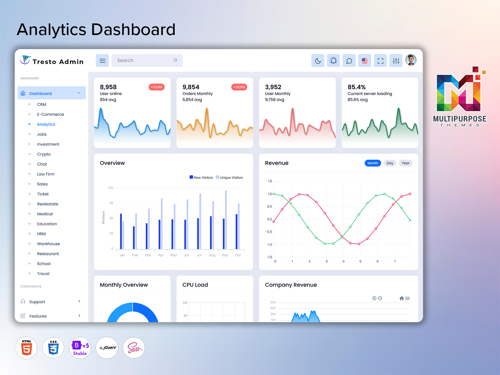
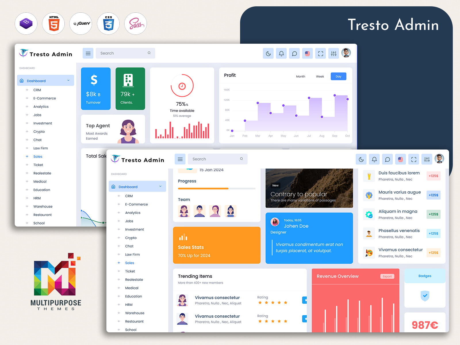
MultiPurpose Themes presents a dashboard known as the Analytical Dashboard. It is meant to offer assistance to business enterprises in analyzing and monitoring critical information through an organized platform. The dashboard features several important information metrics, charts, tables, performance indicators, and views to allow one to analyze the enterprise’s information from various angles. It enables one to observe trends, performance comparisons, changes, and business metrics without going through a lot of unorganized data. Through the organization of information and its various visualization techniques, the Analytical Dashboard from MultiPurpose Themes allows one to present their complex information in an easier way.
Conclusion
An Analytical Dashboard gives businesses a practical way to move from raw information toward clearer understanding. By organizing trends, comparisons, detailed records, and important indicators, it helps users examine what is happening and consider why a particular result may have occurred.
A well-designed Data Visualization Dashboard can make complex information easier to interpret, while a Business Intelligence Dashboard can bring different areas of the organization into a more connected analytical view. When current information is important, Real-Time Insights can further improve awareness and help teams respond to changing conditions.
The strongest dashboards are not necessarily the ones containing the most visual elements. They are the ones that help users answer meaningful questions without unnecessary complexity. When the data is reliable, the interface is clear, and the information is connected to real business decisions, an analytical dashboard can become a valuable tool for smarter planning and more confident management.
Frequently Asked Questions
1. What is the main purpose of an Analytical Dashboard?
The main purpose of a Multi Purpose Themes Analytical Dashboard is to help users understand business information more easily. It organizes important metrics, trends, comparisons, and supporting details so managers and teams can examine performance and make decisions using a clearer view of the available data.
2. What is the difference between an Analytical Dashboard and a regular report?
A regular report often presents information for a specific purpose or period, while an analytical dashboard is generally designed for ongoing exploration. Users can compare information, apply filters, review trends, and investigate particular areas instead of only reading a fixed set of results.
3. Can an Analytical Dashboard provide Real-Time Insights?
Yes, when the connected data sources support frequent or continuous updates. Real-Time Insights can be useful for businesses that need to monitor rapidly changing conditions. However, not every dashboard requires real-time information; the update frequency should match the business process and decision being supported.
4. Why is a Data Visualization Dashboard useful?
A Multi Purpose Themes Data Visualization Dashboard presents information through suitable visual formats that can make patterns, differences, and trends easier to recognize. It can reduce the effort required to interpret large datasets and help users focus their attention on information that may require further investigation.
5. Who can use a Business Intelligence Dashboard?
A Business Intelligence Dashboard can be useful for executives, managers, analysts, sales teams, finance professionals, marketing departments, operations teams, and other authorized users. Each group may use different metrics and views depending on the questions they need to answer.
6. Does an analytical dashboard work with multiple data sources?
It can, provided the dashboard solution supports the required integrations. Combining information from different systems can give businesses a broader perspective, but the data should be properly structured and validated so that users are not comparing inconsistent or incomplete information.
7. What should businesses look for when choosing an Analytical Dashboard?
Businesses should consider data integration, usability, visualization quality, filtering capabilities, scalability, update frequency, security, and customization. Most importantly, the dashboard should support actual business questions and workflows. A simple interface that provides relevant information can be more valuable than a complicated dashboard filled with unnecessary metrics.

Related Posts

This Post Has 0 Comments