
Today, almost every business runs on WebApps. From customer management systems to eCommerce platforms, from…

Why Your Admin Dashboard Deserves Better Than Cookie-Cutter Templates
Reading Time: 4 minutes
You’re staring at yet another admin panel. Rows of data. Boring charts. That same old sidebar navigation you’ve seen a hundred times before. Sound familiar?
Here’s the truth. Most admin dashboard look like they came from the same factory. They work, sure. But they don’t spark joy. They don’t make your users want to log in. And they definitely don’t make your SaaS product stand out. Let’s talk about how to break free from template mediocrity.
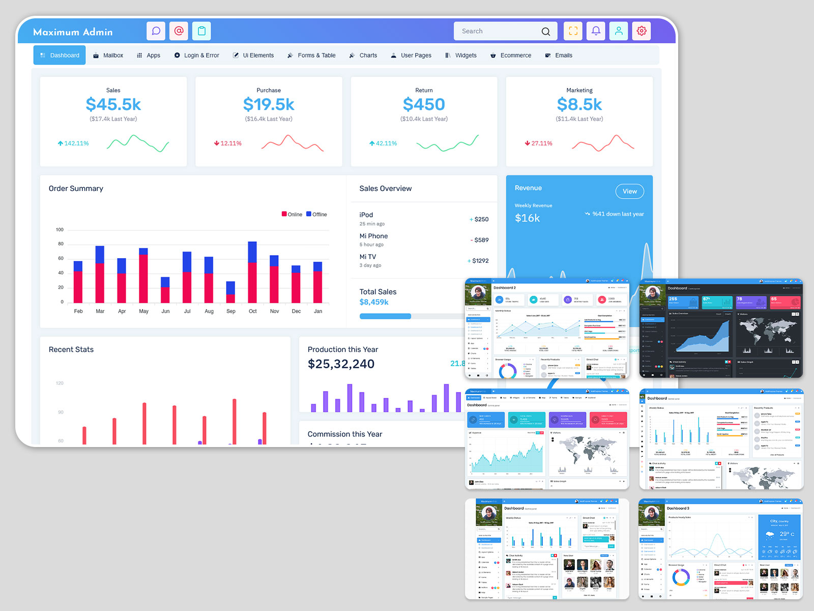
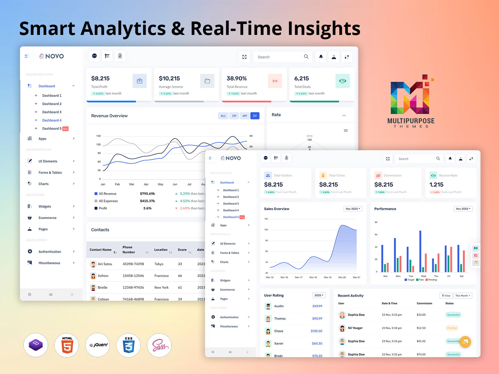
Explore Admin Templates with Dashboard Design
The Template Trap
Walk into any developer forum, and you’ll see the same question pop up weekly. “What’s the best bootstrap admin template for my project?” The answers flood in. Dozens of recommendations. Each one looks professional. Each one promises to save you time. And each one looks almost identical to the last.
This is the template trap. You download a sleek admin template. You customize the colors. You swap out the logo. You call it done. But here’s what happens next. Your users log in. They’ve seen this interface before. Maybe on their last project management tool. Or their previous analytics platform. The familiarity breeds indifference. Your product becomes just another dashboard in a sea of sameness.
What Makes Admin Dashboard Memorable
Think about the admin panels you actually enjoy using. What makes them different? It’s rarely about fancy animations or cutting-edge design. The best dashboards nail three things. They load fast. They show you what matters. And they get out of your way.
Speed matters more than you think. Users notice when your admin dashboard takes three seconds to load. They feel every millisecond of lag when filtering data. A lightweight bootstrap admin template gives you speed by default. But you need to maintain it. Strip out unused CSS. Lazy load your charts. Compress your images. Every kilobyte counts.
Relevance is next. Your users don’t need to see everything at once. They need to see what matters right now. Design your dashboard around user workflows, not feature checklists. Ask yourself: What do my users check first? What actions do they take most often? Build your interface around those answers.
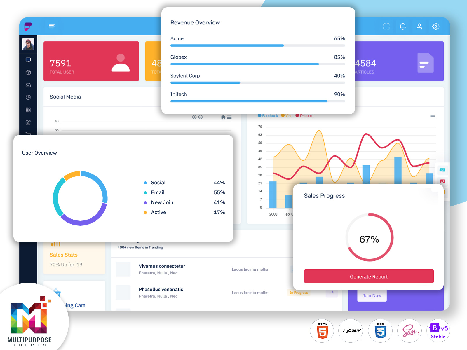
Beyond Bootstrap Basics
Bootstrap gets a bad rap sometimes. Developers call it boring. Designers call it limiting. But here’s the secret. Bootstrap is a starting point, not a destination. The best admin templates built on Bootstrap don’t look like Bootstrap anymore. They use the framework’s grid system and utilities. They leverage its responsive breakpoints. But they add custom components that make the interface unique.
Start with variables. Change your color palette beyond primary and secondary. Define custom spacing scales. Create brand-specific typography styles. Then move to components. Build card layouts that match your data types. Design form elements that guide users through complex inputs. Create data tables that work with your specific content. The framework handles the boring stuff. You handle the personality.
The Hidden Cost of Free Templates
Free admin templates are everywhere. GitHub repos full of them. Template marketplaces giving them away. They seem like a no-brainer for bootstrapped startups. But free comes with hidden costs.
First, there’s the customization debt. That free template includes fifty components you’ll never use. Removing them takes longer than you’d think. Each component connects to others. Pull one thread and watch dependencies unravel.
Second, there’s the support gap. Found a bug? Good luck getting help. The maintainer moved on to other projects. The documentation is sparse. You’re on your own. Third, there’s the security question. When was this template last updated? Does it use outdated dependencies? Are there known vulnerabilities lurking in the code? Premium templates cost money upfront. But they save time in the long run. They come with documentation. They offer support. They receive regular updates. Sometimes free is expensive.
Building for Real Users
Here’s a story. A friend launched a project management tool last year. She spent weeks choosing the perfect bootstrap admin template. She customized every detail. The dashboard looked gorgeous in screenshots. Then real users logged in.
They got lost in the navigation. They couldn’t find basic features. They abandoned complex workflows halfway through. The beautiful interface got in the way of actual work. She learned a hard lesson. Pretty dashboards don’t equal useful dashboards.
Good admin templates solve real problems. They show system health at a glance. They surface errors before they become critical. They make complex data operations feel simple. This means testing with real users. Not just developers. Not just your team. Actual people who will use this dashboard daily. Watch them click around. Note where they hesitate. Ask what confuses them. Then fix it.
The Mobile Question
Most admin dashboards assume desktop users. Big screens. Full keyboards. Plenty of space for data tables and charts. But admins work from everywhere now. They check metrics on their phones. They approve requests from tablets. They troubleshoot issues from coffee shops.
Your admin dashboard needs to work on small screens. Not just technically work. Actually, be usable. This is where responsive design gets real. You can’t just shrink desktop layouts. You need to rethink the interface for mobile contexts. What information is critical on a phone? What actions can wait until desktop? How do you make data tables readable on a four-inch screen? A good bootstrap admin template gives you responsive components. But you still need to design mobile-first workflows.
Performance Under Pressure
Your dashboard looks great with sample data. Ten users. A hundred records. Everything loads instantly. Then you launch. Real data floods in. Thousands of users. Millions of records. Your carefully crafted interface grinds to a halt.
Performance testing isn’t optional. It’s critical. Load your admin template with realistic data volumes. Simulate real user patterns. Find the breaking points before your users do. Consider pagination strategies. Implement virtual scrolling for long lists. Use debouncing on search inputs. Cache frequently accessed data. Speed isn’t a feature. It’s a requirement.
The Path Forward
Choosing admin templates is just the beginning. The real work comes after. Understanding your users. Testing with real data. Iterating based on feedback. Don’t get stuck in template paralysis. Pick something solid. Customize what matters. Ship it. Then improve based on actual usage. Your dashboard doesn’t need to be perfect. It needs to be useful. Start there. The rest follows.
Related Posts

This Post Has 0 Comments