
In today’s fast-moving digital landscape, data is one of the most valuable assets for any…

New-Designed Power BI Dashboard on Bootstrap 5 for Statistical Analysis
Reading Time: 7 minutes
Businesses today run on data. Decision-making, strategy planning, customer targeting, performance evaluation, and revenue forecasting—all depend on how efficiently data is visualized and understood. Traditional dashboards often fall short when it comes to providing real-time insights, interactive visuals, and simplified access to valuable information. Understanding these modern business needs, we have introduced our newly upgraded Power BI Dashboard, designed with a clean, modern, and sales-focused admin interface built on Bootstrap 5 Admin Dashboard technology.
This powerful enhancement is not just an improvement in UI/UX—it is a complete transformation in the way businesses monitor and manage daily operations. The upgraded Power BI Admin Dashboard makes analytics more visual, easier to read, and smarter to act on. It helps organizations turn raw numbers into meaningful insights that accelerate growth, improve customer engagement, and support performance-based decisions with confidence.
From real-time sales analysis to product performance tracking, country-wise comparisons, visual benchmarks, and simplified data storytelling—our Analytical Dashboard provides everything a sales, marketing, or operations team requires to stay ahead in a competitive market. Whether you’re managing thousands of daily orders or monitoring traffic engagement across multiple platforms, this new admin panel brings clarity to complex data with beautiful, intuitive visualizations.
Let’s explore the powerful new features added to our advanced dashboard and how they modernize business analytics.
Explore New Analytical Dashboard of Power BI

BUY NOW DEMO
Features of the New Upgraded Power BI Dashboard
Below are the newly enhanced features explained in detail:
1. Clean and Modern Sales-Focused Admin Interface
The dashboard introduces a sleek and visually balanced interface designed specifically for sales insights and performance tracking. Instead of overwhelming the user with complicated elements, the layout stays minimal, well-structured, and easy to navigate. Icons, typography, and spacing have been thoughtfully crafted to deliver a modern design experience. With this refreshed UI, teams can quickly scan important metrics and understand overall performance at a glance without unnecessary clutter—enhancing productivity and reducing decision delays.
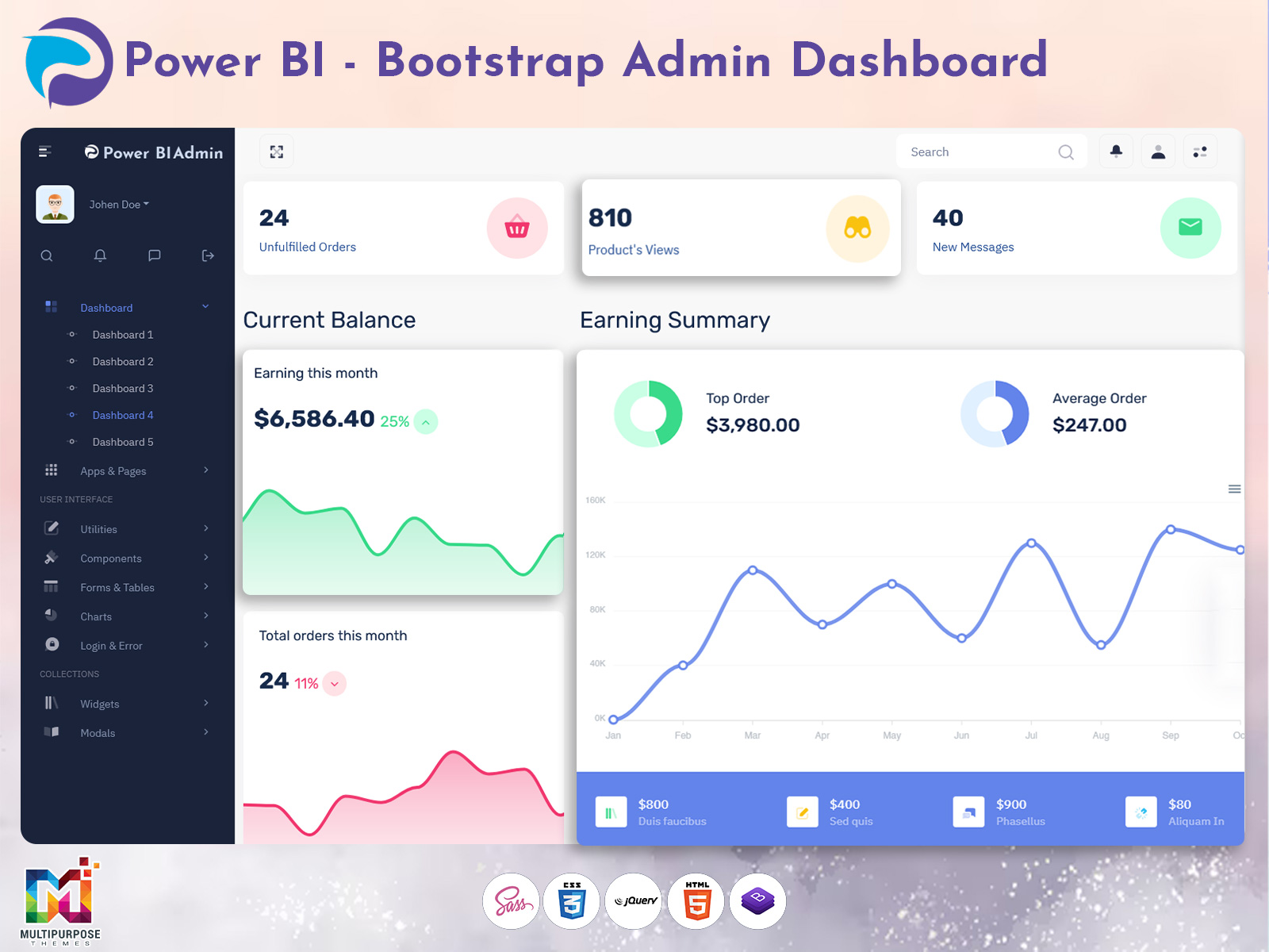
2. Visualize Overall Sales Trends with Intuitive Line Graphs
Tracking monthly and yearly sales performance is now easier with interactive line charts that display trends clearly. This feature allows users to identify growth patterns, peak performance seasons, drops in revenue, and sales fluctuations over time. Managers can instantly detect anomalies, compare previous periods, and adjust sales strategies based on visual data. With smooth interactions and real-time updates, it enables smarter forecasting and planning for inventory, marketing campaigns, and profitability.
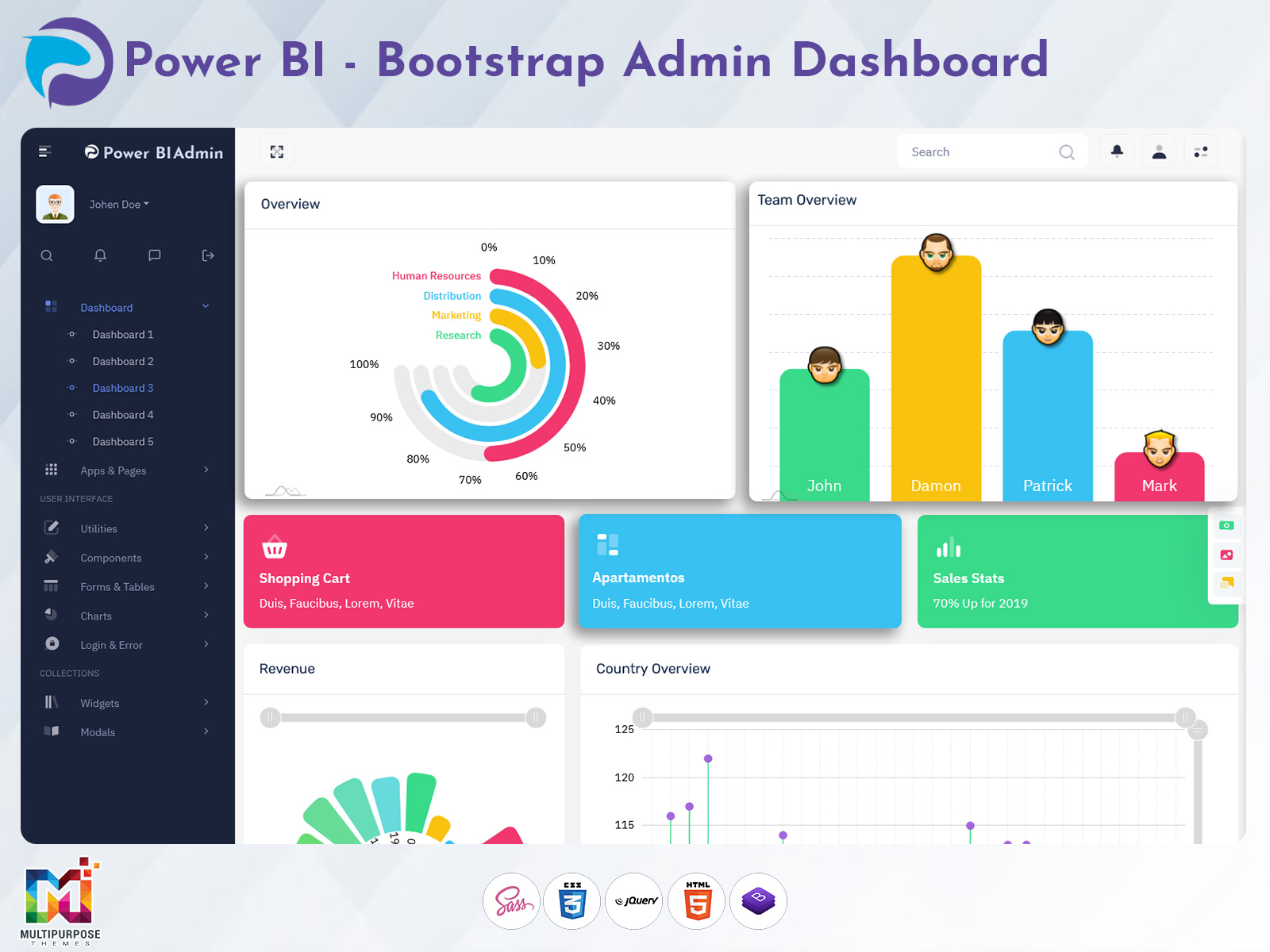
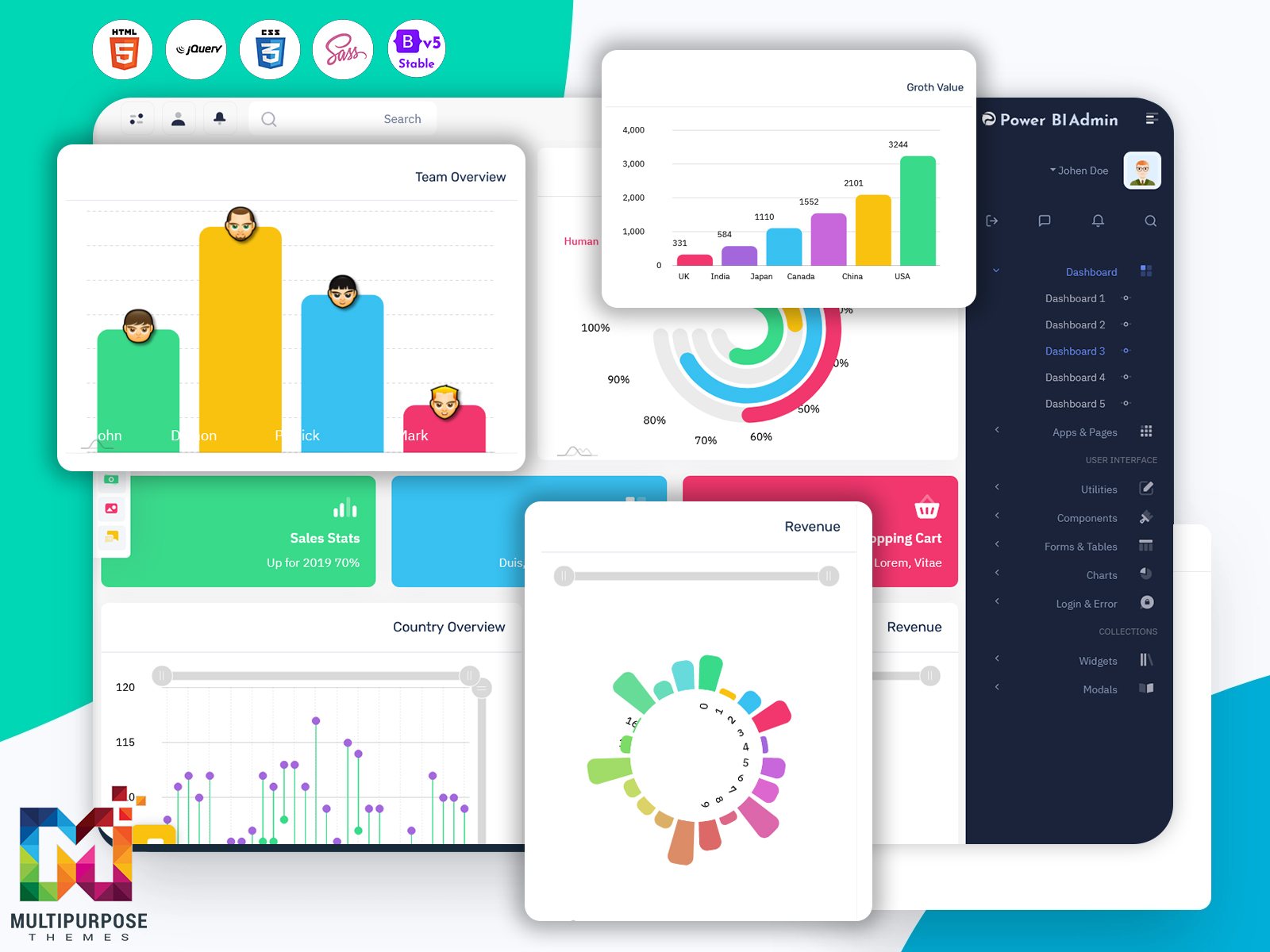
3. Track Purchase Sources Using Interactive Donut Charts
Understanding where customers come from is essential for marketing success. The upgraded Analytical Dashboard includes an interactive donut chart that displays conversion sources such as organic traffic, referrals, social media, paid ads, email marketing, and direct visits. By visualizing these channels, businesses can determine which marketing efforts generate the highest ROI and allocate budgets more strategically. With a single glance, teams can measure channel-wise performance and optimize acquisition strategies.
4. Monitor Visitor Activity Through Bar Charts for Better Insights
User activity analytics help brands improve engagement and conversion rates. The dashboard includes advanced bar charts that allow businesses to study visitor behavior—tracking traffic spikes, device usage, session duration, and activity distribution over different time periods. These insights help identify what customers prefer, which pages or campaigns attract the most attention, and where improvements may be required. With accurate behavioral data, marketing teams can build stronger customer experiences.
5. Quick-View Cards for Unfulfilled Orders, Product Views & New Messages
This feature supports instant monitoring of essential performance indicators. Instead of browsing multiple pages, quick-view cards instantly show counts for pending or unfulfilled orders, product view statistics, unread customer messages, and other important updates. These data cards save time and ensure zero delays in operations. Teams can act quickly, respond faster to customer needs, and maintain smooth workflow operations.
6. Compare Country-Wise Sales for Targeted Analysis
Global businesses require location-based analysis to understand regional demands and performance. With country-wise comparison charts, users can identify top-performing territories, analyze regional buying trends, and optimize product distribution based on sales strength. This feature helps uncover opportunities for expansion, localized marketing campaigns, and stock allocation for maximum efficiency. It also assists decision-makers in setting more accurate revenue goals country-by-country.
7. Detailed Sales History Section with Product Details & Status Updates
The upgraded dashboard includes an improved and detailed sales history section that provides real-time transactional logs with complete product data, order tracking, status updates, and quantity insights. Every order can be reviewed with clarity, and managers can follow every phase—order received, packed, shipped, delivered, or canceled. This granular visibility enhances transparency, supports customer service, and simplifies performance reporting.
8. Simple, Organized & Visually Appealing Layout for Fast Decision-Making
The structure of the interface is built with simplicity and business efficiency in mind. Elements are arranged to provide immediate clarity without requiring users to search through layers of information. The focus is to give users the ability to make confident decisions quickly using well-designed charts, clear headings, smart spacing, and attractive typography. Even for beginners, the platform feels intuitive and easy to understand.
9. Designed to Improve Sales Tracking & Customer Management Efficiency
The modernized dashboard is specifically engineered to improve business workflow efficiency. With real-time data updates and easy access to sales records, organizations can maintain better control over performance and customer relationships. This results in faster responses, more strategic planning, improved conversion rates, and higher customer satisfaction. In short, the upgraded Power BI Dashboard helps transform raw data into meaningful actions.
Discover More Data Visualization Dashboard of Power BI
Dashboard – 1
BUY NOW DEMO
Dashboard – 2
BUY NOW DEMO
Dashboard – 3
BUY NOW DEMO
Dashboard – 4
BUY NOW DEMO
Dashboard – 5
BUY NOW DEMO
Industries Suitable for This New Power BI Dashboard
1. E-commerce & Online Retail
The new Power BI Dashboard is highly beneficial for e-commerce businesses to track real-time orders, product performance, customer engagement, and revenue growth. Retail owners can visualize sales trends, compare marketing sources, and monitor inventory movement using analytical charts. With insights on top-selling categories, abandoned carts, and country-wise demand, businesses can optimize pricing strategies, improve conversions, enhance customer satisfaction, and scale revenue with data-driven decisions. This dashboard makes store management smarter, faster, and more reliable.
2. Manufacturing & Production
Manufacturing industries can use this upgraded dashboard to analyze production output, workflow efficiency, stock levels, and supply chain performance with real-time visibility. Interactive charts provide insights into material usage, equipment performance, and process bottlenecks. Managers can monitor order fulfillment speed, production schedules, and customer delivery timelines effortlessly. With detailed performance analytics, manufacturers can reduce downtime, enhance productivity, control operational expenses, and ensure consistent quality improvement across units, empowering smarter decision-making and long-term growth.
3. Healthcare & Pharmaceutical Industry
Healthcare and pharmaceutical organizations can leverage this Analytical Dashboard to monitor medicine supply chains, hospital operational analytics, patient service efficiency, and purchase sources with accuracy. The dashboard helps track inventory consumption, vendor performance, prescription trends, and region-wise demand forecasting. With clean visuals and real-time data, hospitals and distributors can improve resource planning, reduce waste, ensure product availability, and streamline workflow operations for better patient care and distribution management.
4. Finance, Banking & Investment Firms
This Power BI Admin Dashboard supports financial and banking institutions in monitoring profits, transactions, customer activity, and investment performance through detailed visual analytics. Businesses can track interest income, loan approvals, policy growth, and market trends in real time. The dashboard assists wealth managers in comparing portfolios, risk control, and forecasting market opportunities using clean financial charts. With organized insights and secure data handling, finance teams can make informed decisions faster and enhance customer trust.
5. Logistics & Supply Chain Industry
Logistics companies can utilize the dashboard to track fleet activity, order delivery timelines, shipment status, and route performance all in one place. With visual charts displaying delivery efficiency, transport costs, and region-wise performance, businesses can optimize routes and reduce operational delays. Detailed sales and order tracking support accurate forecasting and resource distribution. This analytical tool enables logistics managers to improve delivery experience, reduce costs, and enhance overall supply chain productivity.
6. Education & eLearning Platforms
Educational institutions and eLearning platforms can use the Power BI Dashboard to track student engagement, course performance, registrations, and activity insights. Admins can visualize assessment results, attendance patterns, and faculty productivity through clean bar and line charts. With real-time data comparison and intuitive analytics, organizations can improve learning strategies, increase performance transparency, and manage operations efficiently. This structured dashboard helps decision-makers create better academic planning and learner experiences.
7. Travel, Tourism & Hospitality
Travel and hospitality industries can monitor booking trends, customer interest analytics, package performance, seasonal patterns, and revenue growth with visually rich insights. Using donut and line charts, managers can track purchase sources, regional traffic, and guest feedback in real time. The dashboard supports targeted promotional planning and improves service quality monitoring. With actionable insights, tourism businesses can enhance customer satisfaction, optimize resource allocation, and boost overall profitability.
8. Real Estate & Property Management
Real estate businesses can track property inquiries, bookings, location-wise performance, pricing trends, and marketing lead sources through comprehensive visual analytics. The dashboard enables developers and agents to compare ROI, analyze project performance, and forecast demand based on buyer preferences. Quick data access enhances decision-making regarding new project launches, budget distribution, and customer follow-ups. The visually organized interface helps manage sales pipelines efficiently and close deals faster.
Conclusion
The newly upgraded Analytical Dashboard powered by Power BI Dashboard and built with Bootstrap 5 Admin Dashboard design brings a modern, visually engaging, and performance-driven experience to businesses. It is a transformative data analytics solution that eliminates complexity and offers crystal-clear insights. From analyzing global sales performance to monitoring orders, tracking communication, visualizing growth trends, and managing customer engagement—this dashboard empowers decision-makers to act smarter, faster, and more accurately.
By converting difficult statistics into beautiful visual charts and actionable insights, our dashboard becomes the perfect partner for every business aiming for growth and efficiency. Whether you are a small business owner, marketing manager, operations executive, or enterprise leader—this solution will help take your performance visibility to the next level.
FAQs
1. What is a Power BI Dashboard?
A Power BI Dashboard is a visual data analysis tool that represents complex business metrics through charts, graphs, and real-time insights for smarter decision-making.
2. What makes this new dashboard different from older versions?
It offers improved UI, modern design, advanced analytics, quick-view cards, country-wise comparison, better sales visualization, and faster performance.
3. Can businesses customize the analytics and charts?
Yes, the dashboard is fully customizable and allows businesses to modify charts, filters, and data visuals according to their workflow requirements.
4. Which industries can use this Analytical Dashboard?
It is ideal for e-commerce, finance, logistics, healthcare, manufacturing, real-estate, education, and marketing companies.
5. Does the dashboard support real-time data monitoring?
Yes, real-time updates ensure faster decision-making and accurate evaluation of performance across all essential KPIs.
6. Are the charts interactive and responsive?
Absolutely. All graphs and metrics are interactive, responsive, and mobile-friendly for easy access on any device.
7. Is Bootstrap 5 Admin Dashboard technology used?
Yes, the dashboard is designed using modern Bootstrap 5 Admin Dashboard architecture for improved performance and faster load time.
8. How does the dashboard help track sales performance?
With line charts, sales history sections, quick-view cards, and country-level insights, businesses monitor sales progress efficiently.
9. Can users manage customer messages and queries?
Yes, quick-view message cards help ensure no customer request is missed, improving support and engagement.
10. Is this dashboard suitable for large organizations?
Yes, it scales smoothly for both small businesses and large enterprises with heavy data analytics needs.
Related Posts

This Post Has 0 Comments