
Today, almost every business runs on WebApps. From customer management systems to eCommerce platforms, from…
Admin Dashboard – Upgraded with Smart Analytics & Real-Time Insights
Reading Time: 7 minutes
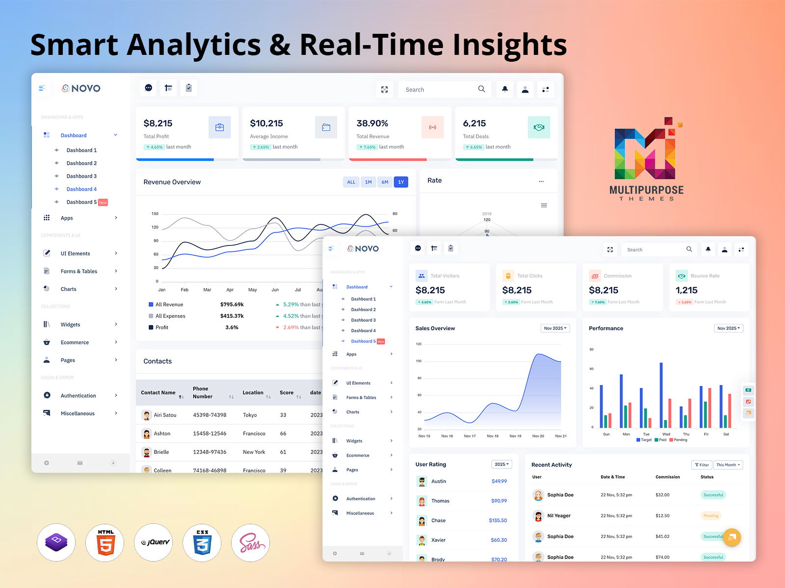
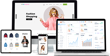
We are excited to introduce a new Dashboard Template added to our existing Bootstrap 5 Admin Template, designed to make business monitoring, performance tracking, and management operations smarter and more efficient. This newly added Admin Dashboard is created with modern UI design principles, smart data visualization tools, and smooth navigation, making it easier for administrators, team leaders, and managers to access real-time business insights. Built with clean code structure and responsive layouts, this Bootstrap Admin Dashboard works seamlessly on desktops, tablets, and mobile screens, ensuring every user can access essential KPIs anytime and anywhere without compromise.
Our new dashboard gives a complete snapshot of sales updates, financial performance, user engagement, project progress, activity status, communication tracking, and workflow planning. It combines visual data representations such as graphs, bar charts, radar charts, and interactive tables to help teams make informed decisions effortlessly. As part of our WebApps Template collection, this upgrade aligns perfectly with today’s fast-moving digital business environment, where speed, accuracy, and clarity are essential for growth.
From improved performance indicators to beautifully designed interfaces, this dashboard helps organizations minimize complexity and simplify daily operations. Whether you want to monitor revenue trends, evaluate staff productivity, manage contacts, or analyze email activities, everything is intelligently placed in one powerful centralized panel. Our goal is to offer a highly practical and deeply optimized solution that supports decision-making and boosts business outcomes with minimal effort.
Explore New Dashboard of Novo Admin
BUY NOW DEMO
Why Choose Our New Dashboard
Our new Dashboard Template stands out because it is designed for real-world business needs rather than theoretical data structures. Every section of the dashboard has been crafted after researching how managers work, what kind of information they prioritize, and how they interact with analytics. We believe that a perfect dashboard is not just about displaying numbers, but about presenting them in meaningful and easy-to-understand ways. That is why this Bootstrap 5 Admin Template focuses on clean visualization, user-friendly design, and logical content placement.
Unlike traditional dashboard layouts that look confusing and require heavy training, our Bootstrap Admin Dashboard allows users to begin analyzing data instantly. The interactive charts, categorized tables, and real-time statistics give immediate clarity and help reduce the time it takes to process information. The dashboard’s flexible structure makes it suitable for various industries, and organizations can customize it according to their internal processes without technical complexity.
The dashboard also emphasizes faster performance and reduced load time through optimized code and efficient back-end integration. The interface supports intuitive navigation, allowing users to jump from sales reports to contact details, activity tracking, or task management in seconds. With improved security structure and browser compatibility, teams can confidently perform their daily operations without interruptions. This is not just another addition to our WebApps Template, but a carefully developed business-friendly tool that transforms data into action.
Key Features
Overview Section
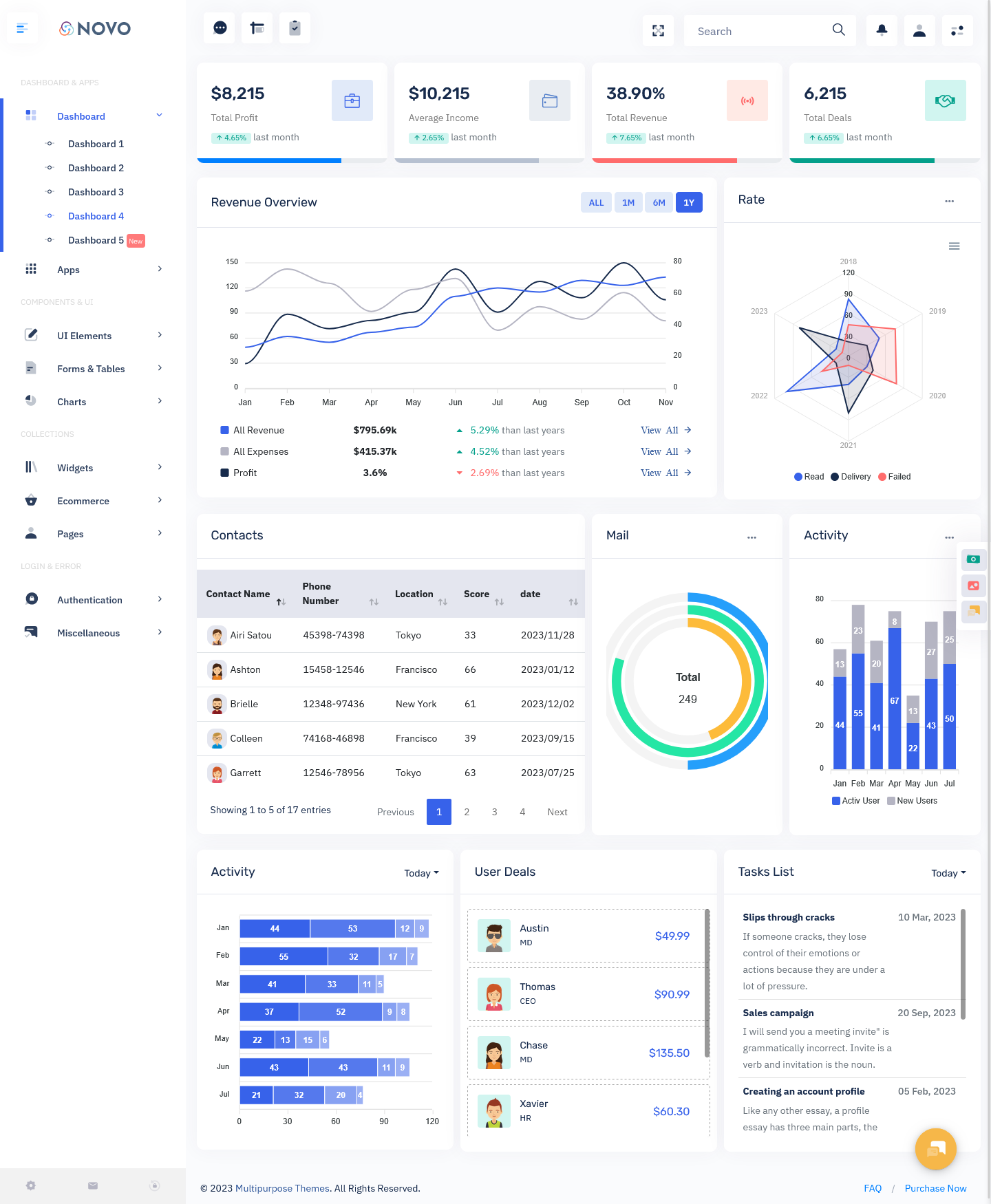
The Overview section of our new Bootstrap 5 Admin Dashboard shows essential business metrics such as total profit, average income, revenue performance, and financial comparison with previous months. This gives managers access to instant financial visibility without having to generate separate reports. The clean graphical charts transform raw numeric data into simplified patterns that can be understood at a glance. By reviewing month-to-month progress, businesses can identify growth trends, plan future strategies, and understand seasonal performance shifts. Decision-making becomes faster because everything is visually represented in one place. The Overview removes complexity and focuses on clarity, enabling business owners and analysts to evaluate organizational health in real-time and take action when required.
Rate Performance Analytics
The Rate Performance feature uses a radar chart that displays performance results across multiple years, tracking different metrics such as reads, deliveries, and failed attempts. This data visualization method simplifies complex performance tracking by allowing managers to compare results between the past and the present seamlessly. Instead of analyzing bulk datasets manually, the radar chart highlights progress gaps and strengths clearly. It becomes easy to understand where improvement is needed or which area is performing best. This feature especially supports marketing teams, communication specialists, and sales leaders who depend heavily on activity-based metrics. By presenting multi-year comparisons, organizations can set measurable targets and build future strategies with confidence.
Contacts Management System
Our Contacts Management area displays all contact details with their interaction history, engagement score, and recent communication activity. This single integrated table helps teams maintain organized records without handling multiple spreadsheets. Managers gain deep insight into lead value, interaction frequency, and relationship status instantly. It improves customer relationship management because teams can follow up more effectively and prioritize high-value contacts. Built into the Bootstrap Admin Dashboard, this system eliminates outdated and messy manual processes and transitions everything into a structured automated workflow. The ability to maintain clean and accurate contact history supports higher conversion rates and builds stronger client relationships.
Mail Overview Panel
The Mail Overview shows the total volume of emails, categorized statistical values, and activity tracking over time. For example, if the system displays 249 total mails, managers can review communication load and response flow instantly. It helps organizations evaluate communication efficiency and track mail handling progress across departments. Instead of checking separate inbox systems manually, users get a clear visual breakdown in the dashboard itself. This enhances the transparency of communication workload and allows businesses to detect bottlenecks quickly. It is a practical, simple, and powerful enhancement for growing teams handling large communication volumes.
Activity Tracking Insights
Activity Tracking shows monthly performance and user activity through a modern interactive bar chart. This provides a clear view of how active users have been over different months and identifies engagement patterns over time. It supports operational planning by identifying when productivity is highest and lowest, helping to optimize internal scheduling. Rather than making assumptions about performance cycles, managers can rely on actual data. The interface is visually appealing yet extremely easy to understand, making it effective for team leaders, HR managers, analysts, and project managers.
User Deals Monitoring
The User Deals section presents a structured table that displays deal amounts, client names, and team members responsible for closing the deals. With this feature, organizations can track revenue contributors, identify top performers, and evaluate conversion rates with high accuracy. Managers can guide their teams better by reviewing performance results instantly. This type of clarity allows organizations to optimize sales strategy and resource planning. Every deal is recorded transparently, promoting accountability and smoother workflow management.
Task Management Panel
The Task Management section lists pending, ongoing, and upcoming tasks along with deadlines, task descriptions, and responsible members. It eliminates confusion and manual scheduling issues by placing task progress in front of the user clearly. This encourages better time management and helps ensure that important deliverables are never missed. It ensures team synchronization and supports better project planning. This feature transforms daily work into a structured workflow system that keeps productivity active and measurable.
Interactive Charts and Graphs
Interactive charts enable users to review performance visually without going through lengthy report files. Clear visual data provides actionable insights quickly and boosts decision accuracy. These intelligent charts convert complex business metrics into easy-to-digest visuals, reducing effort and saving time for managers who rely heavily on analytics.
Search Bar System
The search bar allows instant access to specific data within the dashboard, eliminating long navigation processes. This saves time and makes the dashboard more efficient and user-friendly.
User-Friendly Modern Design
Every element is designed with usability in mind. The interface is clean, modern, visually balanced, and easy to navigate, which makes working with real-time data comfortable and stress-free even for non-technical users.
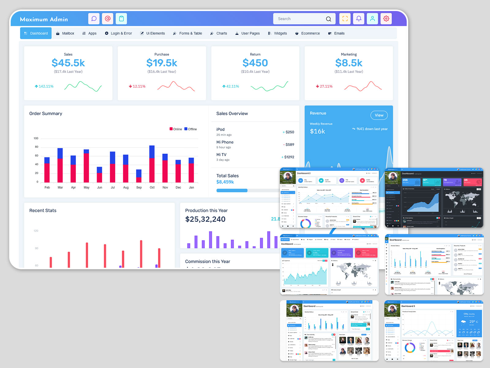
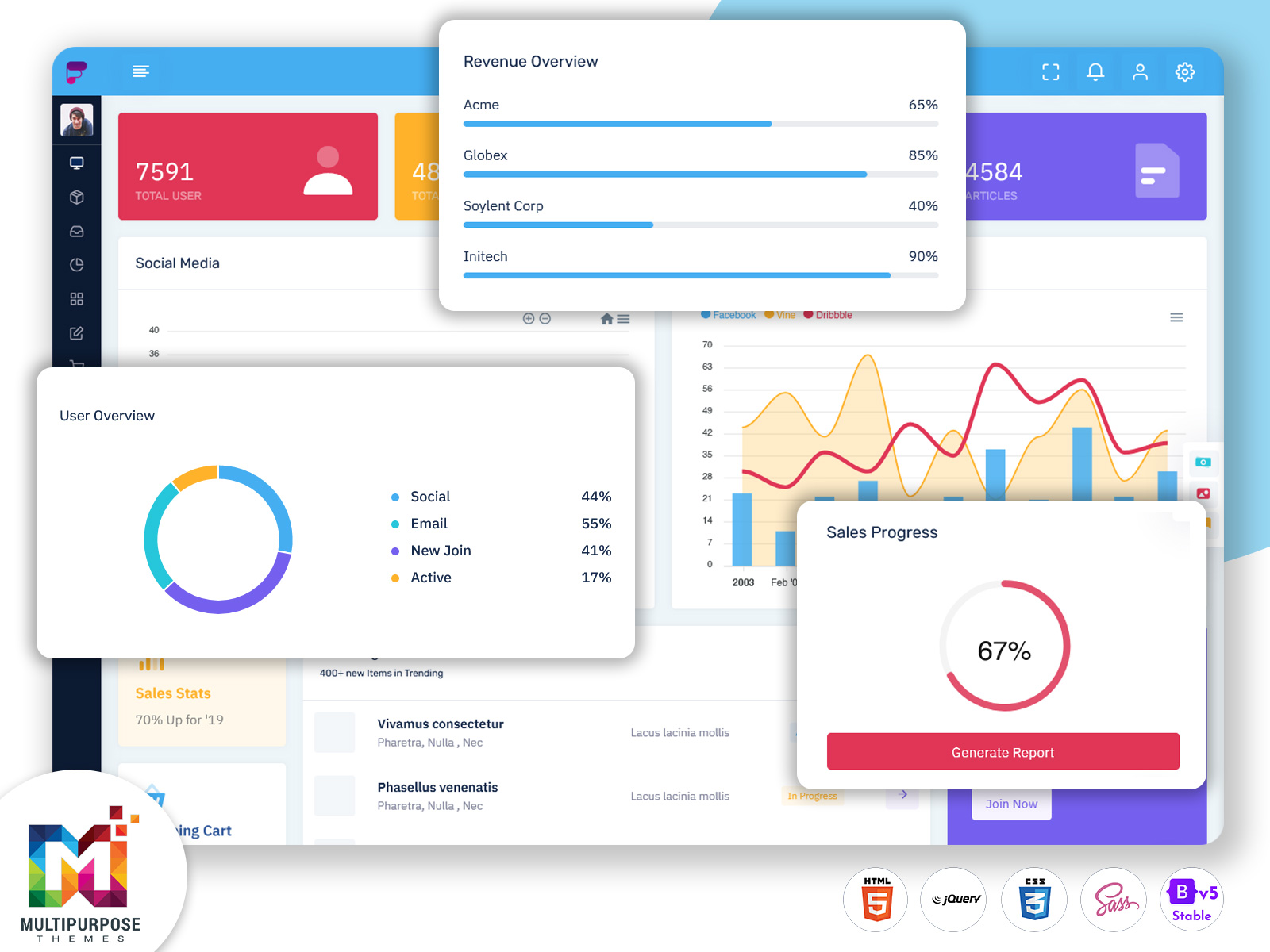
Explore Other Dashboards of Novo Admin
Dashboard: 1
BUY NOW DEMO
Dashboard: 2
BUY NOW DEMO
Dashboard: 3
BUY NOW DEMO
Latest Upgraded Dashboard
BUY NOW DEMO
Who Can Use This Dashboard
Software Development Companies
Software companies manage extensive client tasks, project tracking, sales reports, and user activity metrics. This Dashboard Template offers everything they need in one place, helping project leaders, developers, and managers maintain clear insight into deadlines, tasks, bugs, resource usage, and performance. With the integration of task management and activity tracking, teams can avoid delays and ensure stable delivery cycles. It helps streamline communication while improving team productivity and achieving better project outcomes.
Digital Marketing Agencies
Marketing professionals rely heavily on analytics. Using our Bootstrap 5 Admin Template, agencies can track campaign performance, lead generation activity, contact engagement, and email interactions. The radar chart and activity tracking tools help them visualize results clearly and identify strategies that work. It provides valuable insights for campaign planning, audience targeting, and performance monitoring, helping agencies deliver better ROI for their clients.
E-Commerce Businesses
E-commerce owners track daily sales, profit margins, conversion results, customer activity, shipment reports, and email interactions. With our powerful Admin Dashboard, they can view revenue growth trends, evaluate incoming orders, and manage operational workflows smoothly. Real-time analytics support smarter inventory purchasing and seasonal pricing decisions. It is an ideal performance tool for sustaining sales growth.
Finance & Accounting Firms
Financial organizations need quick access to profits, revenue tracking, comparison charts, and client deal history. The Overview and Deals sections allow consultants and accountants to manage reports, maintain accuracy, and evaluate financial outcomes instantly. Clients also benefit from transparent financial planning and improved advisory services.
Business Startups
Startups operate on rapid decision-making cycles and require easy visibility of business health. With interactive analytics and contact management, startup founders can plan growth strategies, track investments, monitor sales speed, and organize upcoming tasks. This powerful tool reduces time spent on manual reporting and increases focus on innovation.
Educational Institutes
Schools, colleges, and educational training centers can use the Bootstrap Dashboard to manage student information, event activity, fee revenue, communication tracking, and academic tasks. It ensures transparency and better workflow distribution across staff departments.
Corporate Enterprises
Enterprises with multiple teams need centralized management software. This dashboard supports employee performance tracking, project scheduling, and workflow planning. It improves communication and ensures all departments move in sync.
Conclusion
Our new Admin Dashboard is not just an interface upgrade, but a complete business intelligence environment created to simplify performance tracking and improve operational clarity. Built on the strength of Bootstrap 5 Admin Template architecture and developed as a premium WebApps Template, this tool transforms raw data into meaningful insights that drive real action. The clean UI, real-time analytics, interactive charts, and seamless navigation ensure a smooth experience for every type of organization.
By integrating financial data, communication history, team activities, task overview, and performance metrics into one place, this dashboard empowers managers to lead more effectively, make stronger decisions, and enhance business productivity with confidence.
FAQs
What is the purpose of this new dashboard?
The purpose of this new dashboard is to offer a centralized system where administrators and managers can monitor sales performance, financial health, contacts, activities, and tasks in real-time. It improves productivity by providing quick access to essential business metrics.
Can this Dashboard Template be customized easily?
Yes, since it is built on Bootstrap 5 Admin Template, customization is flexible, allowing users to modify layouts, add or remove components, and adjust styling to match their business requirements.
Is this dashboard suitable for mobile devices?
Absolutely. It is fully responsive and works smoothly on mobiles, tablets, laptops, and large screen displays, delivering a consistent and user-friendly experience across all devices.
Who should use this Admin Dashboard?
This dashboard is ideal for startups, corporate businesses, e-commerce firms, software agencies, marketing agencies, educational institutions, and financial consultants who need real-time performance visualization and efficient workflow management.
Does this dashboard include data visualization tools?
Yes, it includes interactive charts, radar graphs, bar charts, and visual performance indicators that transform numbers into easy-to-understand graphical analytics.
Related Posts


This Post Has 0 Comments