In today’s digital world, every business depends on powerful web applications to manage operations, users,…
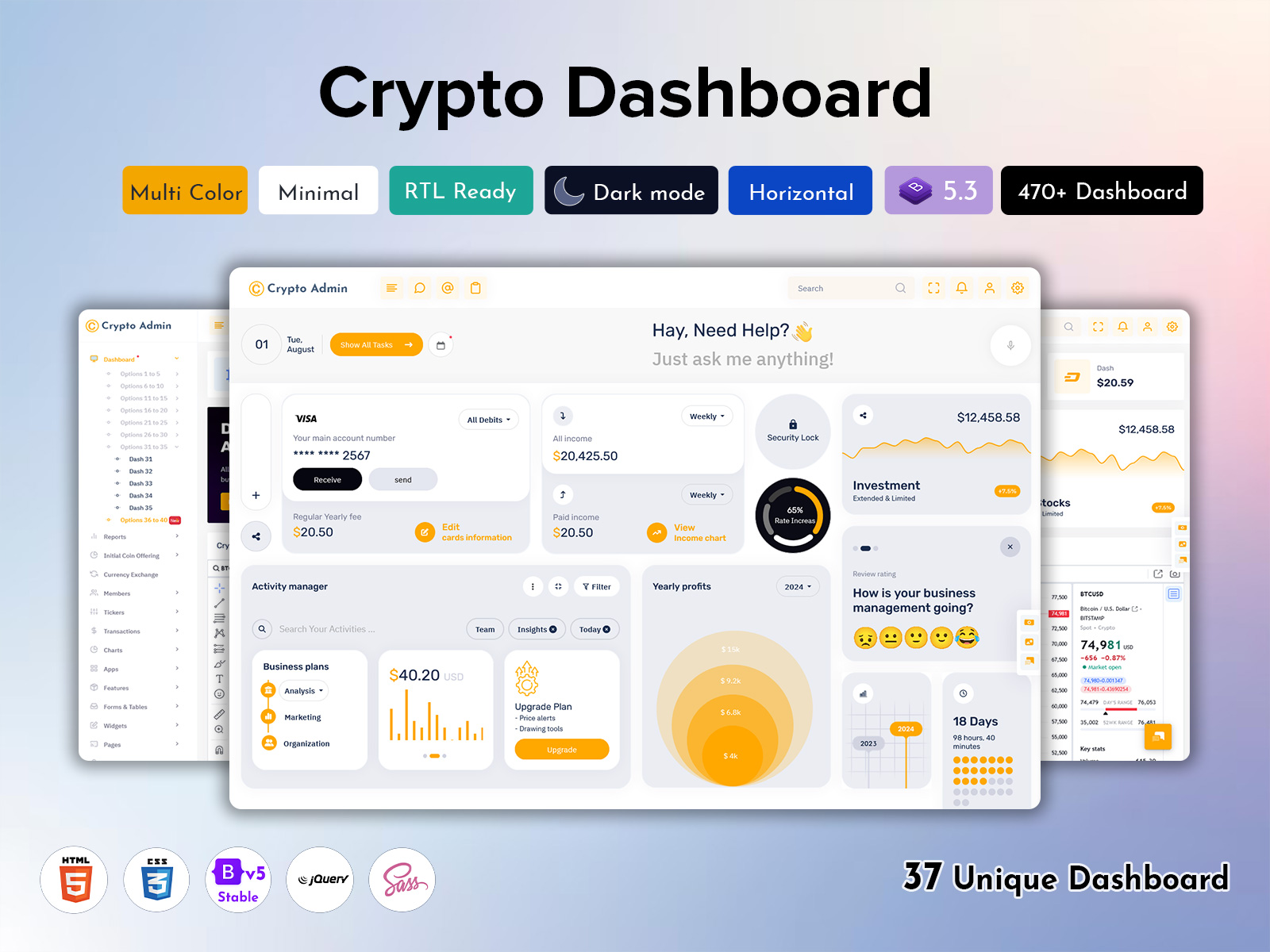
Intuitive Crypto Dashboard Tips for Creating User-Friendly Interface
Reading Time: 5 minutes
As cryptocurrencies continue to grow in popularity, more and more crypto traders are looking for solutions that allow them to easily track coins, manage portfolios, and analyze market data. This is where well-designed Crypto Dashboard come in. An intuitive and user-friendly dashboard can greatly enhance a trader’s efficiency and effectiveness.
However, creating an easy-to-use yet powerful Investment Dashboard interface comes with its fair share of challenges. You need to display complex data in a simple way while also ensuring advanced customization and flexibility. This article provides tips on how to design engaging crypto admin templates and dashboards that delight users.
Follow Visual Hierarchy Principles
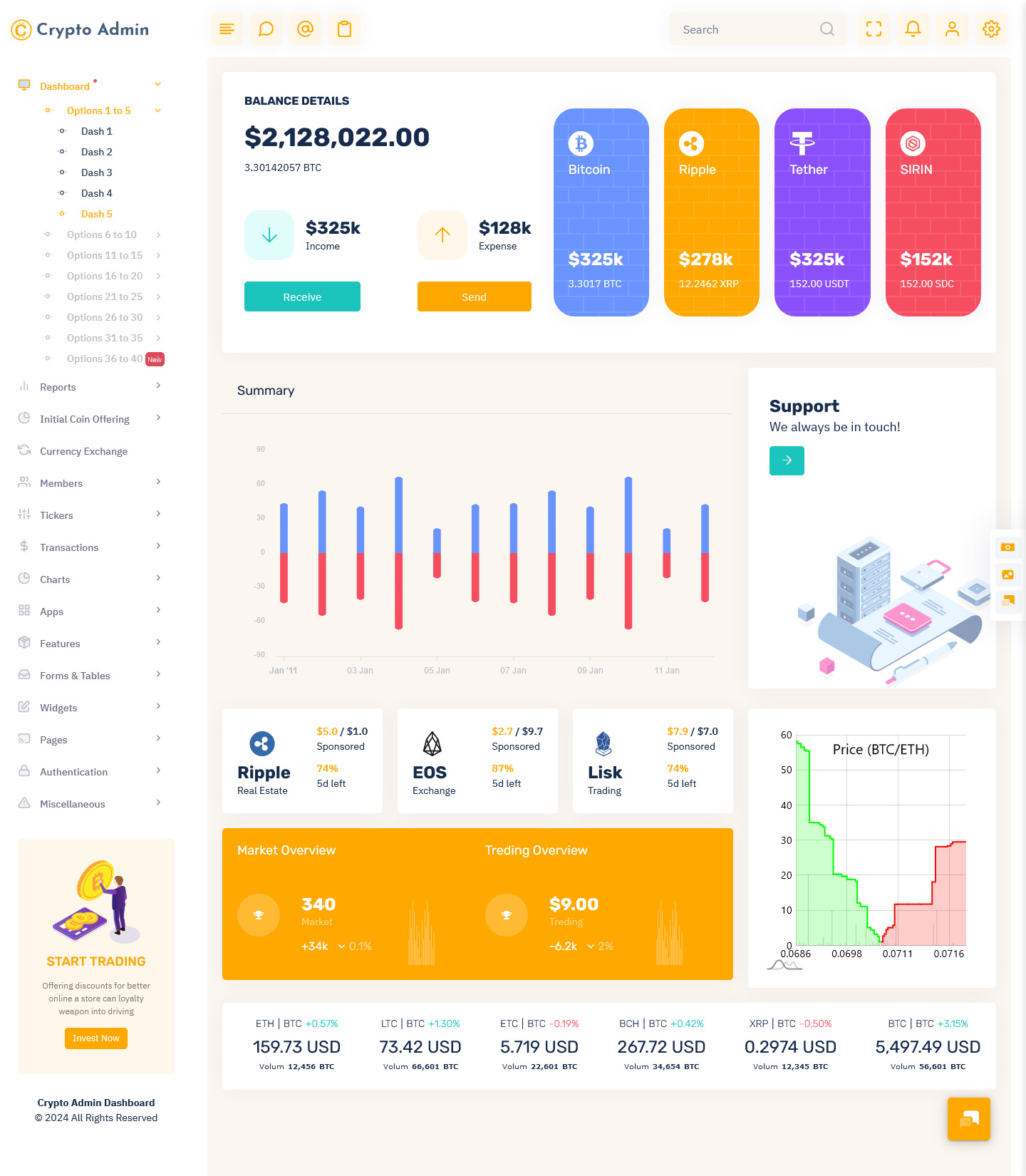
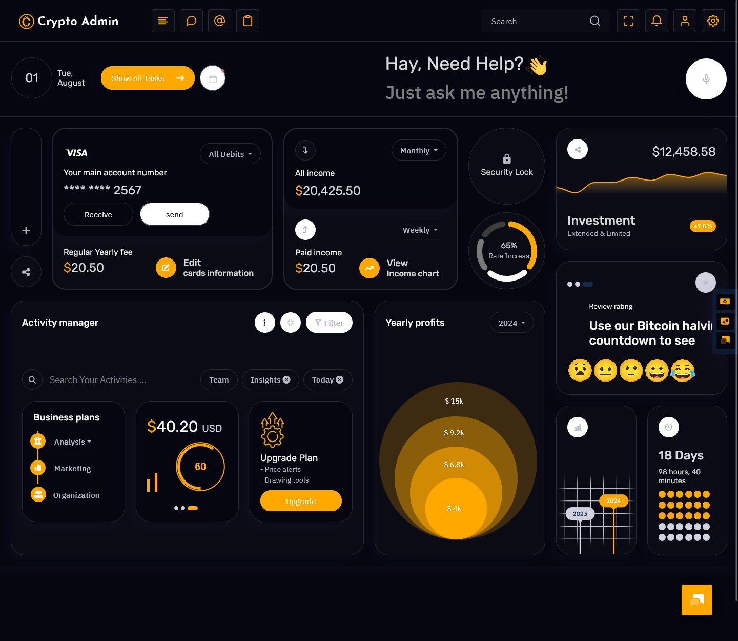
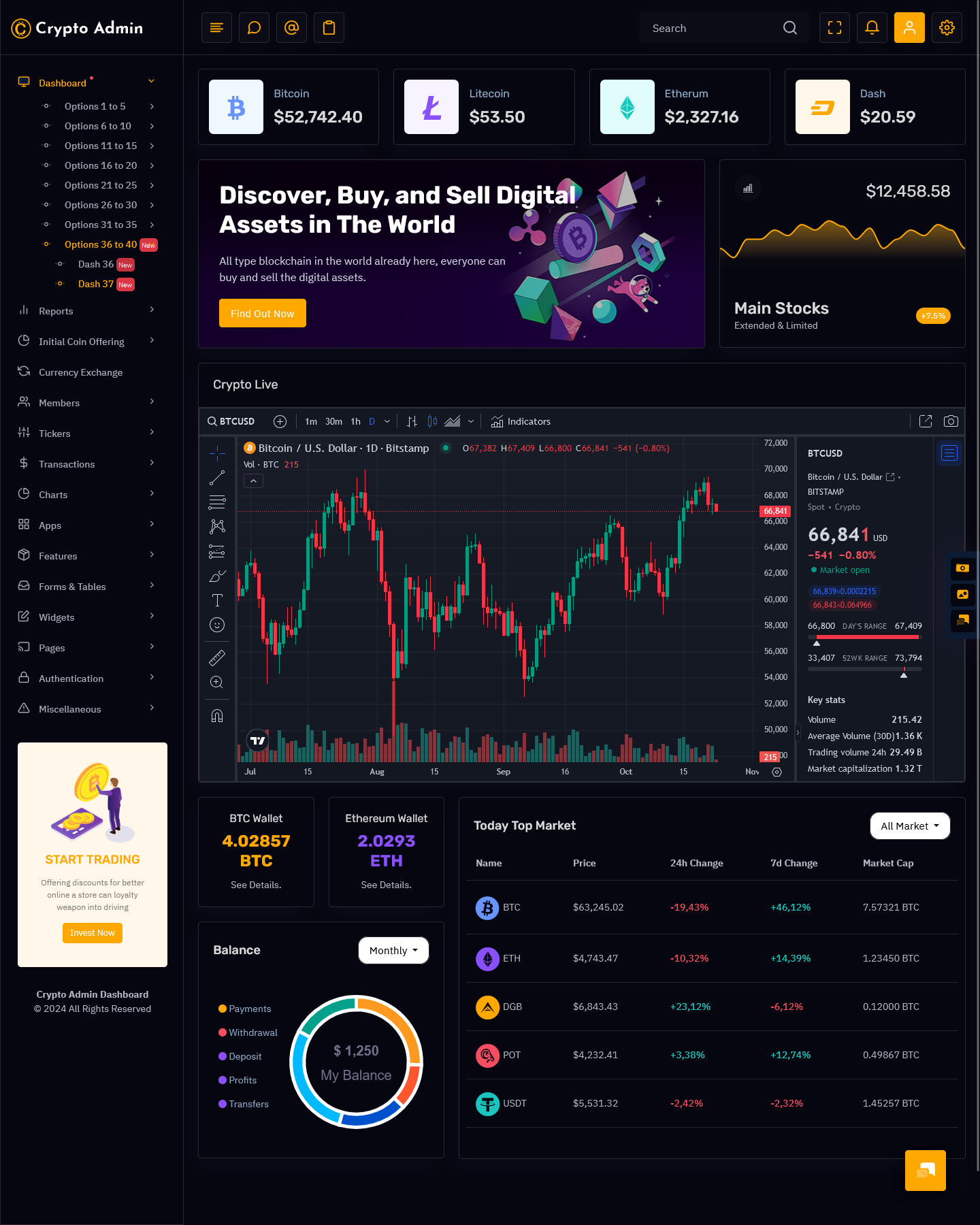
One of the core principles of intuitive interface design is visual hierarchy. This refers to the arrangement of elements on the page so that the most important pieces of information stand out. When designing a crypto dashboard, make sure that key data like portfolio value, market prices, and trading volumes are prominently displayed. Use techniques like size, color, spacing, and contrast to differentiate critical Trading Dashboard components.
For instance, the total portfolio balance could be displayed in a large font, while secondary data like individual coin holdings appear in a smaller size. Using color strategically is also important – red for losses, green for gains. This quickly conveys essential data to users glancing at the Crypto Dashboard. The easiest way to do this would be by selecting an appropriate crypto admin template.
New Dashboards of Crypto Admin – Light Version
LTR Style – New Dashboard
MORE INFO / BUY NOW DEMO
LTR Style – New Dashboard
MORE INFO / BUY NOW DEMO
LTR Style – New Dashboard
MORE INFO / BUY NOW DEMO
LTR Style – New Dashboard
MORE INFO / BUY NOW DEMO
LTR Style – New Dashboard
MORE INFO / BUY NOW DEMO
LTR Style – New Dashboard
MORE INFO / BUY NOW DEMO
LTR Style – New Dashboard
MORE INFO / BUY NOW DEMO
LTR Style – New Dashboard
MORE INFO / BUY NOW DEMO
New Dashboards of Crypto Admin – Dark Version
LTR Style – New Dashboard
MORE INFO / BUY NOW DEMO
LTR Style – New Dashboard
MORE INFO / BUY NOW DEMO
LTR Style – New Dashboard
MORE INFO / BUY NOW DEMO
LTR Style – New Dashboard
MORE INFO / BUY NOW DEMO
Keep the Design Clean and Minimal
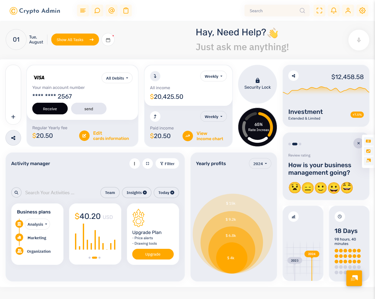
Cryptocurrency data can be dense, complex and extremely detailed. With so much information to display, Trading Dashboard interfaces can easily start to look cluttered. However, human brains are not wired to process overly intricate screens efficiently. The best crypto admin templates feature clean, minimal designs that cut out visual noise.
If you can pick a minimalist cryptocurrency dashboard template, you will be able to get most of your work done. Make strategic choices on the most vital data points that users will care about and display only those. Remove elements that are “nice to have” but not completely necessary. Use white space liberally to avoid an overloaded look. This streamlined aesthetic enhances comprehension and speeds up usage.
Make Key Functions Easy to Locate
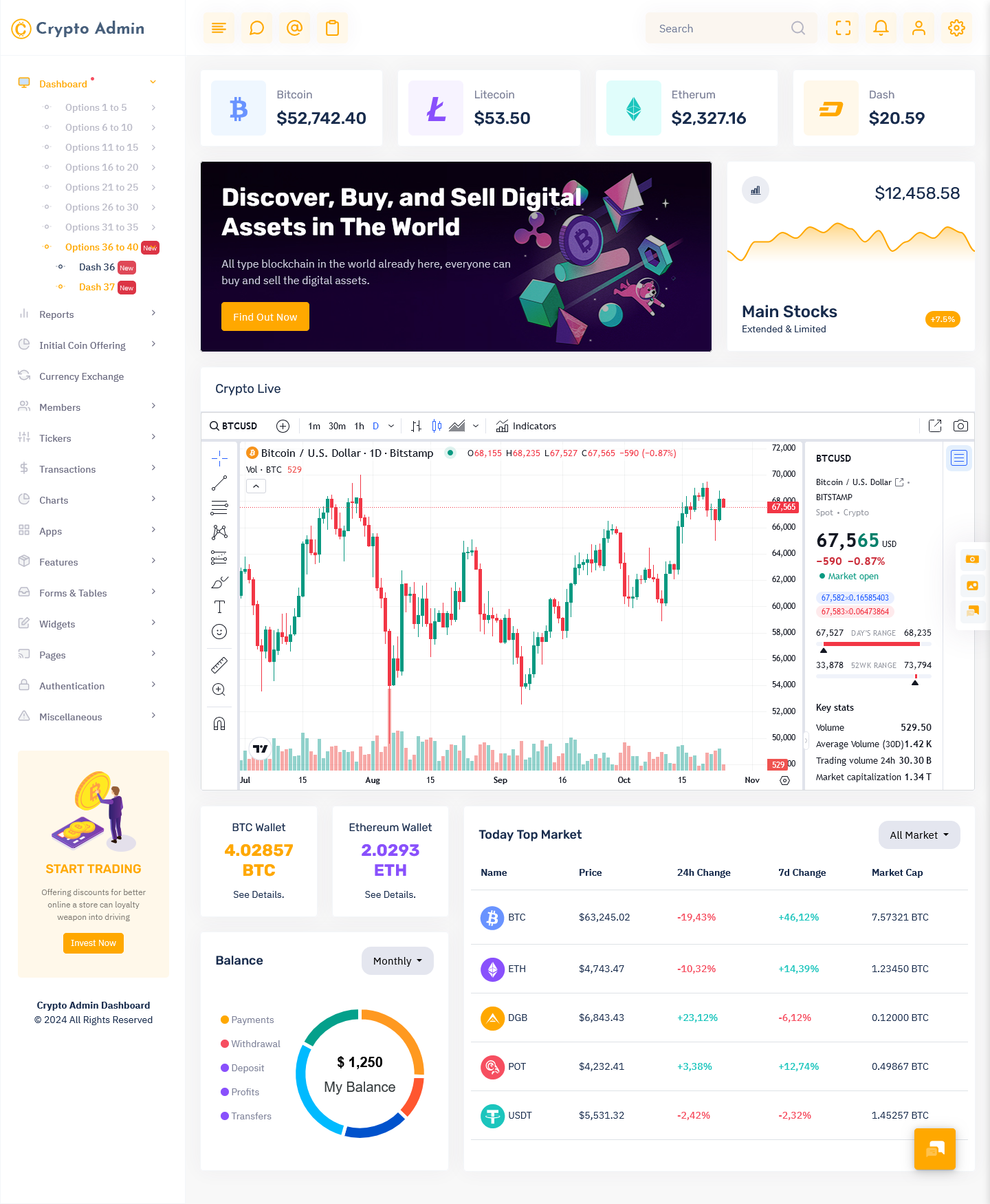
Even the most minimal Investment Dashboard design must incorporate crucial features that traders depend on. This includes functions like order entry screens, price alerts, portfolio views, news feeds, and charting tools. Based on usage analytics and user testing, identify 7-10 core capabilities that a majority rely on daily.
Make sure navigation to these features is extremely simple. Follow principles of thumb reach to position critical icons and menu options where eye focus naturally falls – top and left areas of the screen. Usage of dropdown menus should also be minimized to avoid hiding features away from immediate view. Removing extra clicks enhances usability remarkably.
Use Icons and Illustrations Strategically
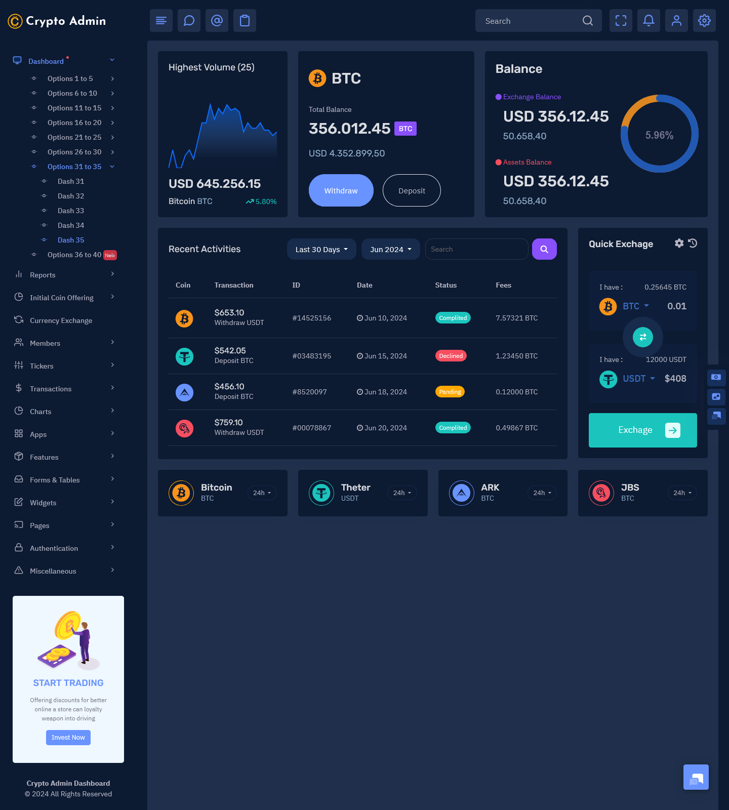
When used right, icons and custom illustrations provide an easy way to communicate complex concepts and add a fun, engaging appeal. Cryptocurrency is filled with technical terms, numbers and metrics that often have little inherent meaning. Relevant images here act as visual cues to simplify comprehension, while making the Crypto Dashboard more interesting. It is a good thing to stick to the icons recommended by the bitcoin dashboard theme to ensure consistency.
Illustrated graphs are a great alternative to dense tables of price data. Creative icons can help instinctively convey functions like trading, deposits, configuration settings etc. But beware of going overboard. Too many visual elements can once again introduce clutter and noise. Use illustrations selectively only for simplifying complex ideas. Avoid repetitive icons and excessive ornamentation.
Incorporate Animations Thoughtfully
Animation provides a dynamic feel, directing user attention to desired areas and communicating feedback. But flashy, distracting animations can also have downsides for usability. The key is incorporating subtle motion purposefully to aid functionality. For instance, a pulsing prompt on order submission provides visual confirmation that the action was completed. Gentle flashing alerts draw attention without feeling interruptive and annoying.
Follow general UX guidelines for animation speed and allow users control by including preferences to disable motion if required. Only critical events and statuses need animation. Overdoing movement because it seems modern is a common pitfall that hurts actual utility.
Final Words
Creating a Crypto Dashboard from scratch involves juggling multiple facets – an intuitive yet feature-rich interface, fast performance, rock-solid security and customization flexibility. By focusing on user-centric design right from the start incorporating best practices around visual hierarchy, minimalism and strategic use of illustrations, crypto admin templates deliver engaging and efficient management experiences catering well to varying trader preferences and goals.
 skip to Main Content





I love how easy this dashboard is to use. All my favorite cryptocurrencies are listed in a clean and simple layout. It’s super quick to track the latest price changes and even get historical data. Perfect for anyone who wants to keep an eye on the market!
Thank you for your fantastic review! We’re thrilled to hear that you love the ease of use and clean layout of the dashboard. Keeping track of your favorite cryptocurrencies and price changes should always be simple, and we’re glad to know it’s working perfectly for you. Your feedback is much appreciated, and we’re happy to be part of your market tracking experience!
This Crypto Admin Template is exactly what I was looking for. It’s simple, but it has all the features I need like live price updates and charts. Very responsive and user-friendly. Definitely recommended for both beginners and experienced crypto traders.
Thank you for the wonderful feedback! We’re so glad to hear that our Crypto Admin Template met your needs. It’s great to know that the live price updates, charts, and overall responsiveness have made it easier for you to stay on top of things. We truly appreciate your recommendation and are happy to support both beginners and experienced crypto traders!
As someone new to crypto, I was looking for something not too complicated. This Bitcoin Dashboard was perfect. It shows everything I need, like prices, market trends, and even news updates. It’s easy to navigate and helps me understand the market better.
Thank you for sharing your experience! We’re thrilled that our Bitcoin Dashboard was the perfect fit for you as a newcomer to crypto. Simplicity is key, and we’re so glad it has helped you better understand the market trends, prices, and news updates. We hope it continues to support your crypto journey, and we appreciate your kind words!
I’ve tried several crypto dashboards, but this Crypto Trading Dashboard one stands out with its clean design and fast loading speed. I can quickly check prices without any lag. Plus, the layout is really intuitive. No need for a tutorial, I figured it out right away.
Thank you for your awesome feedback! We’re so glad to hear that our Crypto Trading Dashboard stands out to you with its clean design and speed. We understand how important it is to have a fast, intuitive platform, and it’s great to know you were able to figure everything out without a tutorial. Thanks for choosing us!
The Cryptocurrency Exchange on this Admin Template is spot on. It updates in real-time, so I never miss out on market movements. I also love how you can customize the dashboard to focus on your preferred crypto. Super useful for daily monitoring.
Thank you for the great review! We’re happy to hear that the real-time updates and customizable features of the Cryptocurrency Exchange Admin Template have been a great fit for your needs. Being able to track your preferred cryptos in one place is definitely key for efficient monitoring. We appreciate your support!
I was able to personalize this Investment Dashboard to fit my needs perfectly. I added the coins I’m most interested in, and now I can monitor them all in one place. The flexibility is a huge plus, and everything looks neat and organized.
Thank you for your kind words! It’s fantastic to hear that you were able to personalize the Investment Dashboard to suit your needs perfectly. We love that you found the flexibility to add and monitor your preferred coins helpful. A neat and organized layout is something we always aim for, and we’re happy it’s working so well for you!
If you’re looking to manage your crypto portfolio, this Crypto Dashboard Template is perfect. It helps me keep track of my holdings and their current value, so I always know where I stand. It also includes price graphs which are helpful for visualizing market trends.
Thank you for your thoughtful review! We’re so glad to hear that our Crypto Dashboard Template has been perfect for managing your crypto portfolio. Being able to track your holdings, visualize market trends, and stay informed with price graphs is key, and we’re happy to have made that process easier for you. Thanks for trusting us with your crypto management!
I’ve tried a lot of Crypto Dashboard, but this one is by far the most user-friendly. The interface is straightforward, and I don’t have to dig around to find what I need. Whether it’s prices or charts, everything is right at my fingertips.
Thank you for the positive feedback! We’re thrilled to hear that you find the Crypto Dashboard Template user-friendly and easy to navigate. We designed it with simplicity in mind, so it’s great to know that everything you need is right at your fingertips. We appreciate your support and are happy it’s made your crypto management effortless!
This Bitcoin Dashboard Template has everything I need in one place: real-time prices, market caps, trading volume, and even crypto news. It’s definitely an all-in-one solution for anyone serious about crypto trading. I can’t imagine going back to anything else.
Thank you so much for the fantastic review! We’re so glad that the Bitcoin Dashboard Template has everything you need in one place. Real-time prices, market caps, and trading volume are all essential for serious traders, and we’re happy to provide a complete solution. We appreciate your trust and look forward to being part of your continued success in crypto!
I’ve been using this Crypto Dashboard Template for a while now, and it’s been really reliable. The design is sleek, and everything works as expected. It’s a great tool for keeping up with crypto trends and managing investments.
Thank you for your loyal feedback! We’re happy to hear that our Crypto Dashboard Template has been reliable and that you’ve found the sleek design and functionality to be exactly what you need. We’re committed to helping you stay updated with the latest crypto trends, and we appreciate you choosing our template for managing your investments!