
In today’s digital world, every business depends on powerful web applications to manage operations, users,…
7 Essential Tips for Our Most Effective Power Bi Dashboard
Reading Time: 6 minutes
Power Bi Dashboard serve as powerful tools for data visualization and decision-making in various industries. An effective dashboard not only presents information in a clear and concise manner but also offers an intuitive and visually appealing user interface (UI) design. In this article, we will explore seven essential tips for creating compelling Dashboard UI Design that enhance user experience and enable users to derive valuable insights effortlessly.
- Prioritize Data Relevance and Hierarchy
The first step in designing a successful dashboard UI is to prioritize data relevance and hierarchy. Identify the key metrics and information that are crucial for your users and place them prominently. Organize the dashboard in a hierarchical manner, emphasizing the most important data at the top or center. Use visual cues such as size, color, and positioning to guide users’ attention to the most critical information. By focusing on data relevance and hierarchy, you can ensure that users quickly grasp the key insights without being overwhelmed by unnecessary details.
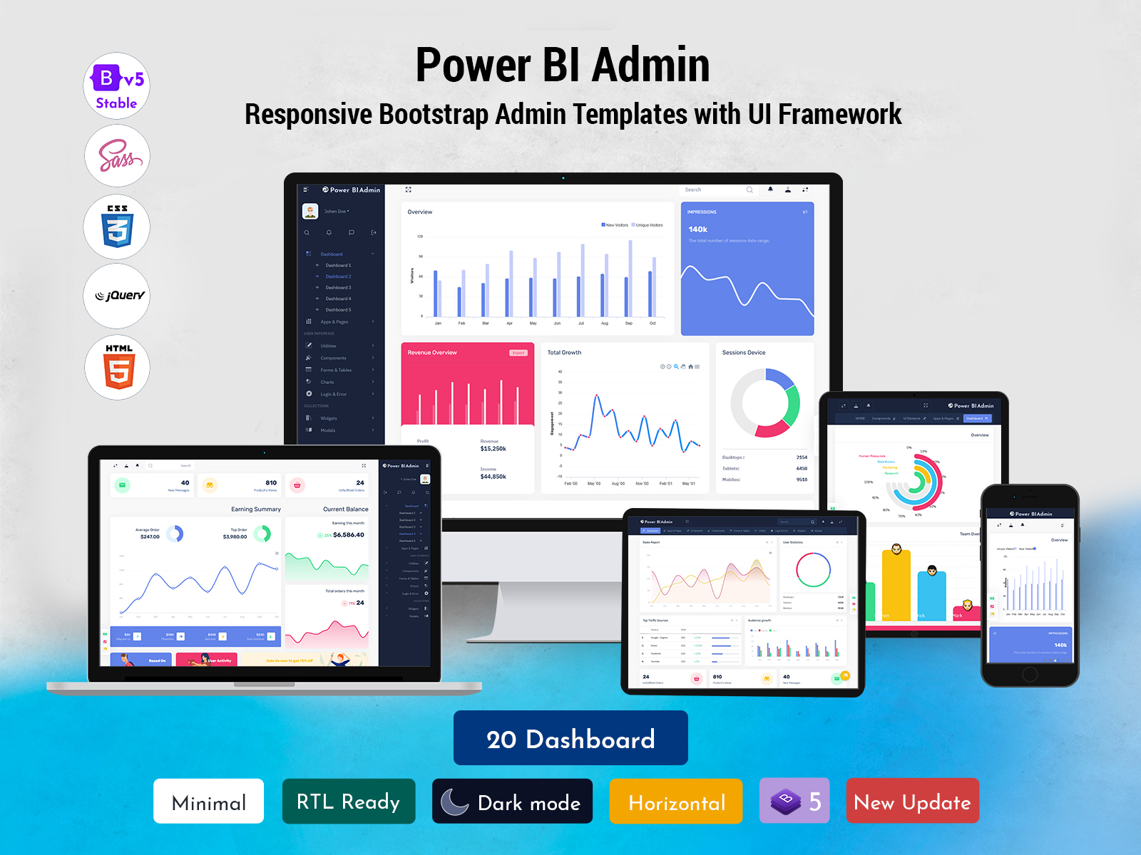
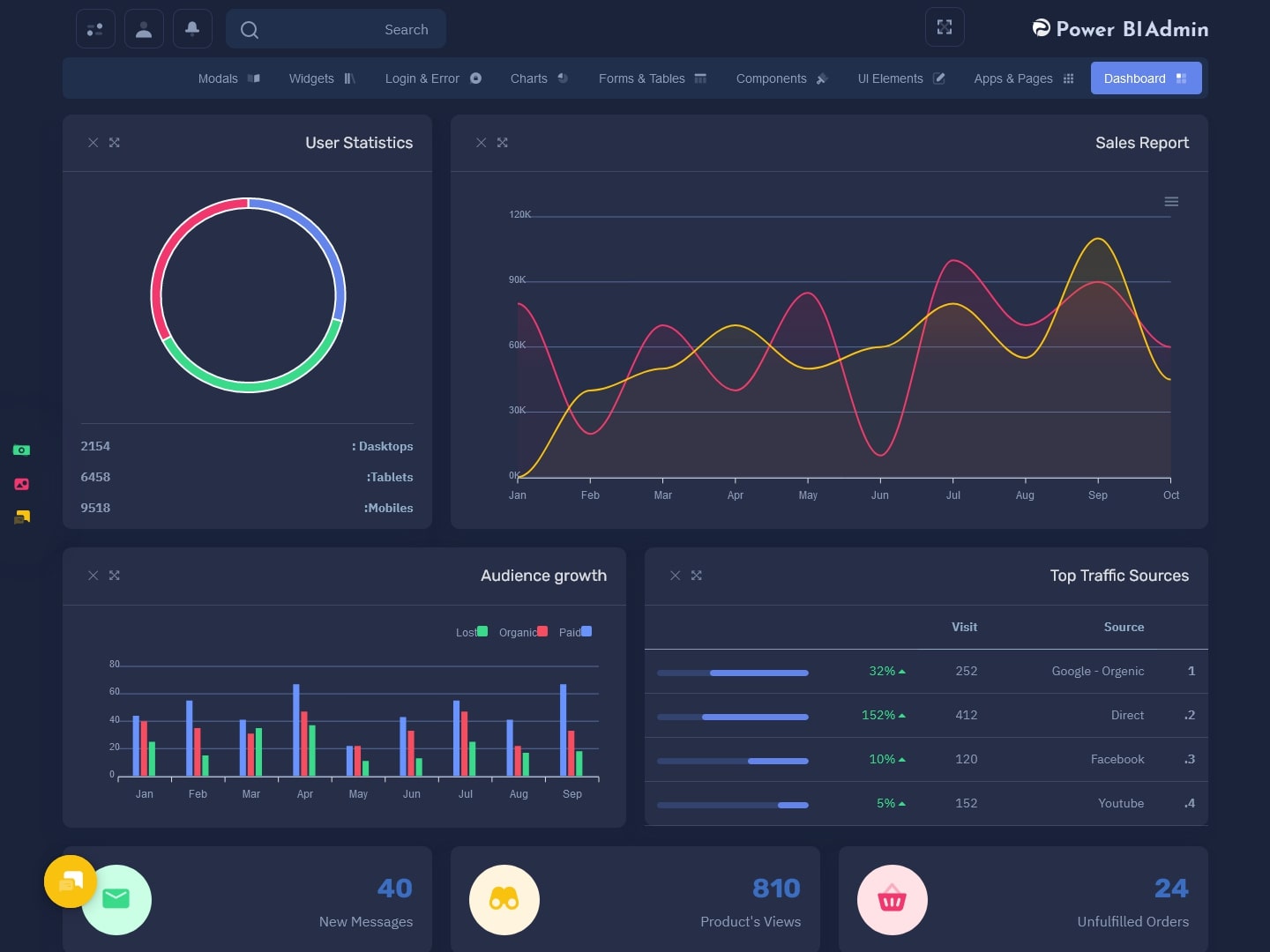
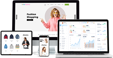
Power Bi Admin
Watch Video
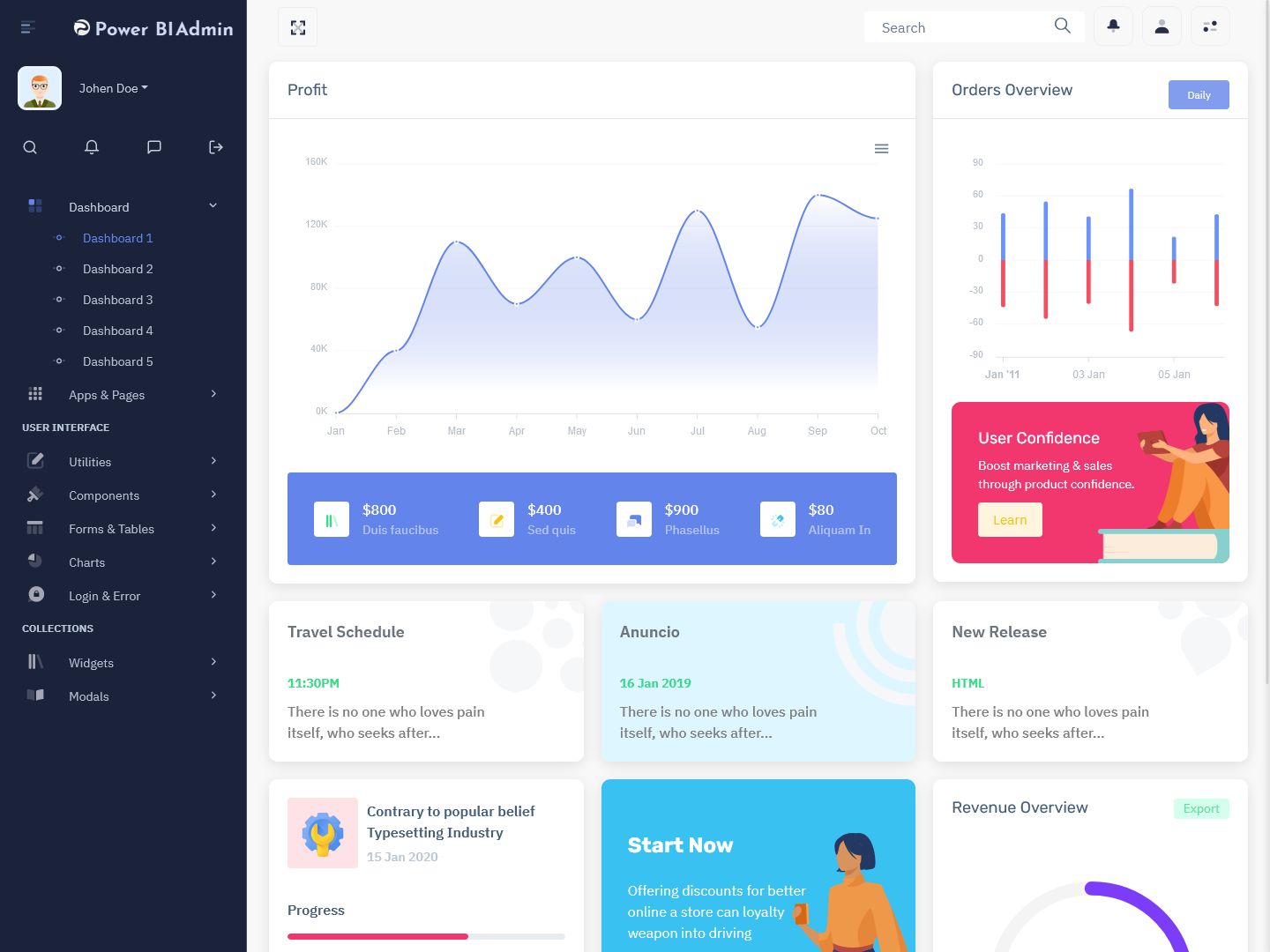
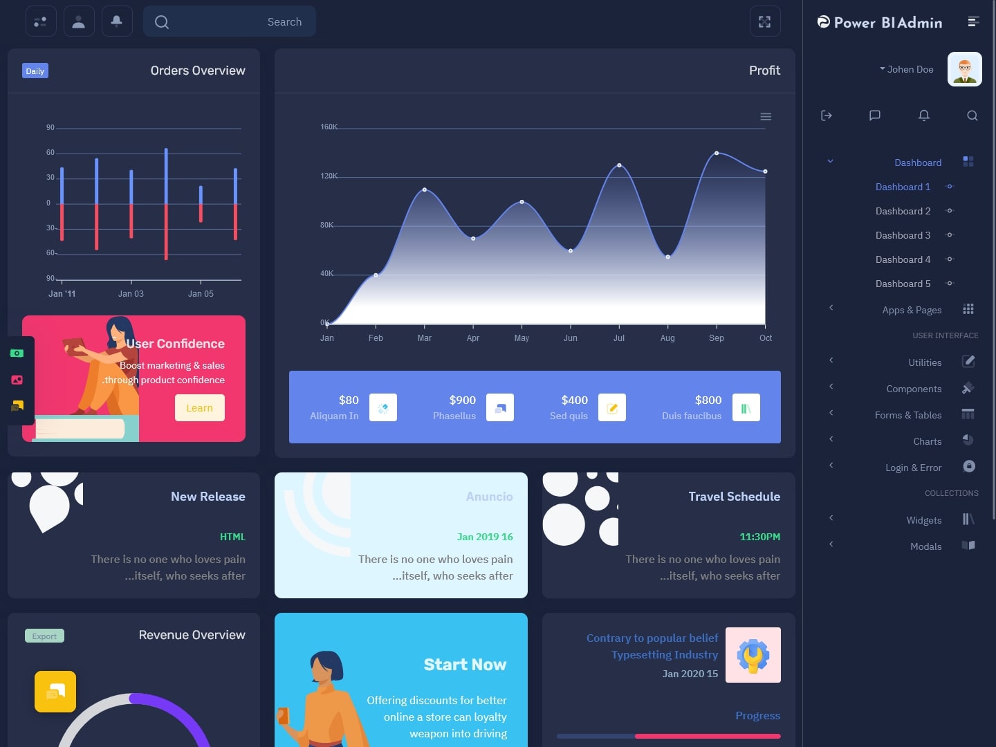
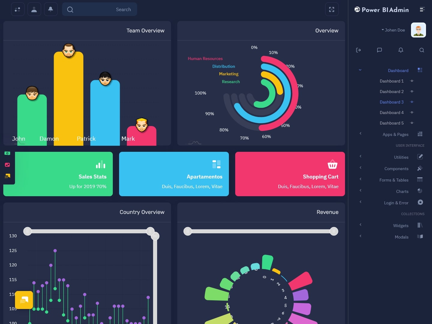
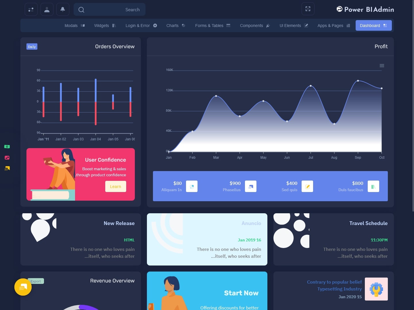
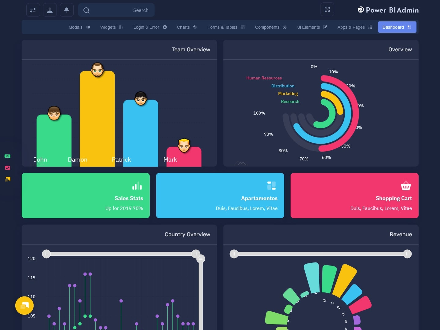
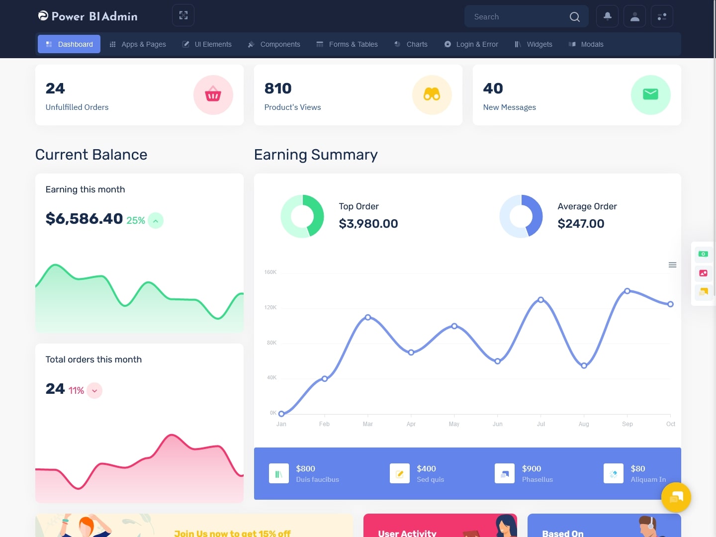
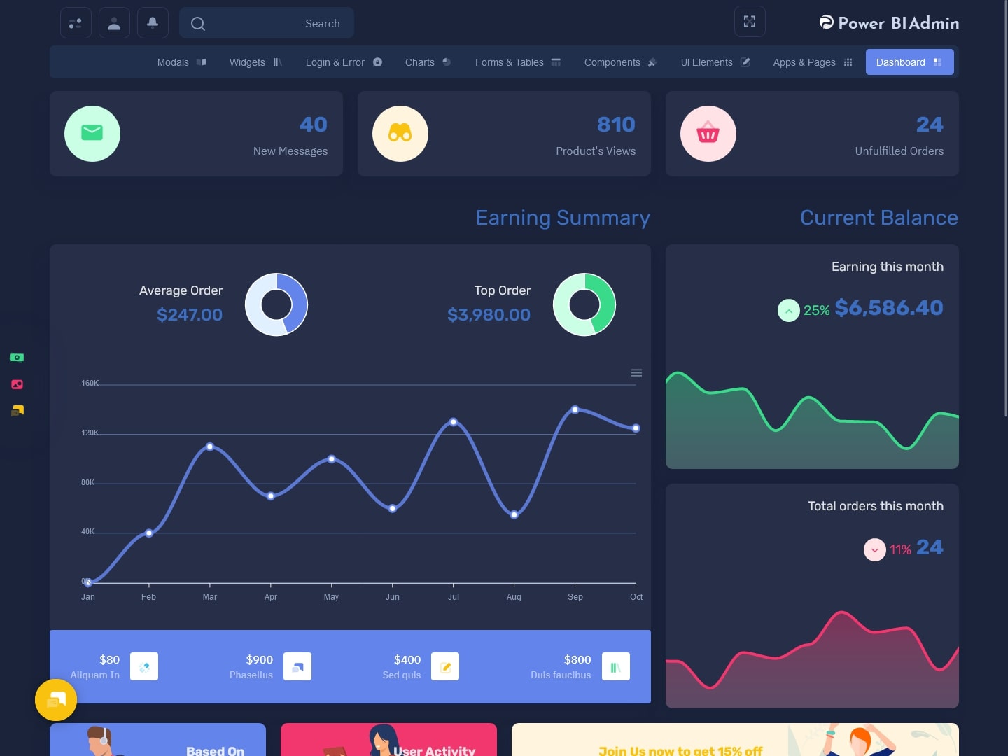
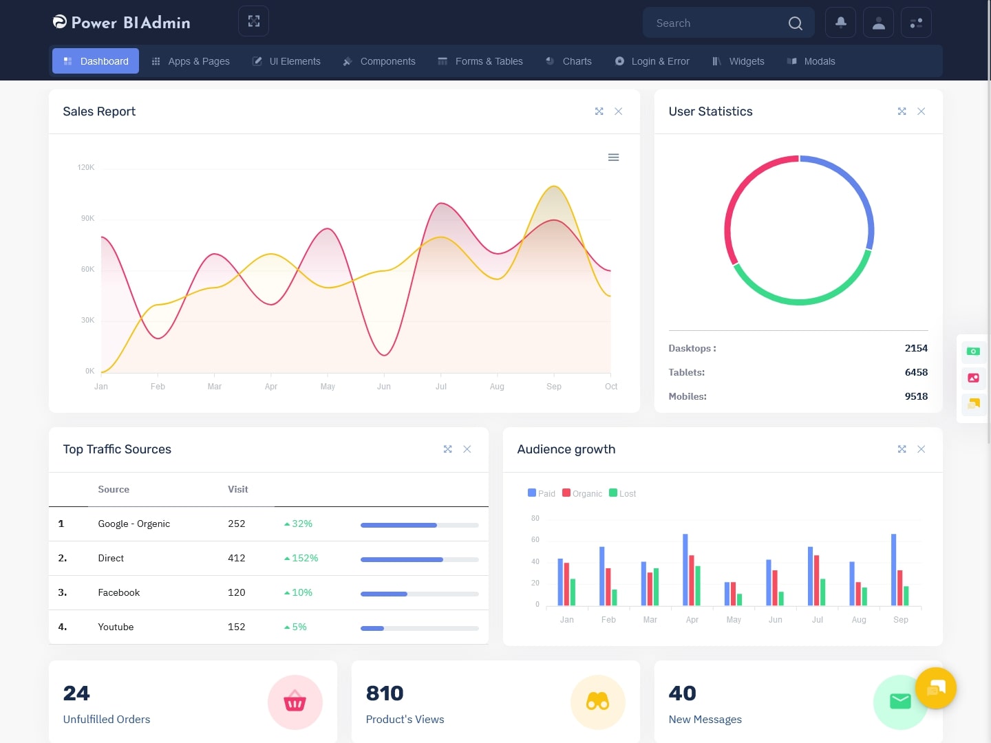
Power Bi Admin – LTR Style Bootstrap 5 Dashboard – 1 – Light
MORE INFO / BUY NOW DEMO
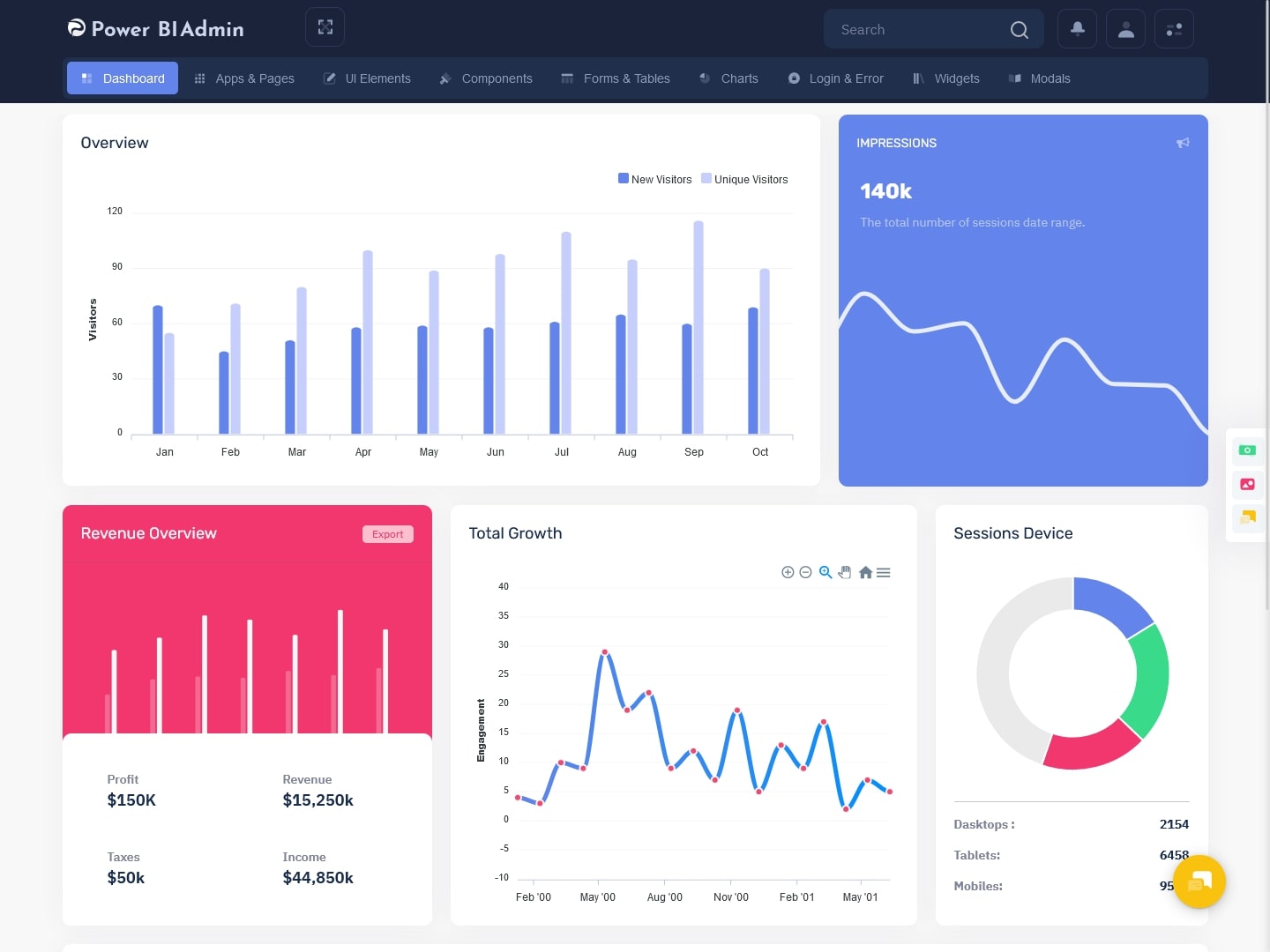
Power Bi Admin – RTL Style Bootstrap 5 Dashboard – 1 – Dark
MORE INFO / BUY NOW DEMO
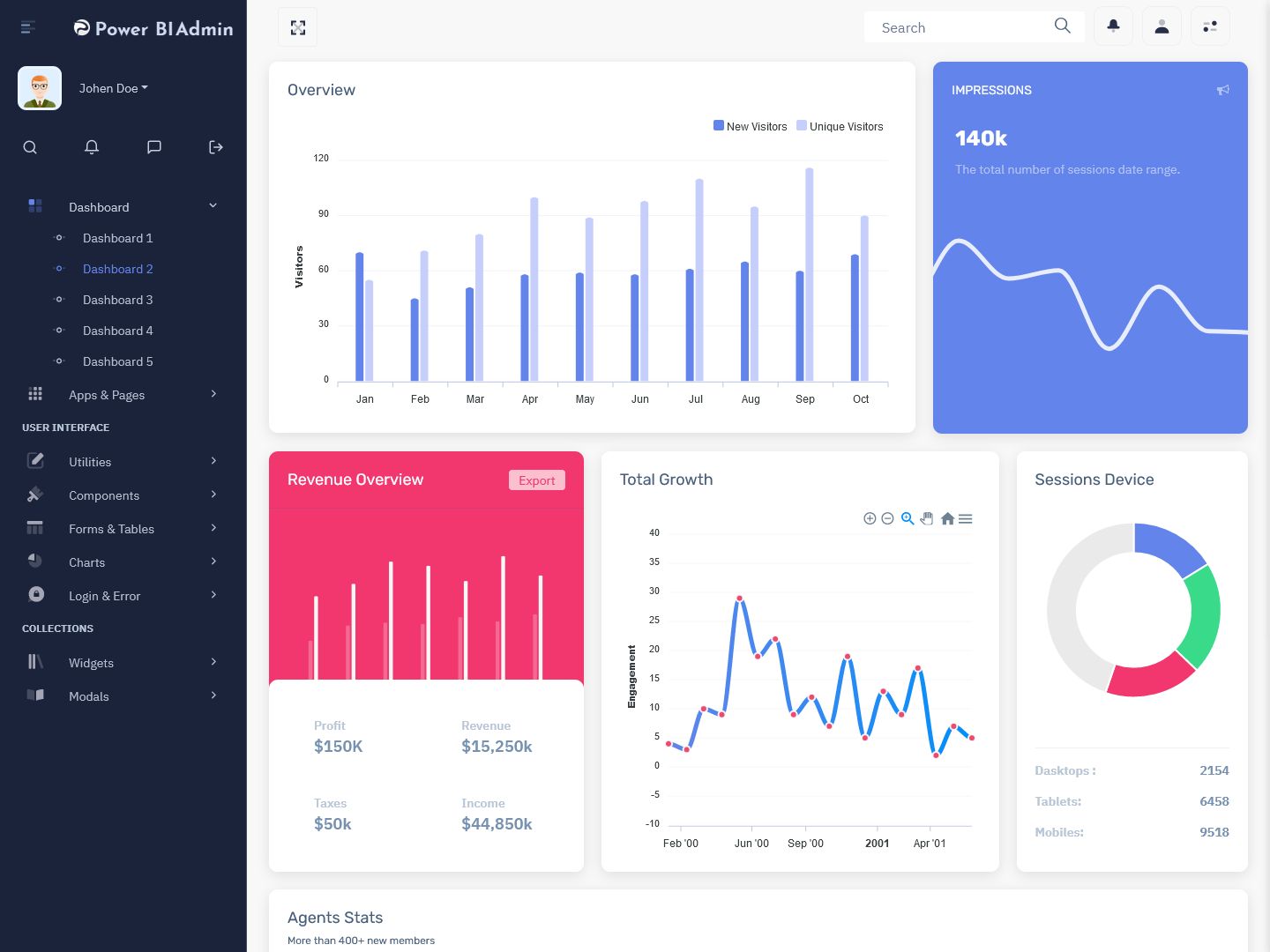
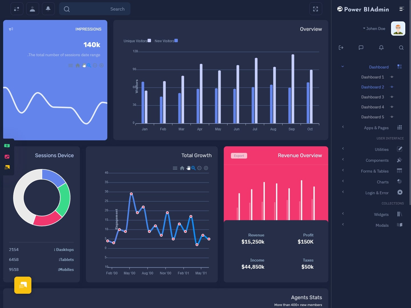
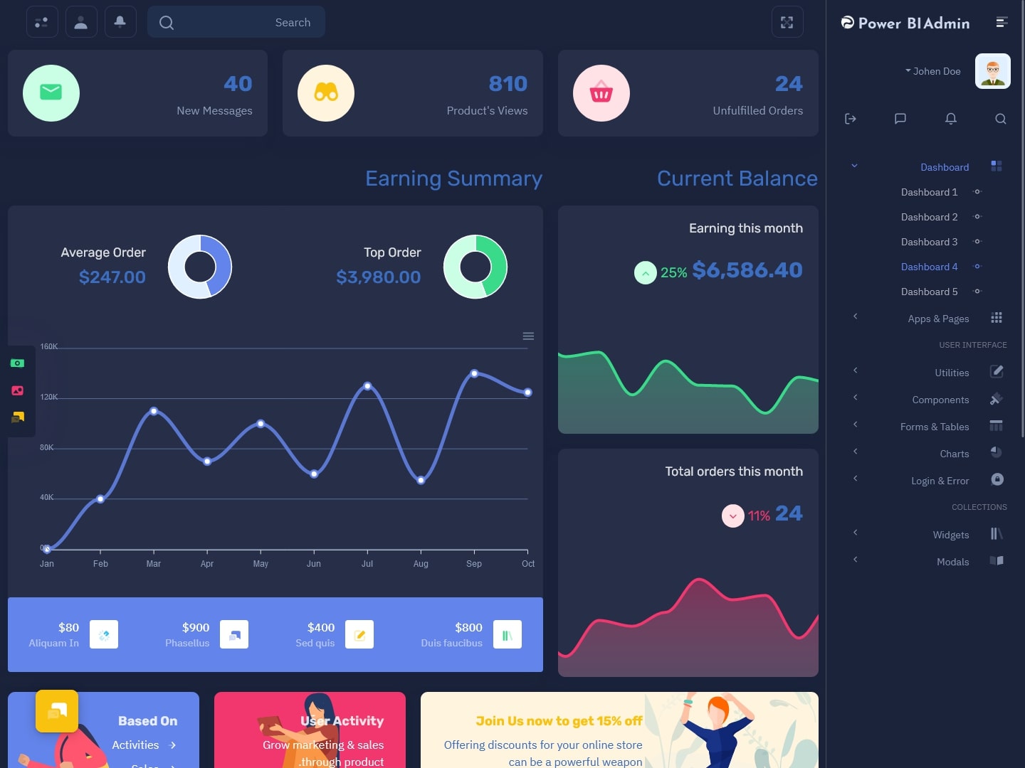
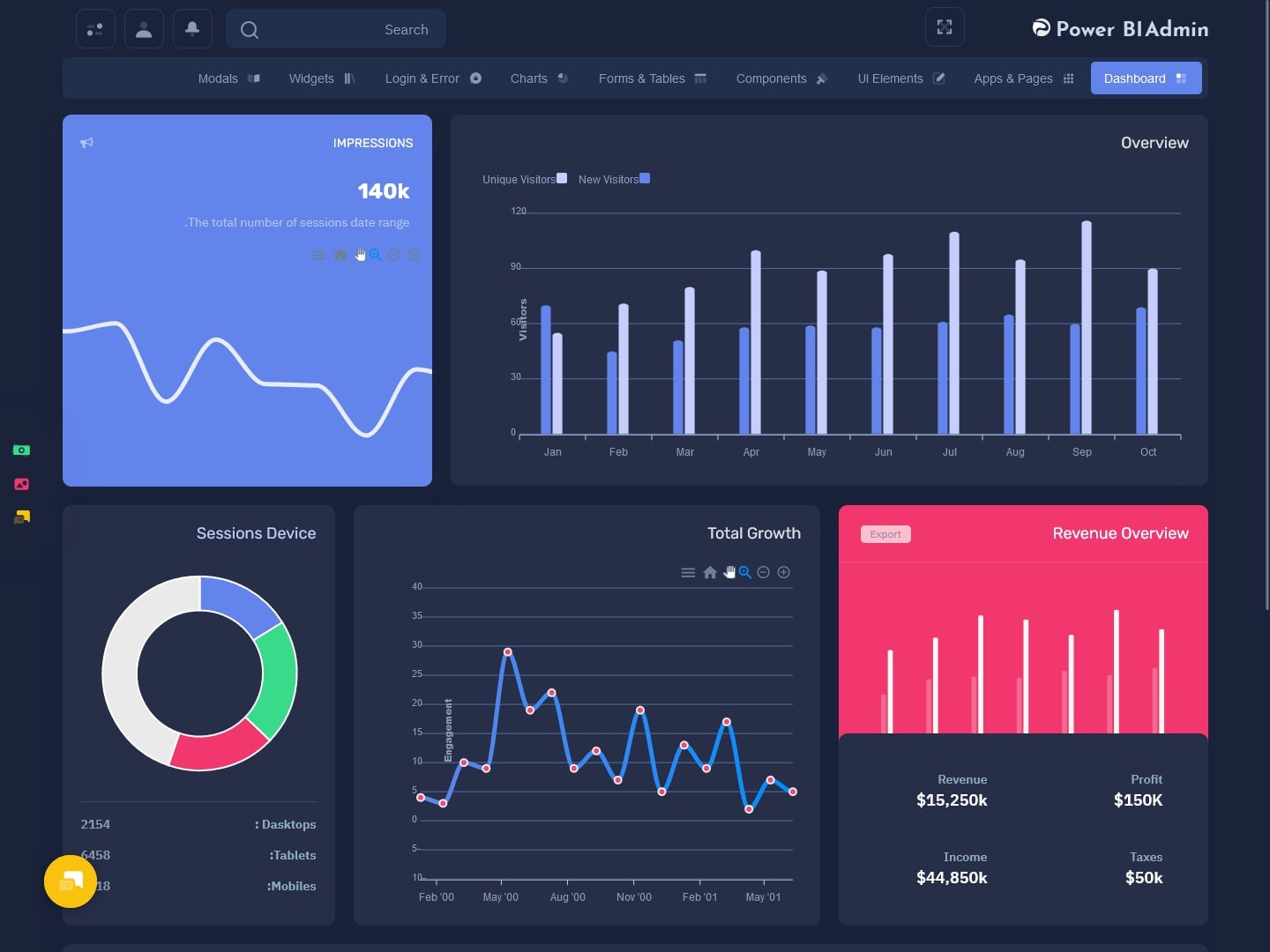
Power Bi Admin – LTR Style Bootstrap 5 Dashboard – 2 – Light
MORE INFO / BUY NOW DEMO
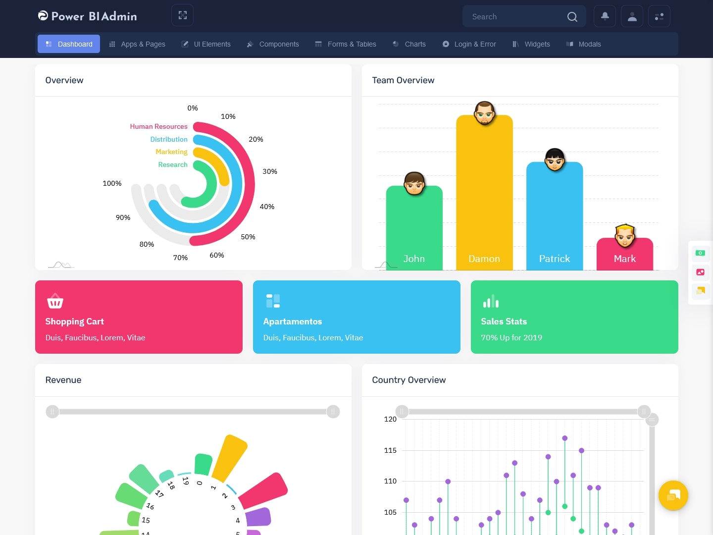
Power Bi Admin – RTL Style Bootstrap 5 Dashboard – 2 – Dark
MORE INFO / BUY NOW DEMO
Power Bi Admin – LTR Style Bootstrap 5 Dashboard – 3 – Light
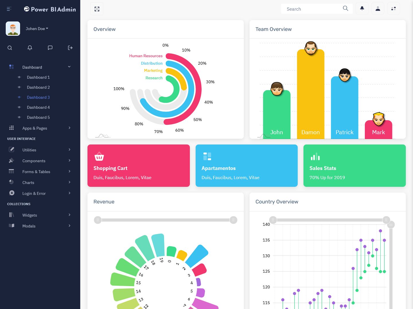
MORE INFO / BUY NOW DEMO
Power Bi Admin – RTL Style Bootstrap 5 Dashboard – 3 – Dark
MORE INFO / BUY NOW DEMO
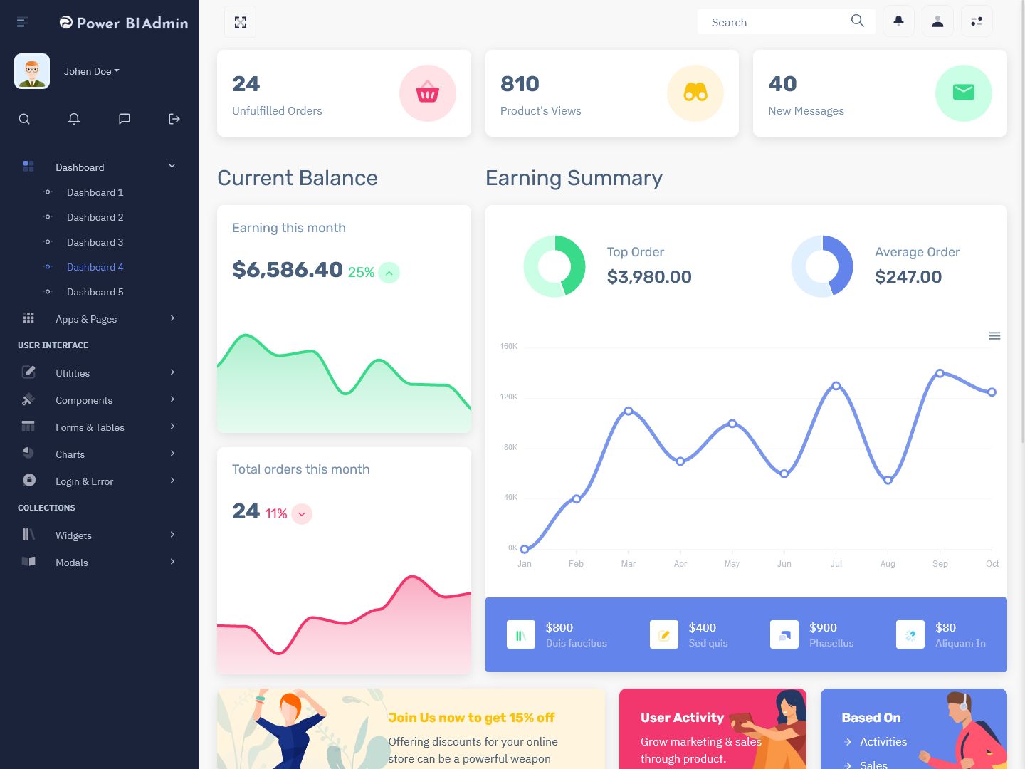
Power Bi Admin – LTR Style Bootstrap 5 Dashboard – 4 – Light
MORE INFO / BUY NOW DEMO
Power Bi Admin – RTL Style Bootstrap 5 Dashboard – 4 – Dark
MORE INFO / BUY NOW DEMO
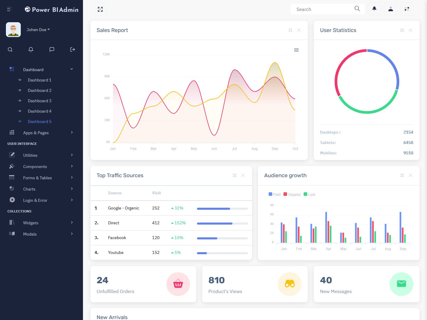
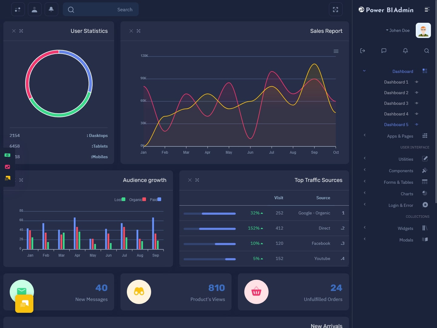
Power Bi Admin – LTR Style Bootstrap 5 Dashboard – 5 – Light
MORE INFO / BUY NOW DEMO
Power Bi Admin – RTL Style Bootstrap 5 Dashboard – 5 – Dark
MORE INFO / BUY NOW DEMO
Power Bi Admin
Watch Video
- Use Consistent and Intuitive Visual Elements
Consistency and intuitiveness are key factors in software dashboard UI design. Use a consistent visual language throughout the dashboard to maintain a cohesive and unified experience. Ensure that fonts, colors, icons, and other visual elements are consistent across different sections of the dashboard. Intuitive navigation and labelling are also crucial. Users should be able to navigate through the dashboard effortlessly and understand the purpose of each element without confusion. Adopting industry-standard conventions for icons and labels can enhance familiarity and usability. This is where you should pick the best dashboard template.
- Embrace White Space
White space, also known as negative space, plays a vital role in Dashboard software UI. By incorporating ample white space around elements, you create a clean and uncluttered visual environment. White space helps separate different sections, making it easier for users to focus on individual components and avoid visual overload. It improves readability, highlights important data, and enhances overall aesthetics. Embracing white space also provides room for scalability and future additions to the dashboard without sacrificing clarity and usability.
Power Bi Admin
Watch Video
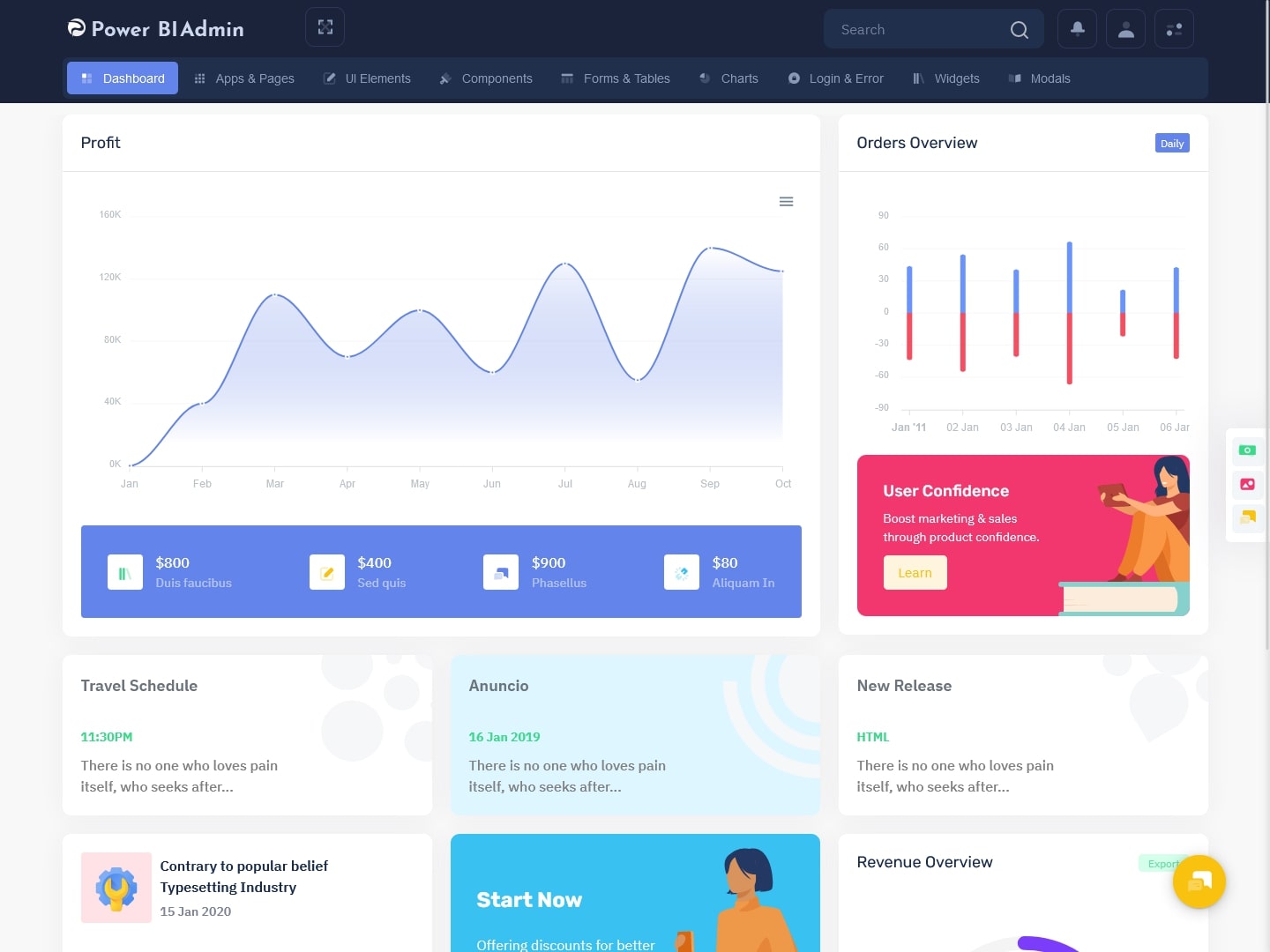
Power Bi Admin – LTR Style Horizontal Dashboard – 1 – Light
MORE INFO / BUY NOW DEMO
Power Bi Admin – RTL Style Horizontal Dashboard – 1 – Dark
MORE INFO / BUY NOW DEMO
Power Bi Admin – LTR Style Horizontal Dashboard – 2 – Light
MORE INFO / BUY NOW DEMO
Power Bi Admin – RTL Style Horizontal Dashboard – 2 – Dark
MORE INFO / BUY NOW DEMO
Power Bi Admin – LTR Style Horizontal Dashboard – 3 – Light
MORE INFO / BUY NOW DEMO
Power Bi Admin – RTL Style Horizontal Dashboard – 3 – Dark
MORE INFO / BUY NOW DEMO
Power Bi Admin – LTR Style Horizontal Dashboard – 4 – Light
MORE INFO / BUY NOW DEMO
Power Bi Admin – RTL Style Horizontal Dashboard – 4 – Dark
MORE INFO / BUY NOW DEMO
Power Bi Admin – LTR Style Horizontal Dashboard – 5 – Light
MORE INFO / BUY NOW DEMO
Power Bi Admin – RTL Style Horizontal Dashboard – 5 – Dark
MORE INFO / BUY NOW DEMO
Power Bi Admin
Watch Video
- Leverage Data Visualization Techniques
Data visualization is at the core of software dashboard UI. Utilize appropriate data visualization techniques to present complex information in a visually engaging and easily understandable manner. Choose the right charts, graphs, and diagrams that best represent the data being conveyed. Consider the context and purpose of the dashboard to determine the most effective visualization methods. Use color coding, labels, and tooltips to provide additional context and insights. Well-designed visualizations can help users interpret data quickly, identify trends, and make informed decisions.
- Ensure Responsiveness and Compatibility
In today’s multi-device landscape, it is crucial to design responsive Software Dashboard that adapt to different screen sizes and resolutions. Users may access the dashboard from desktops, laptops, tablets, or smartphones. Ensure that the dashboard UI design is responsive and maintains its usability and visual integrity across devices. Test the Dashboard UI Design on various screen sizes and platforms to ensure compatibility and responsiveness. Adaptive layouts, fluid grids, and flexible elements are essential to deliver a consistent experience and enable users to access critical information on the go. You can take a look at Bootstrap Admin Template examples for inspiration.
- Provide Customization and Personalization Options
Different users have varying preferences and needs when it comes to data visualization. Offering customization and personalization options within the Software Dashboard UI design can greatly enhance user satisfaction and engagement. Allow users to select the types of data they want to view, customize the layout, and set their own preferences. Provide interactive elements such as filters, search functionalities, and drill-down capabilities that enable users to delve deeper into the data based on their specific requirements. Customization empowers users to tailor the dashboard to their unique needs, making it more valuable and user centric.
- Conduct User Testing and Iteration
Lastly, user testing and iteration are critical steps in dashboard software UI design. Gather feedback from users and conduct usability testing to identify pain points and areas for improvement. Observe how users interact with the dashboard, identify any confusion or difficulties they encounter, and make necessary adjustments. Iterate on the design based on user feedback to refine the UI and enhance user experience continuously. User-centric design principles, such as user testing and iteration, ensure that the dashboard meets the specific needs of its target audience and remains relevant over time.
Final words
Designing an effective Power Bi Dashboard careful consideration of data relevance, visual elements, responsiveness, and user preferences. By following these seven essential tips, you can create a compelling dashboard. It can empower users to make informed decisions and extract valuable insights from complex data sets.
This Post Has 21 Comments
Leave a Reply
Related Posts

Amazing Options Dashboard options you give us is so nice that we as customers are very happy to see this many options and can use different Power Bi Admin Template from this many options. Thnak you so much for creating this templates.
Sir we try to make all our Bootstrap 5 Admin Template best that’s why we like our admin template dashboard thank you
Power Bi Software Ui Framework everything one would expect, and more from one of the most popular Template-related websites out there! we loved your products and are using them widely thank you multipurpose themes for creating these themes and templates and we highly recommend it..!!!
Thank you sir, our Bootstrap 5 Ui Frmaework that you have bought has really new features. The more you do it, the more you will get new experiences.
our customers are so happy with the platform-independent feature of your Power Bi Dashboard , we tried your MicroSoft Power Bi admin dashboard template, and we really appreciate you for your work, and thanks for creating these themes and templates..!!!
Thank you sir, we assure you that our Power Bee Admin template will give you a very good experience and make your work easy and save your valuable time.
different charts options in Power Bi responsive bootstrap admin dashboard template is so useful in creating our admin dashboard and the feedback is so responsive about the templates and charts from our clients thank you so much for creating these templates..!!!!!!!!!
Thank you sir, we also like to make such good web admin template for our honest customers like you.
the frontend pages of Power Bi admin responsive Bootstrap 5 Admin Template is so attractive to build our website with a great frontend look and we used your frontend templates in our website and it is fully responsive and customizable we are glad that we choose your templates for building our website
Thank you sir your comment is very important for us. .If you want Warehouse Related Dashboard Admin Templates then you can visit our website
The customer support of Power Bi WebApp Templates is so good that they helped us through the process we were stuck in and yes of course the template is so well coded and is fully responsive and customizable
We would like to thank you from the bottom of our heart because from your comment we got the confidence to make our Bootstrap Admin Web App even better.
The design and concept of Power Bi admin responsive bootstrap admin templates here for the Bootstrap 5 Admin Template are so nicely done. Keep it up!
Thank you sir, we want to tell you that in our Responsive Bootstrap 5 Admin you will get all the career related features.
Very unique content with an awesome concept of Power Bi Admin Dashboard Template we are glad to use this templates tahnk you for creating it
Thank you sir, if you want to see our more good admin template, you can visit our website, you will get to see all types of bootstrap admin templates.
“Responsive and Retina Ready for all devices” these lines of Power Bi responsive WebApplicatin Kit actually worked on all your templates, dashboards are fully responsive and work on all devices, and resolution images are also viewed very well
Thank you sir, I am happy to know that our investment bootstrap admin template is working for your business.
Power Bi admin dashboard template is one of the most creative and well-coded bootstrap Dashboard, we are so happy to use your templates as being in this field of restaurants we needed the admin dashboard just like this template thanks a lot.!!
Thank you sir for supporting us, visit our website to see our other admin template
Hey very nice blog!